The Essential Landscape
Common Sense and Common Sins in Nature Photography - Part I
Text and photography copyright © Guy Tal. All rights reserved.
German philosopher Arthur Schopenhauer said that all truth passes through three stages: first it is ridiculed, then it is violently opposed, and finally it is accepted as self-evident. I find that similar steps apply to some personal convictions as well, albeit in reverse: first we convince ourselves that a lie is self-evident, then we violently defend it, and oftentimes we realize it was a ridiculous premise to begin with. It just so happens that discussions of nature photography offer a seemingly infinite source for so many of these truths in their varying stages (and no small amount of lies).
Consider the following a somewhat tongue-in-cheek discussion of some common truths, lies, and misconceptions.
The Truth about Color Casts
Color casts can result from a variety of reasons. By far the most common of these is variation in color temperature. Color temperature is essentially a measurement of the color of light. Temperature is a misleading term here and relates to the device used to generate these measurements by heating a piece of metal and associating its temperature with the color of light it emits. Perhaps somewhat counter-intuitive is the fact that lower temperatures indicate red/orange light (which we confusingly call "warm colors"), and high temperatures indicate blue/magenta light (which by the same strange logic we term "cool colors"). Confusing enough?
Now consider a typical day in the field. Color temperature outdoors is not constant and will vary significantly throughout the day. It may be low (warm) at dawn or dusk, high (cool) in areas of open shade or under cloud cover, etc.
The result is that objects will reflect different colors depending on the source and temperature of the light hitting them. Many unsuspecting photographers are often surprised when their files or film exhibit a color different from what they remember. This is where an important factor comes in - we see with our brains, not with our eyes. The eyes transmit information and the brain interprets it. Our brain is notorious for automatically compensating for the ambient color temperature. That blue cast you see in your image is not an error - it really was there, but you may not have been conscious of it.
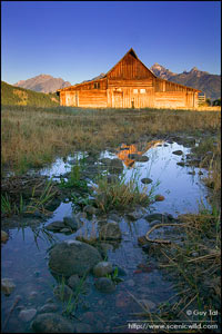
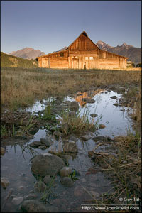
This brings us to a truth that some oppose violently: eliminating color casts is not always the right thing to do. Too many people "correct" their images by the numbers, trying to neutralize white, black, and gray as part of their process. The practical result is often the elimination of color that is legitimately part of the scene and without which the image loses much of its mood and appeal.

Open shade has a high color temperature, resulting in blue hues.
|
|

Setting the mid-tones to neutral gray eliminates most of the blue that was part of the original scene and results in a flat, "muddy" palette.
|
|
Working "by the numbers" is the right way to approach your tax return, not your art.
The Myth of the Matching the Original Capture
Another violently contested truth is that film and digital sensors do not "see" like humans. Some are closer than other but each medium has its own unique spectral sensitivity (range of colors it is sensitive to and the degree of sensitivity to specific colors), and its own way of interpreting reflected light and rendering it into tone.
In a digital camera, the computer interpreting sensor readings performs pretty much the same function as a film's chemical formula which transforms exposure into dye or density. For that matters so does our brain when interpreting light captured on our retinas. Each of these mediums "sees" a little differently.
Now let us remember another famous German philosopher - the curmudgeonly Mr. Friedrich Nietzsche - who pretty much summed it up when he said "there are no facts, only interpretations." And indeed any medium interprets light in its own unique way.
If you agree with the above, it is immediately evident that obsessing about prints matching the film or web images matching the raw file or other random interpretations that happen to result from the way the original capture medium sees are without any real basis. The exact same light in the exact same scene can be interpreted in many different ways and no one is necessarily more valid than another. Certainly the film or the camera's computer is not the authoritative source for what the scene looked like to the photographer.
When deciding how to present your image, match what you saw or - better yet - match what you felt.
Another interesting twist to this is the ongoing debate about cloning distracting elements out of images. Some interesting scientific experiments show that the brain sometimes completely misses objects in clear view. A famous experiment shows the audience this video and asks them to count the number of times the ball is passed by players wearing white shirts. Go ahead and try it out for yourself. Write down your answer, then watch the video a second time without counting. You may be surprised to learn how different what you see is from what was actually recorded by the camera.
In all but documentary/journalistic photography the "real" image - the one that moved you to record it and made you wish to share it with the world - is the one you saw, not the one the camera saw.
There are No Rules for Good Composition
To say that good compositions must follow the Rule of Thirds or some other so-called rule is like saying that good food must contain garlic. Surely there a lot of wonderful dishes containing garlic, but what about chocolate cake? Does chocolate cake "creatively break the rules"? Of course not, it's just a different kind of dish.
Why then is it when someone presents a successful composition that does not adhere to these tired guidelines they are often considered to do exactly that - creatively break the rules? And honestly I see such successful rule-breaking at least a couple of times each week so just how relevant are those rules?
I contend that these rules are not rules at all but actually after-the-fact academic observations. Take a poll of great images and you will find that many share the same characteristics. This is not surprising. The same is true for great dishes, great music, great writing, etc. The secret to success is not in forcing any one method or ingredient - it's in the ability to identify exciting combinations, both original and traditional, of ingredients and to combine them into a successful mix. Trying to force some scenes into a given rule is like trying to force pesto into a fruit pie. Some combinations work and others do not, and knowing the difference is the genius of a great composer, a great chef, or a great artist.
Bigger is not always Better
So many things in nature photography are about size - whether the capture format or the maximum aperture of an expensive prime lens, or ultimately the dimensions of the print.
Someone cynically quipped that if you can't make it better - make it bigger. To which the great Albert Einstein responds: "any fool can make things bigger, more complex, and more violent. It takes a touch of genius-and a lot of courage-to move in the opposite direction."
Indeed there are many cases in which size doesn't matter and yes, there are even cases where smaller sizes are more appealing and appropriate. In particular let's consider print sizes. I find that this is one area most photographers seem to firmly - and wrongly - believe that bigger is always better.
Determining the ideal size for an print really depends on two factors: the characteristics of the specific image, and the intended viewing conditions. Examine whether your image draws its power from careful composition, from detail, from subtleties of color, etc. and whether the subject portrayed is really suitable for extreme enlargement. Also determine what size is appropriate for the space allocated for the print whether hanging on a wall, incorporated into an album or a book, or displayed online. In particular with images that rely on careful composition make sure that the composition can be taken as a whole in one glance. Factors such as viewing distance, lighting, and the presence of other elements in the immediate vicinity can all factor into the impact the image has on the viewer.
Images that rely on detail or color and/or that portray vast landscapes may indeed gain prominence and power from being printed very large when space allows. Not necessarily so for images of intimate scenes and/or where attention to nuances is important and where forcing the viewer to step back or move their gaze around may detract from the print's impact. Prints displayed in large spacious venues may need to be large enough to command attention. Prints sharing space with other images or elements should allow sufficient "breathing room" to allow the viewer to isolate the one print or set of related prints from the others etc.
Let the print size be the outcome of careful consideration of these factors and don't assume that "largest I can afford" is always preferable.
The Most Important Photographic Skill is Thinking
I concede in advance that the question of what is "most important" is a little contrived. It's like asking what the most important part of a car is. In truth some parts and skills are equally essential to being able to produce an image. For the sake of argument let's narrow the discussion to the most important skill in creating a successful image, assuming one possesses all the right equipment and skills to do so.
Some may call it the "art of seeing", some refer to it as "visualization", the spiritual may opt for "black magic" or "alchemy", and the cynics may dismiss it as "getting lucky". With the exception of the last one, it is quite obvious there is a deliberate process at play, whether consciously or not, that leads to that "aha!" moment when a composition transcends a mere record of reflected light and gains an independent existence as an "object d'art".
It is a common misconception that successful landscape photographers just travel a lot and meander around beautiful scenery hoping for something to happen and aim a camera at it. While some images are indeed the result of pure serendipity, for the most part they are a result of the photographer's ability to distill information, to identify favorable arrangements and conditions, to intuitively predict what may or may not work in the eyes of a viewer, to quickly react to new or changing conditions, and to come up with ways of portraying a subject that are not only unique but also visually appealing.
The term I favor for this cognitive ability is "the creative muscle". The term also implies that like a physical muscle, so does this one need to be exercised and toned and flexed and challenged to improve its performance.
More common sense and sins in the next installment.
GT-NPN 0440
Comments on NPN landscape photography articles? Send them to the editor.
Guy Tal resides in Utah, where most of the Colorado Plateau's breathtaking grandeur can be found, and where issues of preservation and land-use are among the most prominent on the political agenda. Guy's large format photography can be viewed on his website at http://scenicwild.com.


| 

