|
|

Artist's Perspective... Art in Photographic Composition
Text and Photography Copyright Dale Proctor
These little so called little details are the very thing good photographers know about and do something with, they apply their personal photographic knowledge and experience. Those photographers who are not informed really can't be blamed for not knowing. They have a need to be enlightened but instead, they are fumbling with the equipment and technical stuff. Yes, we hear it all the time, the questions and then the answers. I am not saying the technical stuff isn't important, try to make a photograph without it and you can't. But, if we spend time working on understanding what it takes to make a photograph, the artistic part, the technical stuff must be included to get the end result. Approaching photography from this perspective, the technical is in the backseat with the artist in the driver’s seat controlling the photographic process. The two major hurdles to overcome in the making of a photograph are simple: placing the camera in the right position and pushing the shutter release at the right time. Placing the camera in the right position is perspective. This is how you personally see when you photograph the subject, your point of view. Remember the lines, the horizon line is high and you are putting emphasis on the foreground, placed low you are placing importance on the upper part of the scene which in landscape photography is the sky. But what about all the little intersections, where lines cross, where tones blend together and become one? These are mergers, where two or more objects or tones come together and become in a photograph either a blob, a nuisance, or near miss. The tree branch from hell, shadows fall across the subject leaving no detail, plants become bushes that become just green mass.
Mergers help viewers “stumble” when looking at your photograph. Anybody who remembers music records will remember the sound of tick tick tick from a scratch in the vinyl. Not really enough in most cases to ruin the music but it sure was annoying. Well mergers are kind of like that too, they stop the flow and snag attention, then what? The viewer will question is that a “?” or think to themselves or sometimes speak out loud they (you) should have not included that branch. Let’s discuss mergers on the border. Our eyes are very sensitive to light and when we are looking at a photograph, the lighter tones will be more prominent, so we will see them first. Light tonal value objects such as rocks (especially rocks) and bare branches should be clearly in the frame or not showing. This doesn't mean you have to show the entire rock or branch, just enough to show you were in control. An example of this would be a nice green meadow with a white colored rock on the border, half in and half out. The viewer’s eyes will race over there to see what that lighter tone is. When this happens they are not receiving your message clearly, tick tick tick. When I mention lighter tones, I mean lighter tones and hues. The tonal values are light being reflected and hues are color. I sure don't want to get into exposure in an article about mergers, but I do want to make this clear. In color and B+W photography, tonal values are measured with your in camera light meter. The light meter reads only reflected light which is tonal value (light) and not color or hue. You would need a color meter to read color. This must be separated to be successful with color photography (those little details). So, when I say light tonal value objects I am combining the hue and light. For example, tan would be a light color brown as baby blue is a light color blue. These lighter colors have power to pull the eyes because they are filled with light. Dried leaves are lighter browns, and in a landscape composition foreground, these dried leaves will catch the light. Having these light catchers along the border or intersecting with your subject in mergers will have a negative effect on viewers. The lighter baby blue sky is more cause for trouble than just about any other situation I have run across. Add the tip or tips of branches anywhere along the border because you didn't "see" them and you will be cropping like a champ, if you can salvage. When trees are standing in the light with mountains to the rear, the top of the trees should not be extending above the mountains. This is no different than the branches entering the border in the sky area of your composition. This trees and mountains situation is however more acceptable to your viewer. It is paying attention to the little detail things that makes the difference.
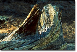
In the photograph of the downed tree which I titled "The Stump", notice I made sure to keep the two branches separated yet held them very close to create tension. Working with exposure, as well as, working to create tension with a near merger, I moved the camera position to show a clean opening between the branches, yet you do have to look. This is tension I mentioned. Editor's Note - Visit Dales web site at www.californiapictures.com to view more of his work. DP - NPN 368 Comments on NPN landscape photography articles? Send them to the editor. |
|
|
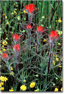
 Placing red against green assures you will not merger the color. Had the dew covered red Indian Paintbrush come in contact with the border, this image would have lost impact created from the powerful contrasting of colors. Nikon N90s, Nikkor 105mm 2.8 Macro, Fuji Velvia, Moose Polarizing Filter, Bogen 3021 w/3047, electronic cable release, F16.0 @ 1/2 sec.
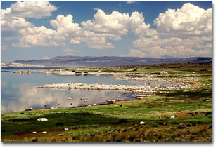
 Here are bright white rocks. Notice how they are well inside the frame. The rock formation running into the lake is given enough room to terminate inside the frame. Nikon N90s, Nikkor 35-70mm 2.8, Fuji Velvia, Polarizing filter, Bogen 3021 w/3047, electronic cable release, F16.0 @ 1/30.
 The Stump, Nikon N90s, Nikkor 80-200mm 2.8, Fuji Velvia, Polarizing filter, Bogen 3021 w/3047, electronic cable release, F5.6 @ 8 Sec.