|
Breaking all the Rules!
Text and photography copyright Gloria Hopkins. All rights reserved.
One big lesson every beginner learns about photography, other than it can drain our bank accounts faster than we can say shoot, is that for each desired result, there is a required action. If we want a lighter image, we compensate exposure. If we want a sharper image, we adjust shutter speed, and so on. Understanding the technical side of photography, while not easy, is straightforward.
Another lesson learned in photography is that for composition, that oft-dreaded but equally important part of photography, exactly the opposite is true. There are no rules to be followed or steps to be taken that can guarantee a well-designed photograph. That knowledge must come from within and for those who image design is not intuitive, composition guidelines can be indispensable tools.
Understanding Composition Guidelines
Composition guidelines are loosely referred to as rules; such as in the title of this article. They are, in reality, merely guidelines ... proven design principles used by artists and designers to assist in the organization and creation of their work. Obviously, as visual artists, it is our right to compose our images any way we want and there are no hard and fast rules to which we are bound. But the guidelines help, and it is critically important to the diversity of our portfolios that we make the distinction between using them as rules and using them as tools.
Composition guidelines exist to help us organize the elements of a scene. They are suggestions for predictable results and should be used with discretion. When we start allowing guidelines to rule our work, our images themselves can become predictable ... a terrible fate for an artist.
When to Break the Rules
Just as there are times when guidelines are helpful, there are times when they can be modified or ignored altogether. Knowing when to ignore the guidelines requires some experience, but the results can be quite dramatic and cause a photograph to shine above the crowd.
Some photographic artists can wield the guidelines as a sculptor and their clay. They blend their understanding of composition with personal interpretation, and sometimes technical experimentation, for magical results that often go beyond the realm of rules and guidelines. There are no formulas for achieving this wonderful ability; it must come from understanding.
Following are four images that have broken major nature and wildlife composition guidelines. While not award-winning works of art, they are still compositionally sound images.

Guideline: Don't Center the Subject
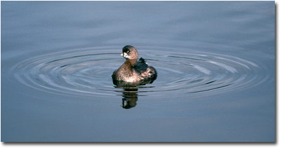
In most circumstances, many skilled artists would dismiss a centered subject as amateurish and unimaginative. Centering a subject provides an average view of a scene and robs the image of uniqueness. After all, anyone can stare straight at a bird in the water. What’s special about that? For this shot, the concentric circles around the centered bird made the scene special. The way to compose this shot was obvious: ignore the guidelines.
The circles, the silky texture of the water, the bird looking at me, and the subject’s perky pose all contribute to the success of this classic bull's-eye composition. If the bird had been looking away from me, the image would have been acceptable, but much of its appeal would be diminished because contact with the subject would be lost.

Guideline: Subject Should Face the Camera
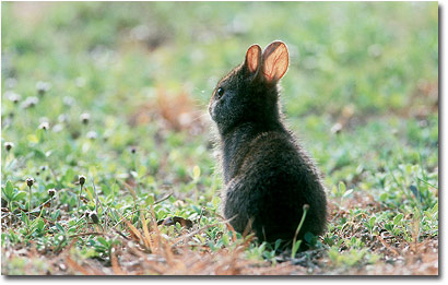
The tiny catch light in the young animal’s eye was the sole reason for breaking one of the biggest guidelines in wildlife photography. It gives the rabbit a sweet, childlike quality while invoking thoughts of innocence and youth. I don’t regularly anthropomorphize, but with the animal looking into the distance, an imaginative person could interpret it as the baby looking at a brand new world with wonder and uncertainty, or maybe it is looking for its mother. I intentionally did not use fill flash to lighten the dark areas of the animal because I felt doing so would diminish the prominence of that all-important eye.
The tiny wildflower near its rump, in my opinion, also contributes to the charm of this photo. And finally, the out-of-focus flowers throughout the image mirror the shape and brightness of the main focal point. This creates a harmonious consistency and distribution of the shapes throughout the image. These qualities are strong enough to carry the image and allowed me to break the rules with confidence.

Guideline: Leave more room in front than behind
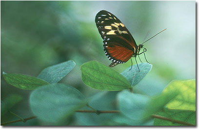
A well-known guideline for animals that are looking left or right is that we leave plenty of space in front of the animal for it to look into. If we compose an image of a bird on a perch and the bird is on the right edge of the frame, but is also looking to the right, the bird would appear to be looking at the right edge of the frame; pretty boring not to mention awkward. There is nothing for our imaginations to use to guess at what the bird could really be watching. Leaving space, depending on what is in that space, can give us a good idea of what the animal is looking at and our imaginations and curiosities can be satisfied.
The butterfly photo above ignores this guideline completely but still achieves the illusion that the insect is looking out into space. The key to the success of this shot is the light space in the top right of the frame. The closeness of the leaves and the darkness of the rest of the image indicate an intimate, confined space. But the contrast of the lightness on the right edge of the frame offers our imaginations a wide open space for the insect to look into, and the image works even though both the space and lightness are both on the right edge.

Guideline: Get the Whole Subject in the Frame
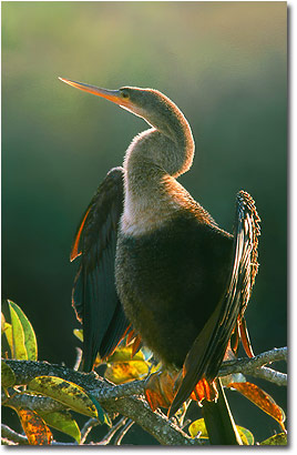
Another guideline is to try and get the entire animal in the image. Unless the photographer is going for a close-up portrait where the intended image is only a portion of the subject, truncating limbs gives an awkward ending to the animal. To someone with an active imagination it can even conjure unsettling thoughts of limb amputations. This is certainly not a message I wish to send my audience.
As far as composition is concerned, an image of an uncropped subject allows the eye to move around the complete shape and inspect every part of the subject. This is not possible with a cropped animal as the eyes abruptly stop where the crop occurs.
In the case of the anhinga above, the tail has been cropped. The reason this image still works is because the crop is hardly noticeable. It is lost among the colorful, backlit leaves and most of the viewer's attention is diverted to the important details on the other end of the photo.
It is up to you to decide when to adhere to the guidelines and when to be a rebel like me and break every one you can find. You can’t, however, break or follow the guidelines unless you know what they are. There are photographers who do not concern themselves with composition guidelines at all. If they can produce solid images doing so, more power to them! The rest of us sometimes need a little help and guidelines are like a silent instructor in the field with you. They gently suggest and guide, but they do not and should not rule your photography.
For an introduction to composition for nature photography, please check out my series on composition on my articles page.
IMAGE INFORMATION:
All images copyright Gloria Hopkins
- Pied-billed Grebe: Wakodahatchee Wetlands, Nikon F-100, Tamron 200-400 f/5.6, Fuji SensiaII, evaluative metering at 0, lens rested on railing.
- Immature Marsh Rabbit: Wakodahatchee Wetlands, EOS3, 400 f/5.6, Fuji Provia100F, evaluative metering at +1/3, lens stabilized on ground.
- Butterfly (captive): Butterfly World, EOS3, 50 f/1.8II, Fuji Sensia100, evaluative metering at 0.
- Anhinga: Anhinga Trail ENP, EOS3, 400 f/5.6, 1.4tc, Fuji Sensia100, fill flash at -1 2/3, evaluative metering at -1/3.
Gloria Hopkins - NPN 015
www.naturesglory.net
Comments on NPN photographic composition articles? Send them to the editor.


| 


