 |
 |
|||
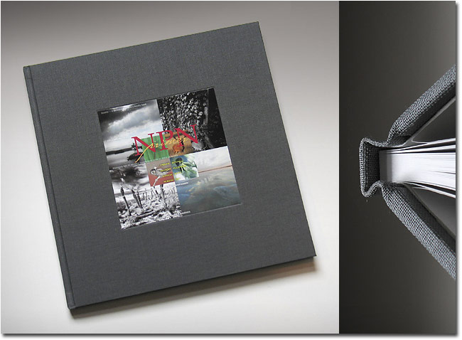
Since the article appeared, two things have happened. The article triggered a rather constant trickle of emails from NPNers with questions about various aspects of photo book design, layout, technical issues, etc. And, as you may have noticed on the front page of NPN, SharedInk.com has signed on as a site sponsor. Put those two happenings together and what do you get? Well, in a nut shell, you get Me, and a 3-part series of articles about custom photo books - the whys, the hows, together with various other rumination and tidbits that you didn’t know you couldn’t live without. Sooo...on with the show. First, let’s deal with the easy part - why create a custom photo book? There are probably as many answers to this question as there are photographers, but let’s touch on just a few that are most likely common to most;
Editor's note - NPN members who offer their books for sale on their personal websites will be listed on the Nature Photography Products page in the NPN Gift Shoppe. Ok then, it’s settled - for one reason or another (unless you raised your hand for all of the above), creating a book of your very own photographs sounds like a good idea. For many, I guess the real question is not why, but how? Designing and laying out a book can seem, to the uninitiated, to be a very daunting task. For that matter, designing and laying out a book is a daunting and intimidating task and very few know this better than those who have been initiated. However, in the present online digital world of custom photo book printing the task has been made considerably easier than it was in the analog past. In the case of SharedInk.com, total page creation (design, layout, photo prep, typography) can be done entirely at home, on your computer, using software (Photoshop) that you already own and are familiar with. Upload the completed files and place them in your book in page order. With Shutterfly.com (and most other online sources), you prep your photographs at home with Photoshop, and, after uploading hi-res jpegs, place them in your choice of page layouts (in the next article in this series, we’ll cover some basic and advanced page layout ideas, the type tool in Photoshop, adding text and captions - most of the “mechanics” you’ll need to know to put a book together). There is much to be considered once the decision to create a book has been made, first and foremost amongst them - what purpose will the book serve? Will it be for pure entertainment (eye candy)? Will it be to inform or educate about a specific topic? Will it be limited to a certain place? Time of day? Technique (panoramic, wide angle, telephoto, B&W)? This first decision is key to success - so many other considerations will hinge on or flow from this decision. Most obviously, your choice of photographs to be included depends on this decision. At this stage it’s also helpful to create a working title for the book - this will help define the project and keep you on track. When it comes to choosing photographs, my suggestion is to keep it personal. Forget polling and trolling for the opinion of others. This is your book and it should, popular or not, reflect your vision, your intent, your message. The only exception to this suggestion is if the book is purely a marketing endeavor. If it is, remember the adage that “...no one ever went broke under-estimating the taste of the American public.” So, in this case, go ahead and pander - it will most likely help the bottom line quite measurably. (Quick aside - who amongst us who has mass-market publishing aspirations can think of a better item than a custom photo book as part of a presentation to a publisher to demonstrate what your photographs look like in book form?) Deciding which photographs to use also begs the question of how many to use - a practice commonly called editing, although some refer to it as agonizing. SharedInk.com and Shutterfly (and virtually all other online sources) have a “base” book that has 20 pages - 10 sheets x 2 sides - and my advise for your first few book projects (once you get started, you’ll definitely be doing more than one) is to limit yourself to that number of pages. Even though you can place more than one photograph on a page, as is wise in most new ventures, you really should keep it simple. As mentioned, photograph selection depends on intent and purpose. If you plan to tell a story, choose photos that flow logically from a start to a finish. If the book is a simple collection of pretty photographs there is no real right or wrong to guide your selection, just pick your best photos and use a simple repetitive page layout to create a sense of continuity. My favorite books are “theme” books, books with photographs that work together without calling undo attention to themselves individually, but conspire to create a powerful impression about a single subject when viewed together as a body of work. Walker Evans’ photographs in Let Us Now Praise Famous Men is a stunning example of a theme type collection of photographs. Which brings me to another point - if I (or anyone) wrote 100 how-to articles about creating custom photo books, I doubt if I could really teach that certain something that goes into creating a book with real impact. Not the impact that comes from formulaic design flash-n-dash (eye candy), but impact that stirs the mind, the soul, and the eye. In a good book, like in a good photograph, Content is King. When good Form (good design/layout/printing) in a book compliments good Content, the result is impact of the highest order. When considering your own book, one of the best how-to resources that you can draw upon is a local library or bookstore with an expansive photography section. In other words, look at photo books, as many as possible. Soak up their impact and figure out for yourself what works for you. Some books that combine outstanding Form and Content to look for;
But we digress. Once you have at least a basic selection of photographs, you need to take the time to familiarize yourself with online custom photo book sources. There are many and a simple Google will find them for you. As mentioned in the earlier article, not all sources MAC compatible, but my recommendations, SharedInk.com and Shutterfly, are. Visit each site, poke around and kick the tires. Keeping it simple is about the only option that you have with Shutterfly.com. Unlike SharedInk.com where each page is a totally blank, potentially full-bleed (printing right out to edges of the page) slate with your imagination (and skill) as the only limit on page layout, Shutterfly.com offers a selection of page layouts to which you must conform. You can “fool” the page layout system to certain degree (more on this in the installment), but there is no full-bleed capability. Type placement and options are severely limited. That said, and with my apologies to SharedInk.com, I would nevertheless recommend Shutterfly as the place to start precisely because there are so few options. That and because of the fact that Shutterfly wins the low-cost comparison hands down (a 20pg 5.5x7.5 soft cover book costs $12.95), which allows you to get your feet wet in this book business without breaking the bank. In addition to Shutterfly’s already lower prices, it should be noted that I have yet to pay full retail for a Shutterfly book - I signed up for “alerts” and rarely a week goes by without a special discount on their products, books included. My book workflow almost always includes a Shutterfly book as a first “proof”. I use it to get a feel for my design/layout and photograph selection. I reserve SharedInk.com as the source for my “finished” books. They are the hands down “top-shelf” of custom photo books - and for the Doubting-Thomas skeptics in the crowd, I arrived at this conclusion after anonymously testing many sources long before they were a site sponsor. Their cost for a basic 20pg hardbound 9x11.75 book is $39.95 (and to my knowledge, never discounted except for larger quantities). You definitely get what you pay for - superb color accuracy/reproduction, very high quality paper choices, truly excellent binding and binding materials, and, as mentioned, full-bleed printing. SharedInk.com alone also offers what amounts to a single page press proof which you can use to check color/contrast and paper quality before you commit to printing your book. There is also a very informative and helpful user forum on their site for asking technical questions and sharing book ideas. So, let’s review. If you’re considering creating a custom photo book (and who amongst us isn’t?), the first (and most difficult) steps are;
Comments on NPN creative photography articles? Send them to the editor. MH-NPN 1196
Mark's photography has been used by Fortune 500s such as Kodak, Xerox, Heinz, PPG, and Bausch & Lomb. As a creative director he has produced campaigns for clients such as; I LOVE NY, Lake Placid, The Adirondacks, Cooperstown and the Finger Lakes. His Adirondack photography has been exhibited in galleries in the NE. He has won recognition as a repeat finalist in the Carnegie International Nature Photo Competition. Mark has also been a judge for the Kodak International Snapshot Competition as well as the Kodak Camera Club. Mark offers comprehensive written portfolio reviews for amateur and professional photographers. Contact him at photoworkshop@charter.net for details. Be sure to visit Mark's website at www.adirondacklight.net. Comments on NPN landscape photography articles? Send them to the editor. | ||||
|
|
||||

 Mark Hobson is a family guy lucky enough to be living in his favorite place on earth, the Adirondacks. A former agency creative director and commercial photographer, Mark has brought his love of the wilderness and photography together to form Nessmuk & Stoddard Trekking.