|
|
 Learning to Photograph the Landscape - Part 2
Text and photography Copyright Guy Tal 
While there is perhaps a province in which the photograph can tell us nothing more than what we see with our own eyes, there is another in which it proves to us how little our eyes permit us to see. -Dorothea Lange In Learning to Photograph the Landscape - Part 1, I introduced a method for analyzing a scene and I discussed the importance of preparation and planning. In this part, I will take things a step further and discuss the transition from an inventory of elements and their attributes to a successful composition. I use the term "success" carefully here as ultimately success is in the eye of the beholder. What I present here are lessons learned by myself and others in the hope that they may help you find your own success and express your own vision. This article is a bit more technical in nature, but is not necessarily geared towards either experienced or novice photographers. The discussion, for the most part, applies primarily to artistic image making and may have little bearing on other types of photography, mainly ones which are documentary in nature. What Makes A Successful Composition? Reality offers us such wealth that we must cut some of it out on the spot, simplify. The question is do we always cut out what we should? While we're working, we must be conscious of what we're doing. Sometimes we have the feeling that we've taken a great photo, and yet we continue to unfold. We must avoid however, snapping away, shooting quickly and without thought, overloading ourselves with unnecessary images that clutter our memory and diminish the clarity of the whole. -Henri Cartier-Bresson
A photograph, regardless of size, format, equipment, or technique used in its production, takes part of a scene and separates it from a larger context. From that point on, the image becomes a whole, self-contained composition. When this composition gains in impact from being separated from its original context, it is successful. If it loses impact – it is unsuccessful. Thus the next criterion for a successful composition is in its ability to stand on its own as a whole when taken out of its original context. A successful composition needs no explanation of the context from which it was removed. Next is simplicity. As Ansel Adams noted – a photograph is usually looked at, seldom looked into. Once the most interesting elements have been identified, one should consider their arrangement within the composition. The composition needs to be simple enough for a viewer to immediately recognize what it is the photographer intended them to see and experience. Note that simplicity in composition does not necessarily imply fewer elements, but rather fewer distractions. For example: an image may contain a subject backed by a vast forest consisting of hundreds of trees. As long as the trees' pattern remains uniform they will not distract from the main subject. Elements in a composition should enhance each other or, at the very least, not interfere with each other. They must never distract from each other. An extension of simplicity is the point of gravity. In compositions with a large number of elements of diverse characteristics, the viewer should not have to search through the elements in an image, but rather be drawn, led by elements and their attributes (lines, curves, color, tone, etc.) to a point or points in the composition that have the most impact. The successful photographer will recognize potential gravity points within a scene and use them to enhance his/her composition's impact. Guidelines, Rules and Technique 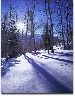
There are no rules for good photographs, there are only good photographs. -Ansel Adams Over the ages there have been many attempts to find a common denominator for aesthetics. From the Golden Ratio to Feng Shui; from prime numbers to Fibonacci sequences, there are no hard and fast rules to achieving a successful image. There are, however, guidelines and techniques that may improve your odds – principles to assist in deciding a good composition based on a wide array of samples and the experience of image makers over many years. One of the most widely used guidelines is the Rule of Thirds. According to the Rule of Thirds, elements placed at (or very close to) the intersection points of an imaginary 3x3 grid dividing the frame, will be more powerful and work better as gravity points. Another oft-used technique is the use of Leading Lines – identify lines in the scene pointing towards an interesting subject. These lines are often more powerful when they are diagonal – adding depth to the image. A common practice is to have these lines intersect with the image's edge, preferably a corner, making them immediately noticeable. The image above has proven very successful for me. Note how the placement of the sunburst coincides with the Rule of Thirds, and the diagonal lines strongly leading towards it. Without these lines, the many trees at the top could easily clutter the composition and distract the viewer. Separating the composition from its context is perhaps the most difficult skill to master. Our eyes see the world at a fixed angle, and what initially draws us to a given scene is the impression conveyed through normal vision. In many cases, wider or tighter compositions may evade us simply because we are not used to visualizing them. In time, experienced photographers learn to recognize scenes as they will appear in the viewfinder or on the ground glass, but even then, some subtle compositions may be overlooked. As I mentioned in my previous article, a common aid is a template – a hollow rectangle preserving the frame ratio of your camera. For 35mm an empty slide mount will do the trick. For larger formats a simple cardboard cut-out can prove a valuable accessory. Studying a scene through this template, holding it at varying distances from your eye, rotating it, etc. can be extremely helpful in determining the most powerful elements and how they co-exist in a composition, independent of their surrounding. This is especially useful when unpacking and setting a camera is a lengthy process.
Equipment Notes Concentrate on equipment and you'll take technically good photographs. Concentrate on seeing the light's magic colors and your images will stir the soul. – Jack Dykinga Like most photographers, I have my own preference when it comes to equipment. Through the years, I experimented with many different types of cameras, lenses, film, and virtually every piece of photographic equipment before settling on my current system. I now create better images than I ever did and I owe much of it to my equipment. I have also learned that there is no such thing as a universally perfect setup. The process of finding my perfect gear was a long and educational journey; expensive at some points, disappointing at other, frustrating at many, and rewarding at most. Far be it for me to sing the praise of a certain type of camera, hype a certain brand, or specify the ideal lens selection. These are all individual choices and while I may point out things I find advantageous in my gear or lacking in other – your own interpretation may be completely different, and every bit as valid. The one thing I can say with authority about photographic gear for the creation of artistic images is that it needs to comply with the artist's mode of work. Ergonomic controls, and work processes should take precedence over any given feature or brand. Your gear should be an extension of you – the controls should readily avail themselves to you where you expect them to be and the image making process should make logical sense to you. Do not feel compelled to opt for the longest list of features, highest numbers, or most popular brand. Before considering the minute details, first judge equipment by how it feels – from the placement and feel of controls to the effect its texture, weight, and size have on your fingertips. Some will tell you to get a better lens rather than a more expensive camera. This is a good rule of thumb, but one with many exceptions. If a camera doesn't feel right in your hands, if its user interface is awkward, if in any way it does not work for you – it will become a source of frustration, a distraction. It will prevent you from applying your full attention to the image you are attempting to create. Experiment, experiment, then experiment some more. Efficient use of some types of equipment requires some learning and practice. Allow yourself the time to be familiar with different types of gear before settling on the one to own. The Artist To convey in the print the feeling you experienced when you exposed your film - to walk out of the darkroom and say: "This is it, the equivalent of what I saw and felt! That's what it's all about. -John Sexton
Understanding your subject matter – the scene, your raw materials – elements and attributes, your tools – the camera, lenses, filters, film, basic rules of optics and exposure, etc. is only a first step. Do not allow yourself be consumed by these - they are merely means, not the goal. The goal is to leverage your skill, knowledge, and inspiration to create a harmonious, synergetic, emotional image. You may now be asking yourself how best to introduce your own vision into a natural scene, to interject your own interpretation, to develop your own style, to produce new concepts and interpretations given all the guidelines and rules and constraints. Herein lies the black magic of art – this is the one thing that cannot be learned or taught other than by yourself, to yourself. Inspiration comes from a heightened state of emotion. Help yourself find your inspiration, be it through music or silence, through poetry or images, through interaction or solitude, and once you find it - learn to avoid cynicism without resorting to cliché, to apply guidelines and rules without becoming an automaton. From here on – you are on your own. Go out, seek beauty, create art. Editor's Note - Guy Tal resides in Salt Lake City, Utah with his wife Sarah. They produce and sell fine art photographic images of nature. Visit their web site at www.spyra.com. Guy Tal - NPN 440 Comments on NPN landscape photography articles? Send them to the editor. |
|
|
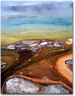 Let us begin by studying the concept of a composition. A composition is the artist's interpretation of a scene – the things he/she finds interesting and inspiring and wishes to convey to the viewer. A composition is a whole – it is the coming together of elements carefully arranged to elicit a response in the viewer. Therefore, the first criterion for judging a successful composition is whether or not the artist's message was indeed conveyed and resulted in an emotional reaction. Further success will be determined by whether that reaction was indeed the intended one.
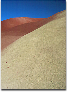 Examine the image on the left. This image was taken at the Painted Hills area of the John Day Fossil Beds National Monument in Oregon. The area consists of several hills of very vivid color and interesting texture. The surrounding area is mostly filled with trails, high-desert vegetation and some farmland. Obviously what attracted my eye were the unique color, texture and lines in the hills. I scouted around for a composition that would isolate these qualities and be interesting in and of itself. The resulting image was taken with a short telephoto lens at close range to properly capture the texture as well as isolate the interesting elements from their larger context, plagued with a variety of distractions.
 By now you may be asking yourself if all there is to an artistic image is following rules and being proficient with your photographic gear. The answer is a resounding "NO." Beyond any guideline or rule, beyond any subject or equipment or light or technique, by far the most important role in the making of a successful image is that of the artist – the photographer.