My Top Eleven Nature Photography Peeves |
Six years and nearly 20,000 image critiques have revealed to me a number of common photographic themes that never fail to annoy me. In my admittedly heavily biased and somewhat deranged opinion, these are the compositional ploys most likely to ruin your reputation as a fine art photographer. In compiling this list, I was both surprised and dismayed that I was able to grab examples of nearly all the subjects that annoy me the most from my very own portfolio, soundly proving that one should always do as I say, and not as I do! So, without further ado and in the spirit of the Late Show, I now humbly present my Top Eleven list of the most annoying things in nature photography ( My list goes to ELEVEN).
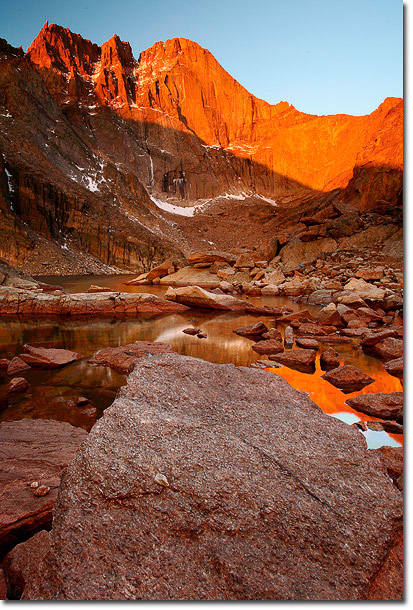
11. The Big Foreground Rock
What's that big ugly bare rock doing up in front, blocking my view of the lovely sunrise? Let that lake be; big foreground rocks are almost never welcome or needed. I used Photoshop to expand the big rock in this example, because I've just never felt the urge to photograph gratuitous rocks.
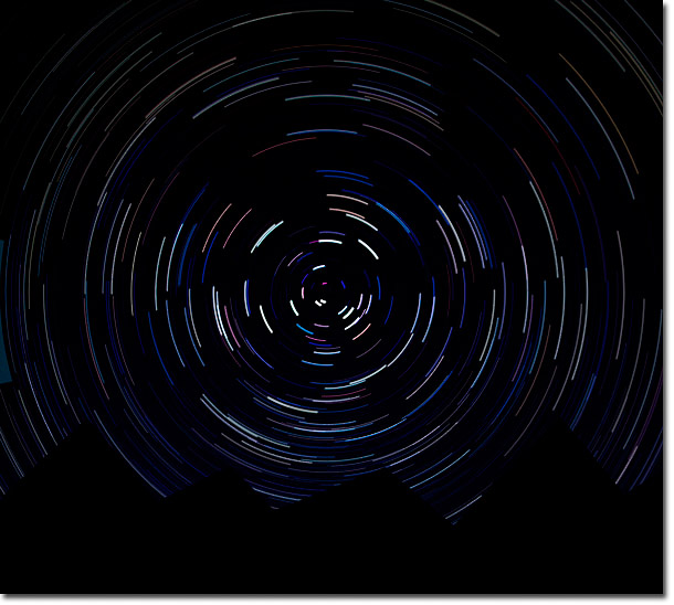
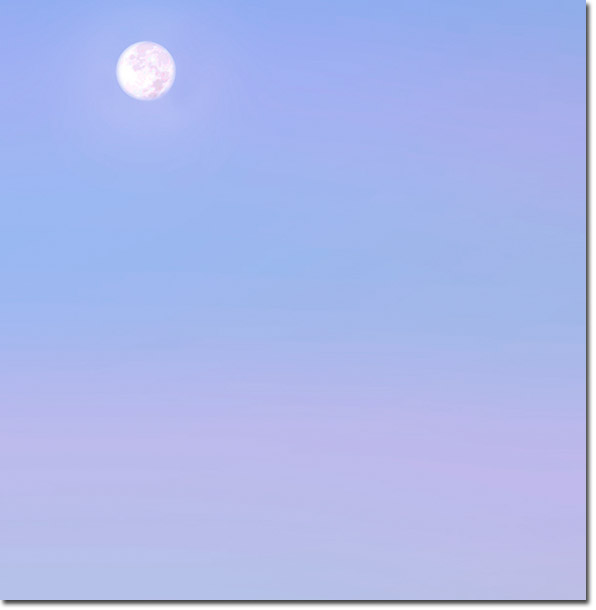
10. Star Trails
Why do photographers want to make stars look like vinyl records, anyways? Even compact discs are going out of style... Well, OK, some trail shots are kind of intriguing--if paired with interesting foreground material--but most star trail shots I've seen just remind me of how cold and boring it must have been sitting out all night with your camera turned on. This is one of only a couple peeves that I couldn't find an example of in my portfolio, since I simply do not have the patience to stay awake all night, so I created this typical example using a little radial blur in Photoshop. I think I like it...
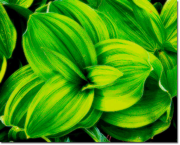
9. Corn Lilies
Enough already! If I see one more corn lily composition, I'm going to take a pair of heavy duty shears to the whole lot of them, make a tossed salad out of it and feed it to the elks in Rocky Mountain National Park! This peeve is sort of a corollary to the copycat icon peeve, (#5 below) but deserves special mention. "But they look so pretty with the dew drops and all..." Phhhttt!, hand me the shears! I used a ghastly Orton Effect on this example to make it doubly nauseating.
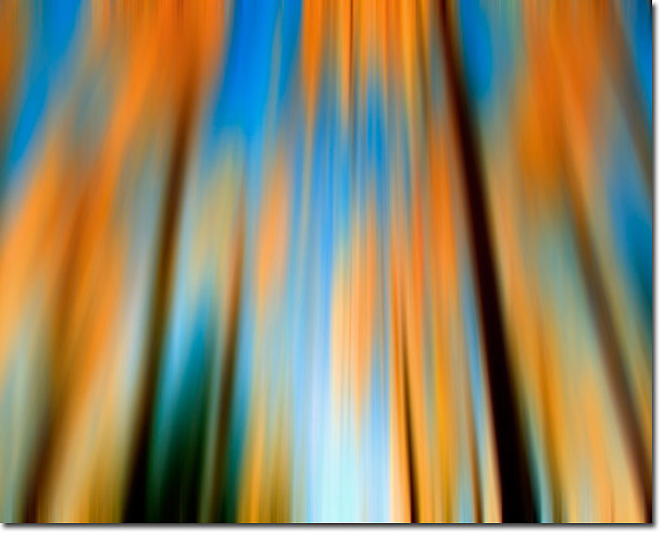
8. Faux Impressionism.
I knew Degas, Degas was a friend of mine... Folks, panning your DSLR across a stand of aspen trees does not make you a Monet or Manet. Besides, It's a lot easier to add blur in Photoshop, as I did in this example. I really wanted to include the Orton Effect in this list, but that would have made an even 12 peeves--too aesthetically pleasing, so I'll just tack Orton on to the general theme of pseudo-impressionist artistry.
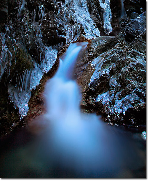
7. Super Long Water Exposures
Turning poor defenseless water into milk or smoke...oh the humanity! Somewhere down the line, photographers everywhere heard that using an uber-long exposure would make their images look moody and atmospheric. Well, they don't; they just make milk and smoke. I don't drink milk, and I don't smoke. Gimme a hard & fast exposure, so that I can enjoy my water naturally pure and clean!
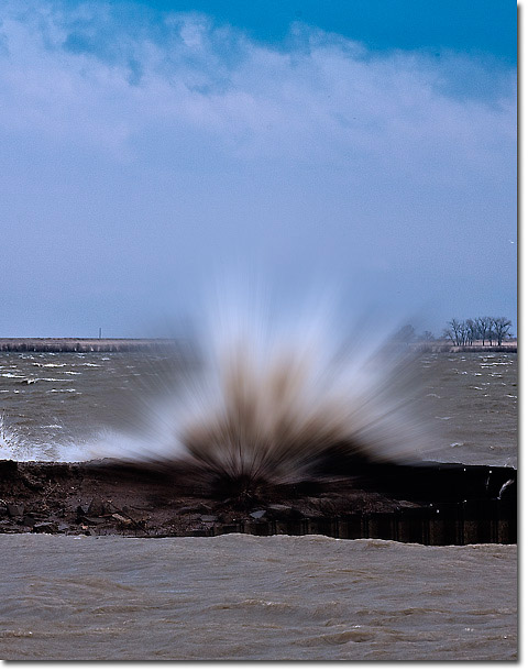
6. Dandelion Waves
I coined the phrase 'dandelion waves' a few years ago in an attempt to describe the effect a certain DSLR exposure gives to crashing waves. They don't look like waves, they look like mutant white dandelions that are ready to drift in the wind; soft and fuzzy. I don't think I've ever seen a dandelion wave in film, so it must be a uniquely digital annoyance. Dandelions are weeds, folks--don't allow them to pollute our beloved oceans! I've never photographed a true dandelion wave, so I 'enhanced' this wave a bit in Photoshop to give you the full floral experience.
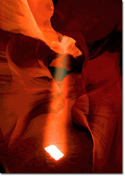
5. The Copycat Icon
I like icons. Show me an icon from a unique perspective, or in unique conditions. However, show me yet another look at Maroon Bells, Delicate Arch, Bandon Beach, Antelope Canyon, Horseshoe Bend, the Matterhorn, Namibia Trees...(I sense a new list forming), and I will PUKE! OK, I won't puke, but I will insist that you contribute $20 to the Stan Rose Stop The Iconic Madness Fund (SRSTIMF). Or, endure my merciless mud-slinging critique. Has anyone NOT seen this composition??
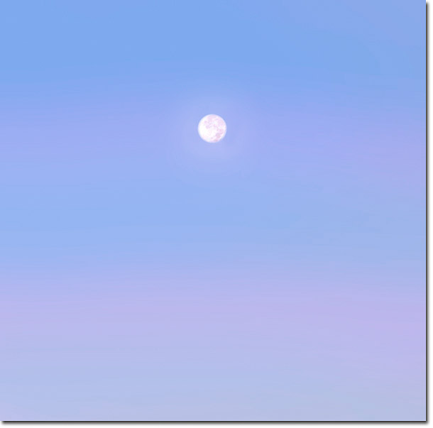
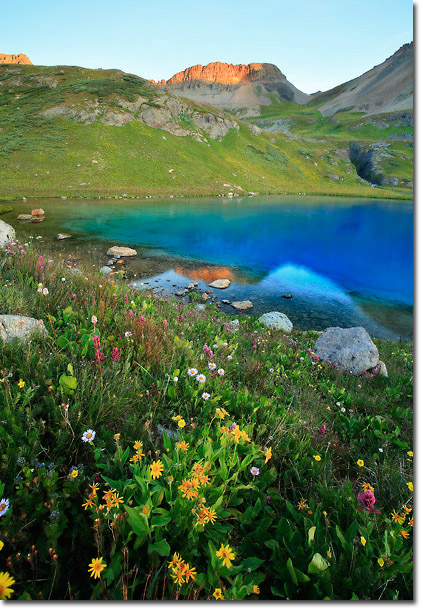
4. Negative Space
I first learned to love to loathe negative space when I viewed a blank blue canvas at the Metropolitan Museum of Modern Art a couple decades ago. It was entitled "blue." OK. Folks, blank things are not good. We go out of our way to cover our blank walls with pretty pictures, so why take photos that look like blank walls?? If I want negative space, I'll close my eyes.
3. Ignoring the Rule of Thirds
If anyone tells you it's cool to break the rules and go with 5/8th or 6/7th rather than thirds, they're likely trying to sabotage your career in photography--it's a conspiracy, I tell you! Rules arose from way more experience and expertise than any one of us will ever amass in our lifetimes. Ignore them at your own peril. Since the two sins are commonly committed together, I used the same example as my 4th peeve to illustrate Numero Tres.
2. The FALES Shot
Flowers-Alpine Lake-Exceptional Sunrise. Whoever came up with this often abused compositional tactic should be tarred and feathered, or at least thrown into an alpine lake at sunrise... Flowers are pretty. Alpine lakes are pretty. Sunrises are pretty. So, put all three together and the result should be Spectacular Fine Art, no?
No! It FALES, miserably! The result deserves to be hung on the wall of a Motel 5. Shown here is a nearly classic example (Ok, I shot a FALES shot once--but I didn't inhale!) but one that probably falls (or FALES) a bit short since it isn't really an exceptional sunrise and even the usual vertical format here wasn't enough to earn it a cheesy magazine cover appearance.
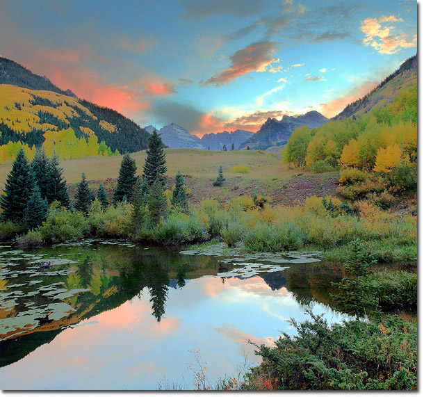
1. Bad HDR
My Number One most annoying thing in nature photography. Everest was climbed because it was there. High Dynamic Range was removed because it can be removed. HDR can be a great tool if used tastefully, but it so seldom is. Instead, It's routinely employed to create the photographic equivalent of Frankenstein's Monster. Contrast is sucked lifeless by this beastly tool. Here is an exaggerated example, for your viewing disgust. Shot at Maroon Bells, of course!
Please spell-check and proof-read all of your hate mail at least twice before sending it to me!
Comments on NPN nature photography articles? Send them to the editor. NPN members may also log in and leave their comments below.
 Stan Rose,is a long time NPN contributor and Colorado based landscape photographer whose work has appeared in venues around the globe. When not working his job as weather forecaster, he is busy taking photos in bad weather, chasing tornadoes, and writing weird songs on the guitar. He insists that no animals were harmed in the writing of this article.