Color Spaces: Beyond Adobe RGB
Text and photography copyright Matt Hagadorn
Choosing a color space for your images can be confusing when youÆre new to digital imaging. YouÆve probably been told that you should use Adobe RGB as your standard color space because itÆs better than sRGB or it matches inkjet prints better. While Adobe RGB is probably the best choice as a general purpose working space, you will capture plenty of imagesŚboth on film and from digital camerasŚthat exceed the color gamut of Adobe RGB. Fortunately, Photoshop allows you to use different color spaces as you see fit.
Large Gamut Color Spaces
Gamut is the universe of colors that a color space can represent. For example, a color spaceÆs gamut determines whether the most saturated red it can produce (255,0,0) looks like Coca-Cola Red or more like a Salvation Army Santa Clause after a long Christmas season standing on the streets of New York City. Adobe RGBÆs gamut is reasonably large; it encompasses most of the colors that can be reproduced by common output devices today. However, it isnÆt large enough to encompass some of the more saturated colors that can be recorded on E6 film or by professional digital cameras. Converting images that contain these colors to Adobe RGB will clip detail in the image, never to be recovered.
Two large-gamut alternatives to Adobe RGB are Ekta Space PS5 and ProPhoto RGB. Ekta Space was designed by landscape photographer Joseph Holmes to encompass the entire gamut of Ektachrome films (however, itÆs suitable for any E6 film because the dyes used in all E6 films are similar). ProPhoto RGB was developed by Kodak and is of interest to digital photographers because itÆs the only large-gamut alternative available in Adobe Camera Raw (ACR). For this article, IÆm going to focus on ProPhoto RGB as itÆs used in an ACR workflow. In a future article, IÆll look more closely at Ekta Space and how to use it in common scanner workflows.
ProPhoto RGB in Theory
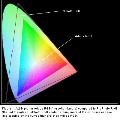
ProPhoto RGB has been referred to in certain circles as a ōhonking bigö color space (on occasion, even color geeks have to resort to colorful metaphors to get their meaning across). It has a very large gamut compared to Adobe RGB (see Figure 1). It contains more saturated reds, greens and blues, but this size comes at a cost. Its green and blue primaries are imaginary, meaning ProPhoto wastes a small percentage of its space on colors we canÆt see, much less print. The result is that you have fewer real image levels with which to work. In practice, this is a small price to pay when you need to preserve certain saturated colors.
Because ProPhoto RGB has such a large gamut, you should be careful about performing major edits (such as large moves in Levels or Curves) if youÆre working with 24-bit images. Because 24-bit images are limited to 256 levels per channel, large color spaces have larger gaps between each level than a relatively small color space. You risk introducing bandingŚnoticeable transitions in areas of smooth color gradationsŚif you make large edits on a 24-bit image. This problem goes away with high-bit images because they contain far more levels, resulting in much smaller steps between each level.
ProPhoto RGB in Practice
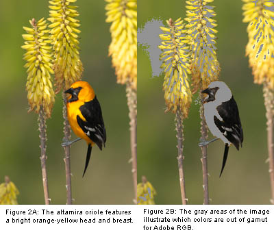
To demonstrate a real-world difference between Adobe RGB and ProPhoto RGB, IÆll use an image of an altamira oriole photographed using a Canon EOS-1D (see Figure 2A). The oriole features a bright yellow-orange head and breast, which is completely out of gamut for Adobe RGB. In addition, much of the yellow aloe plant is out of gamut, as well as some of the green background (Figure 2B). All of these highly saturated colors would be clipped if converted to Adobe RGB, sacrificing image detail.
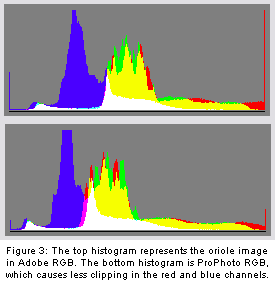
Photoshop allows you to use the View > Proof Setup and Gamut Warning commands to visually check which colors in a source color space would be out of gamut for a target space, as I did for the example above. However, ACR doesnÆt have any gamut warning feature. Instead, I can make an informed decision whether to use Adobe RGB or ProPhoto RGB while converting raw images in ACR simply by looking at the histogram display.
ACR will update the histogram when you select different target color spaces in the Space drop-down box (if youÆre using ACR 1.0 with Photoshop 7, be sure to enable the Histogram check-box). With Adobe RGB selected as the target color space, the histogram for my oriole image shows that the red and blue channels are being severely clipped (tall spikes at either end of the histogram). If I change the target space to ProPhoto RGB there is still a small amount of clipping, but itÆs much better than before (see Figure 3). I canÆt see the difference in the image on screen, but the histogram tells me that ProPhoto is preserving more of the image detail in saturated colors. Now that IÆve decided on the target color space, IÆll make any necessary adjustments to exposure and white balance and click OK to load the image into Photoshop.
ProPhoto RGB and Printing
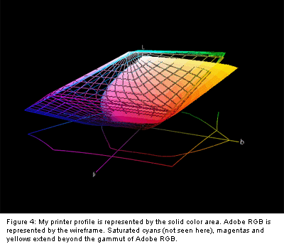
You may have heard that Adobe RGB matches the gamut of most inkjets. You might ask, ōWhy bother converting the image to a larger color space if my printer canÆt print those colors anyway?ö The fact is, photographic inkjets are capable of producing saturated cyans, magentas and yellows that simply donÆt exist in Adobe RGB. To demonstrate this, I compared a plot of Adobe RGB to a custom profile for my Epson 2200 and Hahnemuhle Photo Rag using Chromix ColorThink. (ColorThink is an application that can plot color spaces in three dimensions, allowing you to visually compare different working spaces and output spaces.) The plot shows that the inkjetÆs primary colors extend beyond the boundaries of Adobe RGB (see Figure 4).
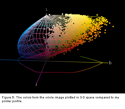
For further analysis, I loaded the oriole image in ColorThink and plotted the image colors compared to my custom printer profile (see Figure 5). The ProPhoto RGB image contains some colors that I wonÆt be able to print, but I will be able to faithfully reproduce more colors that would have been clipped had I converted the image to Adobe RGB. The result is a more vibrant, true to life print.
Choices
ProPhoto RGB isnÆt appropriate for every image. As mentioned earlier, its large size can be problematic for 24-bit images, though in practice I donÆt see this too often. Since I prefer to convert most of my images to 8 bits per channel after doing color corrections to conserve disk space, I use Adobe RGB most of the time. However, when working with images like the one in this article, I use ProPhoto RGB. To be safe, you can leave the image in high-bit mode to avoid banding problems.
Chromix ColorThink is a valuable educational tool and useful utility for anyone working with digital images. If youÆre interested in learning more about color, see www.chromix.com. Note: I have no affiliation with Chromix.
MH-NPN 0112
Comments on NPN digital photography articles? Send them to the editor.


|