Preamble
In its simplest definition, a composition is a combination, or arrangement, of elements. A photographic composition is the arrangement of visual elements (which will be discussed below) and as such is the product of a photographer's vision and their skill in seeing, identifying, arranging, and framing the finished image. This is a clearly distinct skill from those necessary to successfully operate a camera or calculate exposure – these are topics for other discussions. This tutorial is entirely about learning to see.
|
The First Rule: There are No Rules
Though much of this tutorial will discuss a number of "rules of composition", it is important to keep in mind that these so-called rules are not recipes and they are not laws. They are not even recommendations. In any given situation they may or may not work and following them to the letter is no guarantee of a successful image. They do, however, play an important role in learning to see, in understanding what has been known to work in general. They are guiding principles. Perhaps the best explanation for the use of these rules was provided by the late Edward Weston: "to consult the rules of composition before making a picture is a little like consulting the law of gravitation before going for a walk."
In the learning process it is important to be aware of these rules and their effect as they may help yield more dynamic or visually appealing images, but treat them as you would the controls on your vehicle – as you gain experience, the view through the windshield is all that really matters. The decisions on how far to turn the wheel, how hard to push the accelerator or when to tap the brakes are just part of the process of driving and rarely require conscious or deliberate decision making. It's not about operating the car, it's about reaching a destination.
Applied to photography – the rules may help you arrive at a satisfactory composition but, when a decisive moment arrives, the only thing that matters is what you see through the finder – it either works or it doesn't, and little else matters. Following the rules too literally will likely result in images looking artificial and contrived. Know the rules, use them when it makes sense, but do not be afraid to break them.
Primary Consideration: Scale
When considering nature images, one finds that most differ by the scale of scene captured. Three loosely defined categories to keep in mind are:
- Grand Scenic – covering large expanses of the landscape
- Intimate – perhaps the most elusive of all – isolating the "scene within a scene" – keeping only what's important and giving the viewer a sense of being there.
- Close-up and/or macro – enlarging and drawing attention to elements often too small for most casual viewers to notice otherwise
Each of these requires a different way of examining and interpreting a scene. Surprisingly a given scene may yield successful images in any or even all these scales – standing in front of a grand mountain scene, you may discover interesting patterns that can be isolated, or a small flower at your feet.
Do not "lock" your vision to a given scale. At any opportunity, try to think about all possibilities. You may find interesting new and original compositions even in the most familiar places.
Raw Materials
A photographic composition is a collection of visual elements arranged within a frame. These elements are your raw materials to be combined into an image. Let's start by understanding what some of these visual elements are:
- Light – its direction (or lack thereof), angle, and color
- Shapes – the outlines and surface of objects in the scene
- Lines – these can be straight or curved, pointing in or out of the frame, to or from a given object etc.
- Textures and patterns
- Colors and tones
- Frame boundaries
Note that I deliberately listed the elements in this order. While most of them are fairly straightforward, the first element – light, and the last element – frame boundaries should be considered in this order. They are also the ones most frequently missed by inexperienced photographers. The next two sections will elaborate on these two important elements.
Light
The quality of light can make or break even the most carefully composed image. Light is the life blood of your image. It can be the difference between a dull, lifeless, ho-hum scene, and a dynamic, awe-inspiring image.
As nature photographers, our primary (usually only) source of light is the sun. Remember that light changes not only throughout the day, but also through the seasons. On any given day, the sun will rise and set at a different angle and a different time. Being aware of where the sun will be is an important consideration for timing a visit to a known location.
Some rules of thumb with regards to light:
Light can change very quickly, especially around sunrise and sunset. Being able to anticipate these changes will greatly improve your success rate.
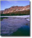
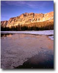
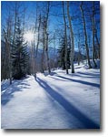
See Photos 1a and 1bAs important as it is to decide when to make your exposure, it is equally important to recognize when not to make an exposure. If light is not ideal for what you have in mind – make a note to return when conditions are more favorable. It's ok to go home empty handed. Even if you don't capture anything, but come back with the knowledge of when to return – the trip has been a productive one.
Frame Boundaries
The edges around your frame are of utmost importance to your composition. They define what is and is not in the frame and how the elements in the frame relate to each other within the confines of your image.
The frame boundaries represent your decision of what to include in, and what to exclude from your final image. I strongly recommend a careful inspection of the frame boundaries as the last step before capturing an image. When concentrating on a given subject, it's often easy to miss unwanted elements protruding into the frame, or important elements (e.g. background) that are not properly represented. It is also useful to allow your main subject(s) some "breathing room" within the frame so that they are not flush against the edges.
The frame boundaries are your primary tool in selecting the scale and effect of your composition, as mentioned above. While close-up images don't often mix with grand scenics, the distinction between a grand scenic and an intimate composition can yield dramatically different effects.
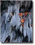
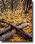
The lines, patterns and color that make up the intimate scene completely lose their effect when the frame boundaries are extended to include the sky. The bright sky dominates the frame and draws the viewer's attention away from the colorful trees. By merely excluding the sky, I was able to turn an "ok" image into a fascinating intimate study in color and texture.
This is where I would recommend an important compositional aid – the empty frame. This can be a cardboard cutout or an empty slide frame. The most important consideration is that the height/width ratio matches that of your film or digital sensor. By holding the frame up to your eye at varying distances you can immediately identify the effect of different placements of the frame boundaries, as well as the effect of various focal length (the farther the frame is from your eye, the longer a lens you will need to duplicate the effect in your camera.
Rule of Thirds vs. Front and Center
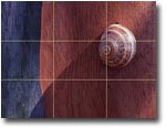
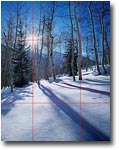
Perhaps best known of the rules of composition is the Rule of Thirds. The concept is simple – divide your frame into a 3x3 grid, and place elements of interest at, or close to, the intersections (often referred to as power points).
The theory behind the Rule of Thirds relates back to the concepts of the Golden Mean or Golden Ratio which, vastly simplified for the purpose of this article, describe a mathematical relationship that is widely prevalent in the natural world and is believed to closely reflect human perception of aesthetics. These theories were widely used in art and architecture dating back to Ancient Egypt and Greece.
One valuable benefit to consider the Rule of Thirds is getting away from the natural tendency to place the most noteworthy element in the center of your composition. By placing your subject off-center you will often find that it is enhanced as portrayed in relation to its surroundings and given a broader context. Such placement also allows the viewer to consider other elements in the frame that may enhance your subject. Though this is an important consideration in the process of arriving at your final composition, it is also one that often doesn't hold true. Some compositions actually do work better when centered. These include subjects that are symmetrical, or where other elements are evenly arranged around the composition's focal point.
A technique I commonly use in determining whether or not to compose off-center is to assume the viewer will always start at the most powerful, attention-grabbing point (what I call the composition's focal point), and expand from there in concentric circles, their attention diminishing with each consecutive circle. This determines how the image unveils itself to a viewer and as such their experience.
Leading Lines
Strong lines in your composition can greatly enhance its effect on the viewer, literally leading their way into the scene. Lines can be the visual way of saying "look here!", or "X marks the spot". They can keep a viewer's eye from wandering or from being distracted. By leading into the frame, lines can create depth and add a 3-dimensional feel to your composition, emphasizing distances and relationships between foreground and background objects.
Some common techniques for using lines are:
- Diagonal lines often work better than horizontal or perpendicular ones
- Intersections of lines form immediate power points. These can be lines intersecting inside the composition or the intersection of a line with a frame boundary or corner
- A common mistake is for lines to point out of the frame, leading the viewer away from your subject and making them wonder what else is out there. Be aware of the directions of strong lines in your composition.
- Combine leading lines with Rule of Thirds to further enhance your composition's focal point
In the Field
At this point you may be asking yourself how these rules translate into practice. The secret to a successful composition is not to find images that comply with the rules, but rather to be aware of the rules as you set out to compose a scene that grabs your attention.
Above I mentioned treating the rules as guiding principles – things to keep in mind. In the learning process, I would suggest you make a short list of useful rules and glance through it while working a scene. You will soon find that these principles become part of the way you see the world and assess the photographic potential for a given situation. This is the true value of these rules – they expand your vision, giving you options to consider and allowing you to examine in your mind the different ways to interpret the information in front of you. Think in terms of visual elements, how they relate to each other, and how they can be best arranged within a frame. Examine compositions at different scales; visualize "what if" scenarios as you consider the best perspective and light. Such is the process of learning to see.
Knowledge is but part of the equation. Understanding what might work will provide you with the tools to analyze a scene. The other part is experience and practice. To quote Eliot Porter: "You learn to see by practice. It's just like playing tennis, you get better the more you play. The more you look around at things, the more you see. The more you photograph, the more you realize what can be photographed and what can't be photographed. You just have to keep doing it."
Know the Rules / Break the Rules
At the end of the day your image is either successful or not. Other than in photography forums, you will never hear viewers comment on how well you applied the Rule of Thirds, or how carefully you placed your Leading Lines. The composition must work as a whole, not as a breakdown of its parts. The rules may give you a starting point, but they do not determine the ultimate effect of your image. Do not be afraid to break or ignore them.
Just before you click the shutter, close your eyes for a second, try to clear your mind and forget about rules and technique, then look at the finder image again. If it doesn't move you – continue exploring, or pack up and move on. A good composition does not always mean a good photograph. Creating a good composition is a skill. Creating a good photograph is an art.
I will leave you with the following truism from Ansel Adams: "There are no rules for good photographs, there are only good photographs."
Comments on NPN nature photography instructional articles? Send them to the editor.
About the author...
Guy Tal is a landscape photographer based in Salt Lake City, Utah. Guy creates fine art prints for gallery exhibits and private collections. He also conducts photography field workshops in partnership with fellow photographer Michael Gordon. For information and to see more of his award-winning images, visit his web site at www.ScenicWild.com.
