Nature Photographers Network
This is the preserved archive of the original Nature Photographers Network. The community continues at naturephotographers.network.
Minimalism
‹ PreviousWildlife GalleryNext ›

Minimalism

by Vincent Grafhorst

Gallery: WildlifePosted January 30, 2009781 views21 comments
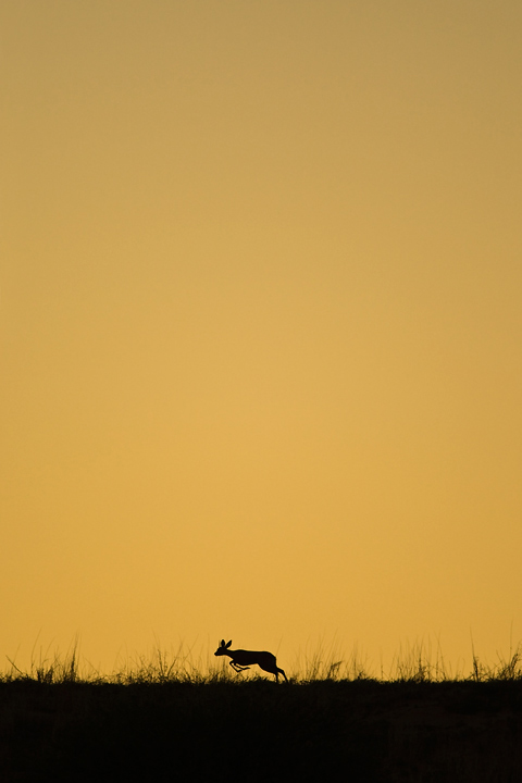
Okay, I know some of you won't like this at all and the main comments will be that the steenbok is too small in the frame and that it would be better positioned to the right. Yet the lack of those attributes is exactly what I like about this, although I cannot explain why. Maybe just because it is breaking the 'rules' :biggrin:

By the way, this image was made just after the lion silhouette image I posted last. This steenbok was walking on this dune when all of a sudden it froze as it saw the lions. It then decided to run for its life.

Kgalagadi Transfrontier Park, Nossob River Valley, South Africa.

Camera Model Canon EOS-1D Mark III
Tv( Shutter Speed ) 1/1250
Av( Aperture Value ) 5.6
Metering Mode Evaluative Metering
Exposure Compensation +1.33
ISO Speed 800
Lens EF500mm f/4L IS USM + 1.4x
Focal Length 700.0 mm
Full frame

Vincent Grafhorst
http://www.khwaiphotography.com

Comments

21 comments
Comment posted by Brad Hill on January 30, 2009 at 11:23 AM
Hey Vincent.

Interesting. Made me look twice. You know that means to me. Works very well for me.

Thanks for being brave enough to break the rules (and post the results here).

Cheers...

Brad
Registered on May 29, 2007, 431 Posts, 6061 Comments
Comment posted by Pramod Viswanath on January 30, 2009 at 11:29 AM
Fantastic image Vincent. These kind of images suits well for my taste buds. Love the action and composition a lot. If I were you, I would have cropped 10-15 pixels from the top just to make the composition slightly tighter, but that's just me :smile:

Great experimentation :toast:
Registered on December 4, 2008, 60 Posts, 697 Comments
Comment posted by Balan Vinod on January 30, 2009 at 12:05 PM
Vincent..I love this one ...my type of image. I would have liked it better if the deer were to be a tad bit to the right. Well Done !!

Balan Vinod :toast:
Registered on March 20, 2006, 889 Posts, 2312 Comments
Comment posted by scott lanz on January 30, 2009 at 12:54 PM
I like this a lot. I also like it in a panorama format with the sky comprising 50% of the frame. Both make for artistic presentations.
Registered on November 14, 2003, 840 Posts, 12902 Comments
Comment posted by James Campbell on January 30, 2009 at 3:56 PM
I really like this image, Vincent. I suppose most of the "rules" that we tend to consider stem from what is naturally appealing on the eye - but that's what I love about photography, the only thing that really counts is what an image says to the viewer, irrespective of technical aspects. The sense of massive space in this shot is great and really sums up the Kgalagadi environment beautifully..

Well done :toast:
Registered on January 12, 2009, 48 Posts, 377 Comments
Comment posted by Pete Bengeyfield on January 30, 2009 at 4:07 PM
Good idea and execution.
Registered on December 2, 2003, 1247 Posts, 3439 Comments
Comment posted by Lon Sharp on January 30, 2009 at 4:58 PM
Works for me! I suppose there is extra blank sky, but in the real world of photo marketing, this leaves room for a magazine cover title!
Registered on December 9, 2007, 258 Posts, 9892 Comments
Comment posted by Ajit Huilgol on January 31, 2009 at 12:37 AM
I love these kinds of images that show more of the environment and less of the main subject, and you have done this really well, Vincent! I, too, would have preferred the steinbok a little to the right, though! :toast:
Registered on December 19, 2008, 302 Posts, 2055 Comments
Comment posted by Cay-Uwe Kulzer on January 31, 2009 at 5:03 AM
Vincent,

this is very nice. I just wished the steenbock a bit more to the right, just a bit...
Registered on January 27, 2004, 494 Posts, 4021 Comments
Comment posted by Marsel van Oosten on January 31, 2009 at 8:58 AM
I don't feel you're breaking any rules here Vincent. Especially with good silhouettes against a clean background, you get very strong shapes that don't need to be big in the frame at all to work - preferable not I dare say. Regarding the placement of the subject, I'd be tempted to move the steenbok all the way to the left, about to jump out of the frame. For me that would have communicated the story (fleeing) better and have resulted in a more unusual composition. That said, I'm a big fan of graphic, minimalistic shots like this - so I like it!
Registered on March 9, 2004, 285 Posts, 2277 Comments
Comment posted by Sally King on January 31, 2009 at 2:00 PM
I like it very much. A perfect sillhouette. The sky has such a nice color too. I don't like rules so I don't mind that you broke them.
Registered on December 2, 2008, 416 Posts, 4450 Comments
Comment posted by Gary Gulash on January 31, 2009 at 6:52 PM
Just excellent. Well seen and photographed!!! Definitely works for me. (Just realized that the color scheme would really work for a Nikon ad, but alas you shoot Canon) :frown:
Registered on January 28, 2005, 879 Posts, 12098 Comments
Comment posted by Julia Flanagan on January 31, 2009 at 9:02 PM
Vincent I like the compostion. Rather than using a horizontal pano to express vastness you have used vertical. The silhouetted form adds to the drama well. I do however think having the springbok more to the right would emphasize all this even more. But I'm learning from posting here that there are just some things that strike my fancy in ways that many others may not prefer. As long as you like the photo as is - keep it that way :smile:
Registered on November 13, 2003, 59 Posts, 986 Comments
Comment posted by Dan Walters on February 1, 2009 at 12:51 PM
Beautiful image! Very powerful yet simple.
Registered on October 30, 2005, 405 Posts, 3693 Comments
Comment posted by Shane McDermott on February 1, 2009 at 7:13 PM
Really cool composition! I find I am going back and forth between feeling like there is too much sky then thinking it's fine. The color is really important in the issue for me though. I know if it were blue sky it wouldn't work at all for me. The golden hue allows it to hold a certain softness and warmth that is particularly appealing, tough to articulate though.

Bottom line is, I like it. Way outside the box, well done!

Shane :toast: :toast:
Registered on November 12, 2007, 49 Posts, 1074 Comments
Comment posted by Richard Olsen on February 3, 2009 at 10:58 AM
Vincent,

Congrats on EP!
Well deserved on a beautiful photograph!
:toast:
Registered on October 19, 2006, 306 Posts, 1571 Comments
Comment posted by Pedro Bento on February 3, 2009 at 1:01 PM
This is just great...love it!
Registered on September 2, 2007, 45 Posts, 761 Comments
Comment posted by Doug Benner on February 4, 2009 at 6:23 AM
Great comp - very creative.
Registered on December 8, 2003, 482 Posts, 1868 Comments
Comment posted by Stuart Williams on February 10, 2009 at 3:27 AM
works well for me, although i'd chop off some of the top, probably to make a square!
Registered on December 7, 2007, 247 Posts, 4792 Comments
Comment posted by Ingrid Vekemans on August 23, 2010 at 2:46 PM
Very creative and original. I love this image a lot! :toast:
Registered on August 2, 2010, 138 Posts, 780 Comments
Comment posted by Roger Kirchen on March 20, 2011 at 9:20 PM
I like this image: the enormous golden sky and the greenish grass with the silhouette steenbok. At least, the grass twigs poking into the sky look a bit green to me, so not entirely silhouette, unless I imagine things. I do not find the steenbok too small. Its size and its front legs off the gound convey an idea of the massive size of its habitat. Its near center position reinforces this. As has already been mentioned, a position moved a tad to the right might look good too. Great image.
Registered on March 6, 2011, 95 Posts, 847 Comments