Bison
by Lon Sharp
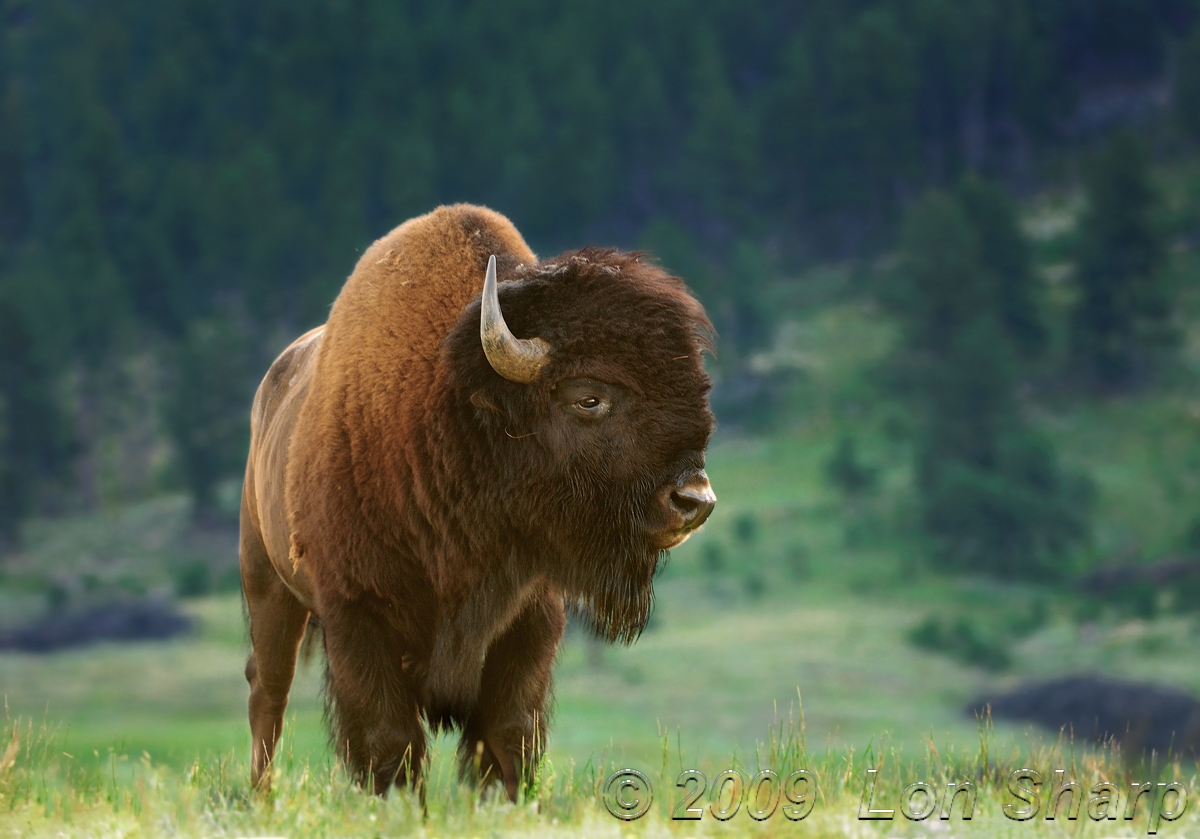
I have an upcoming event requiring additonal bison images so I have been going through my files. This is a capture from last season just now worked up. As shown here it represents many selective adjustments, mostly levels & curves & sharpening. Also the foreground was problematic for the contrasty highlights and space(close to feet) so I added a tiny bit of canvas and tried to blend it. I cropped a narrow panel from the top and the right.
This is from Wind Cave National Park in southwest South Dakota.
What I liked was the angle and lighting but I have been looking at this long enough I am losing my objectivity. Does this work, or does it look over-processed?
D200, 210mm, iso 250, f4, 1/40.
Suggestions appreciated!

Comments
17 commentsFirst off, let me say that this is a really solid image - great detail on the bison, nice composition, a background I think that works well, and more. But...I do think the processing has produced an image which leaves me scratching my head a little about the lighting - particularly the direction of the light. At first glance, I would have said "oh, sidelit from the left side with a flash-fill bringing out shadow detail on the head and neck region". But then I see the illuminated hair at the front/top of the head (more or less at the top of the "forehead") and the illuminated nose and it almost appears to me that there's also light coming from the right side of the frame. So, while I really like the image, I have to say that for my taste the image is a little over-processed (to the point where I really don't understand where the light is coming from).
I can't say this definitively without having the raw file in my hand, but because my favourite part of the image is the fantastic detail in the head region, I would likely decide to present this image as a front-lit one (to retain that great head detail). So...I would reduce the brightness of the regions that appear to be lit from the side, particularly on the hump and flank.
In terms of the B&W image: I prefer the colour one, primarily for the same reasons that Philip pointed out, i.e., pretty narrow tonal range...
Cheers...hope this helps...good luck with the event...
Brad
Brad
I suspect the unusual glow is what my mind translates into "glow" and I see it on the grass too. Nevertheless, I like the image and I can't tell where you added canvas.
pat
I appreciate any additional insights you might have...
I too find the light bit confusing, but I really like both the versions. If this was mine, I would prefer to darken the foreground grass at the bottom corner.
Jagdeep Rajput
Sorry to cause you the grief - I wondered/suspected that there might have been haze/overcast and diffuse light. An important thing to keep in mind is that a lot of viewers (here and at the event) either won't notice or care about light direction or if there appears to be multiple light sources. For me having ambiguous lighting impacts on how "real" an image appears (tho' I don't ever claim that any photo is an accurate reflection of reality - let's not go down that road here).
For me the thing that primarily contributed to the lighting issue was the brightness/saturation of the left side of the hump and side of the bison - if brightness and/or saturation were reduced slightly here I think the issue would go away for me. And this is just one person's opinion - feel free to ignore the lighting comment - if you like the image that should be good enough...
Cheers - sorry again about any grief or frustration I've caused you...
Brad
Brad, do not apologize for your comment! I value it. In my posting I expressed that I had a sense of processing being not-quite-right. I have been trying to get the red out of the flank and hump without the whole thing going flat. Kah Kit's suggestion of lacking a true black is insightful. I just tried adding a black point to the darkest corner of the nostril and it added some real drama but of course altered all the other process work as well so that means perhaps another start-over.
Again, I didn't post this in hope of accolades but rather to have the benefit of other practiced eyes. I think this image will play well with the public, but my personal standard is to make it as good as I can make it.
One thing that I think is a factor is that the background is more shaded than the bison and the foreground, therefore white/color balance differences make for an unusual effect.
Each time I look at this image I'm impressed with the captured personality of this bison. And to me that measure's the image's success. On the technical side I agree that direction of light source may be up for grabs here, although I've photographed in this type of hazy, overcast light many times in Nova Scotia. The particles in the air seem to make light bounce all over the place, and with the many contours of this animals body it shows. But....it's this kind of light that makes this shot special.
I'd like to add one more idea to the other observations in this thread- Maybe the coldness of the blue bg hues are conflicting with the subject's warmth. Just a thought. Really great image.
Love the look at F/4, nice sharp head details, great setting and placement in the frame..
Very nice