Nature Photographers Network
This is the preserved archive of the original Nature Photographers Network. The community continues at naturephotographers.network.
Beautiful Poison
‹ PreviousNAD 2009 GalleryNext ›

Beautiful Poison

by Floris van Breugel

Gallery: NAD 2009Posted October 7, 2009762 views6 comments
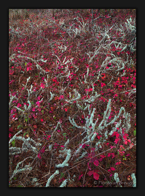
Peak color Poison Oak at Pt. Lobos Reserve from my Sunday trip with Ben Glatt. I realize this is a pile of chaotic mess, but I find the contrasts and evenly scattered mess surprisingly compelling. Or maybe it's that I don't want my hours of rolling around in the poison oak to be for naught. Fortunately I'm not allergic to Poison Oak (and yes I knew that before getting into it). Of course the compression/small size isn't helping much here (don't currently have access to the larger file).

I'd love to hear your honest thoughts, as usual.

Comments

6 comments
Comment posted by Anthony Vincent on October 7, 2009 at 8:54 PM
Very lovely Floris
The white-like vegetation contrasts nicely with the Poison Oak. Shots like these can really be appreciated in big print. Might even crop the very top, maybe. Glad you had a great day.
Registered on February 5, 2009, 199 Posts, 2775 Comments
Comment posted by Angela Classen on October 8, 2009 at 10:01 AM
Nice shot of a rather chaotic scene. The white & red contrast well with each other. I wouldn't dare to venture close to this stuff - I'm very allergic to its cousin, poison ivy.
Registered on June 13, 2007, 434 Posts, 2742 Comments
Comment posted by Wayne Simpson on October 8, 2009 at 10:25 AM
I like this a lot Floris, great eye to pick this comp up.

Wayne
Registered on December 11, 2006, 303 Posts, 924 Comments
Comment posted by Morris McClung on October 8, 2009 at 12:35 PM
Wonderful color combination. Glad you aren't allergic to the poison oak.
Registered on May 7, 2007, 670 Posts, 19650 Comments
Comment posted by Paul Breitkreuz on October 8, 2009 at 11:11 PM
Floris, I really like this. The chaotic vision as a landscape scene a little bit maybe, but seen more as an abstract it works very nicely. The only very slight change I might make is to crop the top to tighten up the ULHC. Otherwise good to go IMO.
Registered on February 25, 2006, 525 Posts, 8448 Comments
Comment posted by John Williams on October 10, 2009 at 2:49 PM
Agreed, the chaos looks good here. I love the red "popcorn."
Registered on September 6, 2007, 221 Posts, 5985 Comments