Gallery: Macro & Close-upPosted November 6, 2009146 views8 comments
Comments
8 comments
Comment posted by Genny K. on November 7, 2009 at 7:04 PM
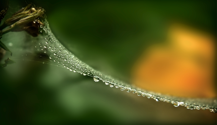
Nice. The greenery on the upper left is distracting; I wonder if it would be better cropping it would work. I really like the water drops and the yellow in the BG. The neatest part of this are those little drops on the upper part.
Registered on June 5, 2006, 132 Posts, 2001 Comments
Comment posted by Scott Fricke on November 8, 2009 at 11:19 PM
I like the different point of view take here, seeing the "side" of the web instead of the face. But with such a small portion of the image taken up by the "subject" I find my eye keeps getting pulled to the big yellow blob on the right and it gets to be too distracting.
Registered on January 19, 2007, 133 Posts, 1448 Comments
Comment posted by Varina Patel on November 10, 2009 at 7:56 AM
Although the yellow in the background is a bit distracting, I love the perspective, here. The droplets seem to be in beautiful focus, and I love the unusual spider web composition. A very unique shot. This is just gorgeous! Well done!
Registered on August 22, 2008, 45 Posts, 1578 Comments
Comment posted by Larry Fischer on November 10, 2009 at 6:06 PM
I like the line of the web? and water. I like the green background out of focus. I'm not sure about the vivid yellow-orange. I think I would reduce the saturation there or increase the saturation at the left origin of the web.
the fisch
Registered on July 28, 2008, 155 Posts, 874 Comments
Comment posted by Jay Patel on November 16, 2009 at 8:58 AM
Although the details in the water droplets seem to be well captured, I would like to see either the camera closer the water droplets or choosing a different angles so that the water droplet fill up the frame.
Registered on August 28, 2008, 87 Posts, 566 Comments
Comment posted by Lon Sharp on December 3, 2009 at 10:51 PM
I like this, but agree with Jay that it would be even nicer if the water droplets were more prominent in the frame.
Registered on December 9, 2007, 258 Posts, 9892 Comments
Comment posted by Erik Van de Water on March 9, 2010 at 1:20 AM
To Brilliant! I would suggest toning down the yellow and cropping from the bottom left to take the web out of the center.
Registered on February 27, 2010, 6 Posts, 72 Comments
Comment posted by Jay Miller on September 29, 2010 at 4:00 PM
The right-left, left-right of the spider web as leading line is okay but not leading the eye to anything. The yellow-orange flower glowing out at you is distracting. A darker background would bring out the focal-point water droplets, all the lighter greens are on the same plane as the web. Lighting, composition and clarity are a three part harmony.
Registered on September 17, 2010, 50 Posts, 66 Comments

Comments
8 commentsthe fisch