Gallery: LandscapePosted November 6, 2009262 views18 comments
Comments
18 comments
Comment posted by Bob&Charly Nelson on November 6, 2009 at 8:17 AM
I like this Dave, it's a good subject for B/W
Bob
Registered on October 27, 2005, 289 Posts, 4202 Comments
Comment posted by Andreas Resch on November 6, 2009 at 8:40 AM
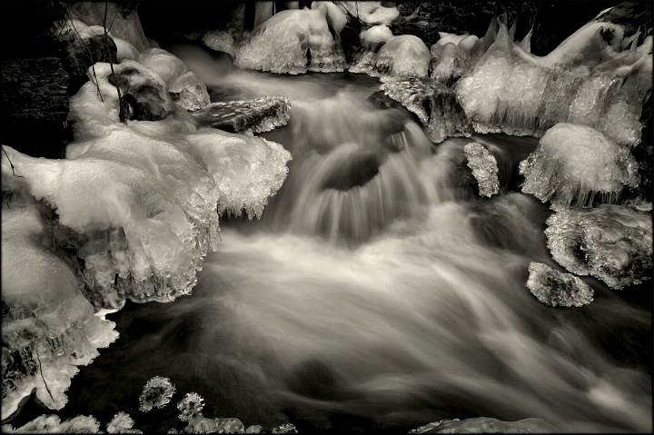
Very well composed and nice shutter speed. For winter images I usually prefer a blueish toning.
Registered on November 14, 2007, 322 Posts, 6101 Comments
Comment posted by Joseph Kayne on November 6, 2009 at 9:20 AM
This is FANTIASTICO!!!! I may suggest cloning out the two little branches on the very left of the image. Kudos!!! Oh, send me a print. Joe.
Registered on November 1, 2003, 573 Posts, 2619 Comments
Comment posted by Bill Chambers on November 6, 2009 at 9:40 AM
This is very nice Dave - works well in B&W too.
Registered on April 10, 2005, 753 Posts, 21216 Comments
Comment posted by Mark Stahlke on November 6, 2009 at 10:34 AM
This is a lovely image. I agree with Andreas, a cooler tone would suit the subject matter.
Cheers,
Mark
Registered on November 1, 2003, 97 Posts, 782 Comments
Comment posted by Harley Goldman on November 6, 2009 at 12:36 PM
Great choice on B&W! This is beautiful. I would agree with Joe about the left branch, but minor stuff. Very nice work.
Registered on November 19, 2003, 586 Posts, 11271 Comments
Comment posted by Dietrich Gloger on November 6, 2009 at 1:46 PM
Excellent bw work Dave!
Registered on January 26, 2007, 360 Posts, 9876 Comments
Comment posted by Dean Sauskojus on November 6, 2009 at 1:49 PM
That makes me shiver. Nice tonal values and texture in the water. Great b&w.
Registered on September 29, 2009, 137 Posts, 2659 Comments
Comment posted by Tony Kuyper on November 6, 2009 at 3:10 PM
Unique comp and very nicely presented in B&W. There's a sense for me that the ice is sort of hovering over the scene and relatively distant from the water. I know this is an illusion (isn't it) that makes me stare a little harder at the image.
Registered on November 1, 2003, 364 Posts, 22328 Comments
Comment posted by Daniel Rappaport on November 6, 2009 at 3:11 PM
Very nicely done. The play between the intricate still ice forms and the perfectly captured water movement really holds my interest.
Registered on September 9, 2009, 294 Posts, 2006 Comments
Comment posted by Igor on November 6, 2009 at 3:33 PM
The sense of 2 layers, one over the other, created by the long exposure of the water, is disturbing and confusing. I feel you need something to somehow unite these 2 planes. In the same manner that a good landscape has a transition between fg and bg.
Registered on February 22, 2009, 12 Posts, 618 Comments
Comment posted by Morris McClung on November 6, 2009 at 7:36 PM
Excellent conversion and toning. Your comp works really well.
Registered on May 7, 2007, 670 Posts, 19650 Comments
Comment posted by Eva McDermott on November 6, 2009 at 8:44 PM
I like the flow and ice forms Dave. B&W sepia is wonderful as well. Nice work.
Registered on January 4, 2009, 1015 Posts, 13229 Comments
Comment posted by Doug Roane on November 6, 2009 at 9:48 PM
This is beautiful. I think you could push the whites a little bit though, and I, personally, would also prefer a cooler tone.
Registered on December 12, 2008, 213 Posts, 2226 Comments
Comment posted by Vance Gese on November 6, 2009 at 10:31 PM
Beautiful, well composed image. Your b/w processing works really well. Like Doug suggested, I might consider pushing the whites a bit to provide a tad more luminosity to the image. Always love how ice can appear to be hovering over a stream like this. Excellent work.
Registered on November 13, 2008, 298 Posts, 6629 Comments
Comment posted by Youssef Ismail on November 7, 2009 at 3:06 AM
Dave,
That is some amazing luminousity in the ice. I don't know where that light is coming from , but it definitely gets my attention and holds it. It looks almost 3D.
Registered on November 1, 2003, 474 Posts, 5555 Comments
Comment posted by Bruno Silva on November 7, 2009 at 11:29 AM
what a spot! nice b&w image. great contrast you got here. I think the whites would look better if they were pumped up a bit, just a thought. great comp.
Registered on May 6, 2009, 132 Posts, 1406 Comments
Comment posted by Albert Darmo on November 8, 2009 at 11:10 PM
Hi Dave Like the flow of the image,. the lighting is great. Very cool
Albert darmo canada
Registered on November 25, 2008, 1386 Posts, 11978 Comments

Comments
18 commentsBob
Cheers,
Mark
That is some amazing luminousity in the ice. I don't know where that light is coming from , but it definitely gets my attention and holds it. It looks almost 3D.
Albert darmo canada