Nature Photographers Network
This is the preserved archive of the original Nature Photographers Network. The community continues at naturephotographers.network.
Tulip
‹ PreviousFlora GalleryNext ›

Tulip

by Kathy Odiorne

Gallery: FloraPosted December 3, 200971 views10 comments
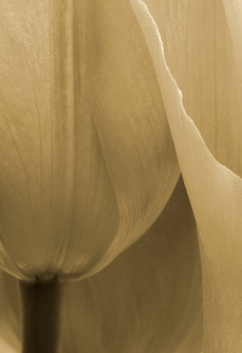
I posted the color version of this a while back, but am looking for opinions on it as a sepia. I'll post the color version as well (below). I just realized I forgot to check the box so my images would remain in my gallery, so all my earlier posts are gone.
Comments and critiques welcome
:smile:
Kathy

Comments

10 comments
Comment posted by Kathy Odiorne on December 3, 2009 at 5:52 PM
Here is the color version I posted earlier. Thanks for looking & for your critique.
Kathy
Registered on November 1, 2003, 211 Posts, 1471 Comments
Comment posted by Bill Fach on December 3, 2009 at 6:06 PM
Kathy: I'm a complete color junkie so I really like it. (When did you post it? I don't think I would have forgotten such a fine image.) As for the sepia it works for me as well although I do think I would like a touch more brightness and contrast. Marvelous comp and capture on both. Very well done.>=))>
Registered on November 1, 2003, 1805 Posts, 26981 Comments
Comment posted by Kathy Odiorne on December 3, 2009 at 6:44 PM
Thanks for your critique, Bill. I probably posted it a couple of months ago. This was one in a bouquet I recieved for Mother's day from my daughter. It's great to recieve flowers so I can spend a few days in photographic nirvana :wink:
Kathy
Registered on November 1, 2003, 211 Posts, 1471 Comments
Comment posted by beth summer on December 4, 2009 at 11:40 AM
Kathy, I like your sepia conversion but agree with Bill about a touch more contrast and brightness. It has an old feel to it. The color is beautiful as well.
Registered on November 1, 2003, 437 Posts, 5220 Comments
Comment posted by Bob&Charly Nelson on December 4, 2009 at 3:45 PM
I'm a color person Kathy, so the second is my fav., but this is really well presented period. NICE :toast:
Bob :wavey:
Registered on October 27, 2005, 289 Posts, 4202 Comments
Comment posted by Steven M Kahn on December 4, 2009 at 3:49 PM
Kathy I prefer the sepia. To me it is more graphic. Very interesting composition. The color to me deminishes the graphic impact. I feel a bump in a layers adjustment - curves could pump up the image. A bit more brightness should add to the impact. :toast:
Registered on July 20, 2009, 140 Posts, 1198 Comments
Comment posted by Elisabeth Czwikla on December 4, 2009 at 5:56 PM
I like the sepia version, but think it's a little dark.
Registered on December 9, 2007, 145 Posts, 852 Comments
Comment posted by Patricia Brundage on December 4, 2009 at 7:26 PM
Both versions are excellent because the basic comp is detailed and has a nice flow. I think I prefer the range of colors, although the b&w has a very elegant and nostalgic feel. Hard choice... changes with each view. Regardless, beautiful image! :toast:
Registered on March 23, 2006, 1111 Posts, 6531 Comments
Comment posted by Morris McClung on December 4, 2009 at 11:14 PM
Both are excellent, and I usually go for the color, but the first one here is almost sultry, sexy.
Registered on May 7, 2007, 670 Posts, 19650 Comments
Comment posted by Debashis Bandyopad on December 5, 2009 at 3:50 PM
Kathy, very nice images both. I like the colour version more though :smile:
Registered on June 24, 2007, 130 Posts, 1309 Comments