Nature Photographers Network
This is the preserved archive of the original Nature Photographers Network. The community continues at naturephotographers.network.
Falls' Icicle Details + Repost
‹ PreviousLandscape GalleryNext ›

Falls' Icicle Details + Repost

by Catherine Reilly

Gallery: LandscapePosted December 20, 2009225 views15 comments
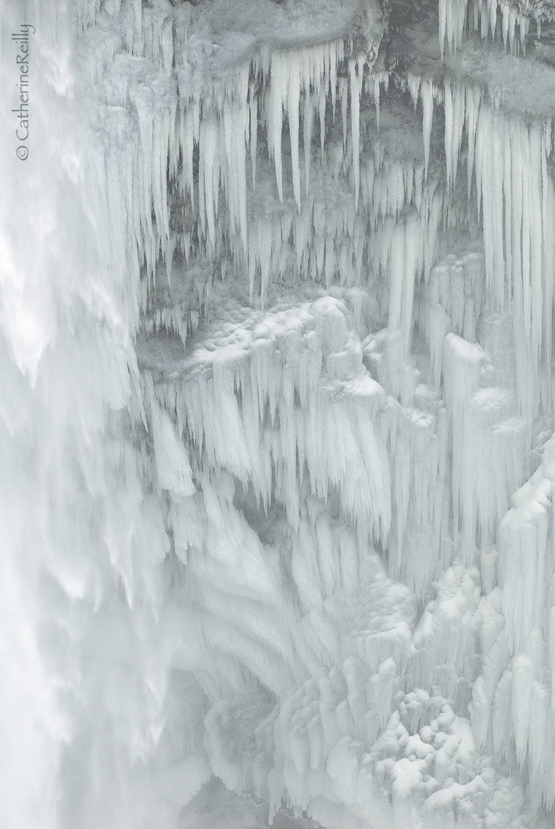
Thanks to all for your encouraging comments on my Falls posts so far. I continue my little series with a closeup-- at least as close as I dared. Plenty of people slipped right past the warning sign and climbed over the barricade to walk out onto a flat area that can flood in a second if they change the flow at the dam. Sign says so. Now WHY do people do that?

Anyway... D200, 70-200/2.8 @ 180 mm, tripod; f 5, 1/90th, ISO 200.

I left a little of the water flow of the Snoqualmie Falls on the left edge. Any thoughts about that? Or anything else? Your feedback is welcome.

Comments

15 comments
Comment posted by Joseph Campisi on December 20, 2009 at 1:52 AM
This is a wonderful high key image Catherine, love the shapes of the jagged ice and the subtle blue cast. The water flow adds variety to the image. Wish I had the notion to head to the falls during that cold snap! Looks like the entrance to an ice dragons lair!
And to answer your question, you know what they say...stupid kills, but not nearly enough! :biggrin:
Registered on November 24, 2008, 304 Posts, 3211 Comments
Comment posted by John&Patty Benway on December 20, 2009 at 5:38 AM
Love ice shots Catherine, and in a little while, I will leaving in search of some ice on a local stream. Yes, I like the water flow included, you did a beautiful job here, I'm liking it. oh for your other question, when you're young, you're bullet proof, when you get to my age, you grew enough brains to know there is no such thing as bullet proof : :wink: .
John
Registered on May 12, 2006, 626 Posts, 8700 Comments
Comment posted by Eric Vaughan on December 20, 2009 at 8:02 AM
Very nice shot Catherine, love those ice formations, beautiful. Here are just couple things I think could help improve the image. I would really like to see more blacks in the shot, contrast is very low and therefore I think a lot of detail is lost in the ice there. Also having true blacks (or close too) gives the shot much nicer 3D appearance. And maybe even little more flowing water on left, would have been nice. I like that touch you added with the moving water, just wish maybe I could see little more of it. Overall great shot just way it is, well done.
Registered on April 29, 2009, 57 Posts, 670 Comments
Comment posted by Philip Schwarz on December 20, 2009 at 9:00 AM
Mice composition.
Registered on November 29, 2006, 236 Posts, 1210 Comments
Comment posted by Mark Pelton on December 20, 2009 at 9:28 AM
This is beautiful Catherine. Your composition and exposure seems perfect .
Registered on November 25, 2003, 380 Posts, 4647 Comments
Comment posted by Andreas Resch on December 20, 2009 at 11:01 AM
Another lovely ice shot, Catherine. I love the icicles. I don't mind the water on the left - it's just a little too bright so close to the border. Overall there's a slight green toning in the image. My personal preference would be a hint more on the magenta/blue side of the spectrum. Overall - excellent work.
Registered on November 14, 2007, 322 Posts, 6101 Comments
Comment posted by Stan Rose on December 20, 2009 at 11:07 AM
Love the icicles--looks frigid!! I might have included a bit more water, if you could tone down the bright highlites some. Snoqualmie is a great place, im sorry i wasnt much of a shutterbug when i was out there. :wavey:
Registered on September 15, 2005, 836 Posts, 17099 Comments
Comment posted by Mark Windom on December 20, 2009 at 11:51 AM
I like everything about this but do agree it could use a little more contrast. I also like the amount of water flow you have on the left.

BTW, I was one of the ones who climbed over the barricade....got some real nice stuff down by the water's edge though.... :wavey:
Registered on November 1, 2003, 176 Posts, 2302 Comments
Comment posted by Pat Sampson on December 20, 2009 at 12:57 PM
Beautiful shot Catherine. Love the icicles and all the shapes in general. There does seem to me to be something a little sinister here but whatever it is, I like it very much.

Pat
Registered on May 19, 2007, 953 Posts, 15989 Comments
Comment posted by Anthony Vincent on December 20, 2009 at 3:34 PM
Nice work Catherine
Very creative and magical capture
Registered on February 5, 2009, 199 Posts, 2775 Comments
Comment posted by Paul Marcellini on December 20, 2009 at 5:33 PM
Very nice Catherine. I really didn't notice it as flowing water on the right until I read your description. It breaks up the repetition and I kinda feel like it distracts for me. I think just a crop to the other side of your sig improves it for me. I like the amount of contrast though. A very interesting and appealing scene.
Registered on November 27, 2007, 250 Posts, 2468 Comments
Comment posted by Catherine Reilly on December 20, 2009 at 6:16 PM
Thanks everyone for your thoughtful comments.

Eric: Thank you, yes, there was a lot of spray, and I didn't want to lose the effect. I chose in the repost to burn and dodge as a compromise to setting a black point. Looks better, I think. Do you?
Andreas: Yep, you're right on the green cast. So I changed it toward blue.
Stan: Now, you just have lots of great excuses to come back to the great PNW for lots of visits!
Mark W.: Oh! you bad, bad boy! (Actually, I'm envious. Now that I am old I am too scared.) So let's what you got!
Pat: Joseph id'd the sinister element. It's the entrance to an ice dragon's lair! Love it. :smile:
Registered on August 16, 2006, 603 Posts, 9192 Comments
Comment posted by Tony Kuyper on December 20, 2009 at 8:04 PM
I was really hoping for a close-up, Catherine. I actually like the original best. The darker values in the repost are less ethereal than the gray tones in the original, and I think those soft-grays actually work better.
Registered on November 1, 2003, 364 Posts, 22328 Comments
Comment posted by Albert Darmo on December 21, 2009 at 11:26 AM
Hi Catherine :wavey: Really well seen and crafted. Fantastic vertical lines of icicles :eek: Agree with tony about the better lighter grey tones on the first post. A very captivating scene catherine. :eek: :smile:
Albert Darmo Canada
Registered on November 25, 2008, 1386 Posts, 11978 Comments
Comment posted by Steve Sieren on December 22, 2009 at 11:08 AM
Catherine, fantastic work! The specular highlights really help the viewer associate that water is flowing over the ice formations. :toast: :toast:

SS
Registered on January 2, 2008, 360 Posts, 5321 Comments