Nature Photographers Network
This is the preserved archive of the original Nature Photographers Network. The community continues at naturephotographers.network.
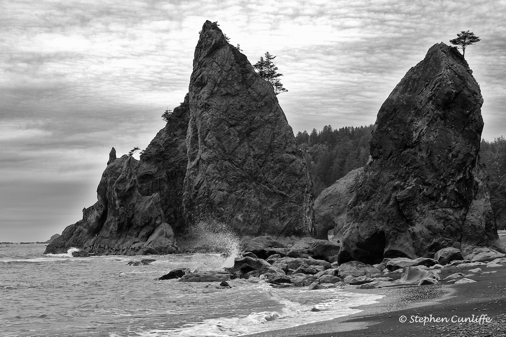
Rialto Beach
‹ PreviousLandscape GalleryNext ›

Rialto Beach

by Stephen Cunliffe

Gallery: LandscapePosted December 27, 2009106 views4 comments
I dont have much experience with black and white conversions, but have recently been having fun experimenting with Nik SilverFX, including here with an image taken a couple of years ago on the West Coast of the Olympic Peninsula. A lot of people shoot sunsets here, but I was trying to capture more of the dark gloomy mood that often prevails.
Would really appreciate some input.
Canon 30D
lost track of which lens I used, but the focal length was 41mm
ISO 100
f/8 @ 1/125s

Comments

4 comments
Comment posted by Elliot Johnston on December 27, 2009 at 10:43 PM
It looks like a good exposure (except for the blownout sky around the tallest sea stack). I think you're on the right track with the B&W conversion but it's still lacking something. I'd up the contrast a bit more, looks a little flat as is. Also seems to be some haloing on the right stack. All of this is an easy fix though. You've already done the hard part
Registered on November 11, 2009, 23 Posts, 288 Comments
Comment posted by Daniel Rappaport on December 28, 2009 at 1:25 AM
I think you've captured the mood perfectly. Very well composed. I would, however reign in the blown out part of the clouds (if possible) and the halo around the R rock.
Registered on September 9, 2009, 294 Posts, 2006 Comments
Comment posted by Ed Cooley on December 28, 2009 at 12:26 PM
Unique take on this beach Stephen. I like the choice of B&W as well.
Registered on August 22, 2007, 45 Posts, 547 Comments
Comment posted by Lon Overacker on December 29, 2009 at 2:42 PM
Stephen,

A nice capture and b&w conversion of the Olympic coast. For me this doesn't really say "dark and gloomy," but does portray the flat, gray days of the north coast. And with those gray days, it's pretty hard to capture any contrast which I think perhaps this might be what's lacking. As mentioned, the sky/clouds above the stacks looks a little blown. I also notice some haloing around the stacks, especially on the lower left. I'm guessing because you were trying to bring out some detail in the rocks.

Overall, I think it's a very good comp and an image certainly worth perfecting.

Lon
Registered on November 24, 2006, 521 Posts, 19147 Comments