Gallery: LandscapePosted January 7, 2010235 views12 comments
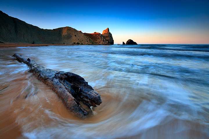
The little bay of Palma di Montechiaro, probably one of the most cold water in Sicily.
Comments welcome!
Comments
12 comments
Comment posted by Luis Argerich on January 7, 2010 at 5:47 PM
Very nice, fantastic light for this great composition
Registered on December 22, 2009, 91 Posts, 1349 Comments
Comment posted by Stan Rose on January 7, 2010 at 7:20 PM
Mario, its a beautiful scene, and some interesting surf lines. The composition has a major flaw in my opinion: the log acts as a leading line, but unfortunately along with the wave lines it leads into the dark corner on the left side, so my eye is pulled away from the nice area at the horizon on the right side. Some people wont be bothered by this or wont even notice, but for me that is what seperates a good shot from a great one, the attention to compostional details.
Registered on September 15, 2005, 836 Posts, 17099 Comments
Comment posted by Floris van Breugel on January 7, 2010 at 7:50 PM
Looks like a very refreshing place to stand. The blues/cyans seem a bit strong to me, but I love the light on the distant rocky outcrop.
Registered on December 19, 2008, 306 Posts, 4840 Comments
Comment posted by Scott Smorra on January 7, 2010 at 9:57 PM
Nice motion in the water here. I like the sunlight lighting up the rock in the center.
Registered on November 2, 2009, 161 Posts, 2143 Comments
Comment posted by Tony Kuyper on January 7, 2010 at 10:19 PM
Very appealing. The wide-angle view certainly makes for a dramatic comp from relatively simple elements. You handled the light well here too.
Registered on November 1, 2003, 364 Posts, 22328 Comments
Comment posted by Cory O'Neill on January 7, 2010 at 10:41 PM
Nice capture, Mario. I really like the wave action leading to the distant rock. The right third of the image doesn't seem as significant, and I might try cropping that side a bit. Great work!
Registered on October 4, 2008, 28 Posts, 273 Comments
Comment posted by Dietrich Gloger on January 8, 2010 at 12:52 AM
I like the low angle and the perspective. Getting that close to the log and the water gives a very nice 3d effect. Colors are strong but very appealing. A very nice seascape Mario!
Registered on January 26, 2007, 360 Posts, 9876 Comments
Comment posted by Mario Pappalardo on January 8, 2010 at 1:42 PM
Thank you all for comments and suggestions!
Registered on October 14, 2009, 18 Posts, 61 Comments
Comment posted by Lon Overacker on January 8, 2010 at 6:16 PM
Mario,
I don't think I've had a chance to welcome you to NPN and the ES&S Gallery - so Welcome aboard! We're glad to have you here and appreciate your participation already. My apologies if this is a repeat - just a sign of my aging brain...
This is a very lovely seascape. I really like how the water motion kind of swirls around the end of the log. And the last (or first?) light hitting the top of the bluff is a nice tough.
Overall, I personally think the saturation is a little strong and especially the strong cyan in the surf where I would think it would be closer to white with a hint of blue maybe... but the cyan is quite strong IMHO. And I might as well mention that the strong colors are pretty consistent with some of your other posted images. This could be many things from monitor calibration, to Saving for the web and of course intential processing. This may be your personal preference, but for me the color balance and blue/cyan are a little strong for my tasted. But then, it could be just me.
Thanks for sharing,
Lon
Registered on November 24, 2006, 521 Posts, 19147 Comments
Comment posted by Mario Pappalardo on January 9, 2010 at 3:07 AM
Mario,
I don't think I've had a chance to welcome you to NPN and the ES&S Gallery - so Welcome aboard! We're glad to have you here and appreciate your participation already. My apologies if this is a repeat - just a sign of my aging brain...
This is a very lovely seascape. I really like how the water motion kind of swirls around the end of the log. And the last (or first?) light hitting the top of the bluff is a nice tough.
Overall, I personally think the saturation is a little strong and especially the strong cyan in the surf where I would think it would be closer to white with a hint of blue maybe... but the cyan is quite strong IMHO. And I might as well mention that the strong colors are pretty consistent with some of your other posted images. This could be many things from monitor calibration, to Saving for the web and of course intential processing. This may be your personal preference, but for me the color balance and blue/cyan are a little strong for my tasted. But then, it could be just me.
Thanks for sharing,
Lon
Thank you Lon,
I think I need to review some part of my work-flow in order to reduce the over-saturation effect even if I think to tend to saturation.
I tried to de-saturate the water.
Registered on October 14, 2009, 18 Posts, 61 Comments
Comment posted by Wayne Willison on January 9, 2010 at 2:31 PM
Love how the water swirls around the log. Beautiful image.
Registered on April 10, 2009, 292 Posts, 3967 Comments
Comment posted by Kent Mearig on January 9, 2010 at 8:20 PM
The heavily saturated blues do give this a cold look. I think for the space in the sky to really work, it would have been nice for your foreground subject to be positioned a little more into the LRC.
edit: I much prefer your updated colors. Great adjustment.
Registered on September 4, 2006, 237 Posts, 4748 Comments

Comments
12 commentsI don't think I've had a chance to welcome you to NPN and the ES&S Gallery - so Welcome aboard! We're glad to have you here and appreciate your participation already. My apologies if this is a repeat - just a sign of my aging brain...
This is a very lovely seascape. I really like how the water motion kind of swirls around the end of the log. And the last (or first?) light hitting the top of the bluff is a nice tough.
Overall, I personally think the saturation is a little strong and especially the strong cyan in the surf where I would think it would be closer to white with a hint of blue maybe... but the cyan is quite strong IMHO. And I might as well mention that the strong colors are pretty consistent with some of your other posted images. This could be many things from monitor calibration, to Saving for the web and of course intential processing. This may be your personal preference, but for me the color balance and blue/cyan are a little strong for my tasted. But then, it could be just me.
Thanks for sharing,
Lon
Thank you Lon,
I think I need to review some part of my work-flow in order to reduce the over-saturation effect even if I think to tend to saturation.
I tried to de-saturate the water.
edit: I much prefer your updated colors. Great adjustment.