Nature Photographers Network
This is the preserved archive of the original Nature Photographers Network. The community continues at naturephotographers.network.
Titan Gate
‹ PreviousLandscape GalleryNext ›

Titan Gate

by Helio Cristovao

Gallery: LandscapePosted January 15, 2010456 views27 comments

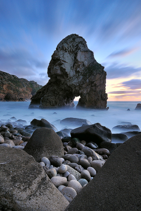
Cape Roca. Portugal

This is a rendition of a Portuguese iconic Cape Roca huge rock called "Pombeira", "Furada" or also, "Azóia Stone".

It´s a spot I go often and love to shoot. And it´s near home ;))
Here, I looked for an interesting and graphic comp. and tried to achieve a different approach on the subject, considering the FG framing.

I´m posting two versions, I´d like to hear your opinions of which works better for you. And all C&C appreciated. Thanks.


Tech. details:
Nikon D300+grip, tripod, cable release, Neutral density filters (3EV) 100mm SE
1 shot made at 13mm 30sec. f/13 ISO280

Comments

27 comments
Comment posted by Helio Cristovao on January 15, 2010 at 6:50 AM
And 2nd photo, subtle light change and major clouds movement. Thanks for critique.
Registered on September 15, 2009, 83 Posts, 434 Comments
Comment posted by Joseph Balcken on January 15, 2010 at 7:02 AM
Helio, both are breathtaking. I prefer the second just for the added drama in the sky/clouds. I love the misty look to the water. The rocks in the fg are also very appealing. Great shot!
Registered on November 29, 2009, 48 Posts, 249 Comments
Comment posted by Andreas Resch on January 15, 2010 at 7:39 AM
Excellent shots, Helio. Everything falls into place here - no nits.
Registered on November 14, 2007, 322 Posts, 6101 Comments
Comment posted by Marco Silva on January 15, 2010 at 8:09 AM
I love the FG, that's what make it diffent.
One of the best pictures of "Pombeira".
The second version is more dramatic, so it's a keeper.

Hugs
Registered on June 21, 2009, 0 Posts, 1 Comments
Comment posted by Ricardo La Piettra on January 15, 2010 at 8:12 AM
Wonderful image Helio, love that fg and the main big rock is impressive. I preffer the second version because its dynamic range.
Registered on July 22, 2009, 62 Posts, 730 Comments
Comment posted by Mark Pelton on January 15, 2010 at 8:24 AM
very nice composition with the foreground. I like the effects of the long exposure.
Registered on November 25, 2003, 380 Posts, 4647 Comments
Comment posted by Guy Tal on January 15, 2010 at 8:43 AM
I really like the effect of the long exposure in the water and cloud trails. Between the 2 versions, I like the first one better, although I wouldn't mind a little more selective saturation of the warm tones in the sky.

Guy
Registered on November 1, 2003, 566 Posts, 15507 Comments
Comment posted by Kevin Trinkner on January 15, 2010 at 8:55 AM
I think I like the softer mood of the second shot, both are beautiful though. Great comp and great colors. Nice work!
Registered on June 30, 2008, 203 Posts, 2641 Comments
Comment posted by John Williams on January 15, 2010 at 10:09 AM
On my monitor the first is more appealing, but I agree that a slight saturation bump would add. That's a great scene, well composed and the lighting is just right.
Registered on September 6, 2007, 221 Posts, 5985 Comments
Comment posted by Nicolas Belokurov on January 15, 2010 at 10:12 AM
Well, it's a beautiful shot indeed. I really like the textures of the first one and the color show of the second. Perhaps a blend could combine them both?
Great work.
Registered on July 22, 2009, 41 Posts, 533 Comments
Comment posted by Greg Cope on January 15, 2010 at 10:19 AM
The cloud patterns are so very nice. I like the tones a bit more in the second post. The skyline on the arch seems to have a halo that is noticeable. A personal taste of course, but I find the extreme foreground rocks slightly overwhelming.
Registered on January 22, 2007, 212 Posts, 2737 Comments
Comment posted by Tony Kuyper on January 15, 2010 at 11:39 AM
Very well done, Helio. The smaller round rocks sort of remind me of eggs here. The light and comp are just fabulous here.
Registered on November 1, 2003, 364 Posts, 22328 Comments
Comment posted by Jimmy Gekas on January 15, 2010 at 12:49 PM
Oh, both are wonderful... but I prefer the first version. Great colors and a really cool comp.
Registered on July 26, 2007, 244 Posts, 2807 Comments
Comment posted by Chris Chamberlain on January 15, 2010 at 1:03 PM
I think these are outstanding! I can't really tell, but find myself leaning toward the second. Beautiful!

Chris
Registered on March 13, 2007, 500 Posts, 8365 Comments
Comment posted by Dan Baumbach on January 15, 2010 at 1:12 PM
I can't pick. I like them both.

- Dan.
Registered on November 1, 2003, 473 Posts, 7980 Comments
Comment posted by Vance Gese on January 15, 2010 at 1:52 PM
Fantastic image Helio. Composition and color are outstanding. Favor the second post with the slightly darker tones and the blues, but both are excellent.
Registered on November 13, 2008, 298 Posts, 6629 Comments
Comment posted by Mario Pappalardo on January 15, 2010 at 2:29 PM
Evocative Helio!
The "V" shape in the foreground create a really appealing consonance with the "A" shape in the background.
Both are great and it is really hard to choose but at the end a prefer the second one, a slightly vibrant colors and more sense of motion.
Registered on October 14, 2009, 18 Posts, 61 Comments
Comment posted by Reed Bowman on January 15, 2010 at 2:39 PM
A really wonderful shot. The sky is awesome and really focuses your attention on Pombeira. I see a bit of a halo around the rock, more noticeable in the first than the second. Here the log exposure of the water works very well (I'm not always a big fan of misty waterscapes)
Registered on March 2, 2009, 166 Posts, 1058 Comments
Comment posted by Lon Overacker on January 15, 2010 at 4:49 PM
Helio,

Initially I thought the rocks up front were blocking, but then it changed to feel more like a window. In addition, this unique view and perspective actually creates some great depth to this seascape.

I prefer the first version overall, but like the sky/clouds in the second better. The first has excellent clarity, contrast and detail.

This is superbly crafted and executed. Great work!

Lon
Registered on November 24, 2006, 521 Posts, 19147 Comments
Comment posted by Ian Haskell on January 15, 2010 at 5:20 PM
Both, superb shots - looks like a timegate to another dimension or world.

Ian
Registered on October 30, 2008, 24 Posts, 673 Comments
Comment posted by Nick Holland on January 15, 2010 at 6:54 PM
I prefer the first, slightly brighter version. That is a really interesting composition with the shape of the rock structure being reflected in the foreground stones. Very well spotted!
Registered on August 18, 2007, 19 Posts, 38 Comments
Comment posted by Helio Cristovao on January 16, 2010 at 6:19 AM
Thanks for all feedback so far.
Really appreciated and also really confused :biggrin: Guess I´ll have to work on this one, in my thought, the situation is that the 1st. image has the better light, the 2nd adds the drama in the sky. Maybe it´s worth the blend? :rolleyes:

Ian:
a timegate to another dimension or world

I´ll Keep this! Inspiring :wink:

Mario:
"V" shape in the foreground create a really appealing consonance with the "A" shape in the background

yes, indeed. Really interesting.
Registered on September 15, 2009, 83 Posts, 434 Comments
Comment posted by Mark Metternich on January 16, 2010 at 2:24 PM
Sorry not too fond of the foreground. But love the image.

Mark
Registered on June 19, 2009, 276 Posts, 6240 Comments
Comment posted by Dean Sauskojus on January 17, 2010 at 2:37 AM
I'm not completely sold on the v in the foreground after looking at this for awhile. I just think it doesn't contribute to the flow and the complexity of the image. Other than that this is a fantastic image and very well executed.
Registered on September 29, 2009, 137 Posts, 2659 Comments
Comment posted by Chris Chamberlain on January 17, 2010 at 1:33 PM
Hi,
Coming back for another look, I noticed that the water in the second version looks a little too cyan. But I still do like the clouds in that one a lot, so maybe a blend would be best.

Chris
Registered on March 13, 2007, 500 Posts, 8365 Comments
Comment posted by David Edwards on January 18, 2010 at 2:00 AM
A another stunning shot, Helio. I prefer the first version as the sky is not so dark and saturated. I feel this version really 'lifts' much more. The color, lighting and comp are superb. An absolute cracker!
:toast:
Registered on December 6, 2008, 142 Posts, 2623 Comments
Comment posted by Helio Cristovao on June 24, 2010 at 2:15 PM
Hi folks,
I´m presenting a final version of this shot, I wasn´t completely satisfied by the prior version on a large print, so, here is a repost after all this time : )
Registered on September 15, 2009, 83 Posts, 434 Comments