Nature Photographers Network
This is the preserved archive of the original Nature Photographers Network. The community continues at naturephotographers.network.
Pond Painting
‹ PreviousLandscape GalleryNext ›

Pond Painting

by Benjamin Glatt

Gallery: LandscapePosted February 3, 2010473 views30 comments
(Larger image provided)

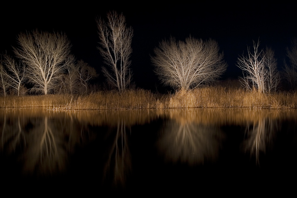
Posted this once before, took some crop suggestions and also went back to the raw and redid the processing. This was taken last March with Steve Sieren using his 10lb flashlight, beaming the light across this pond in Bishop CA. Pretty fun stuff. The trick was being patient enough for the 70 second shutter, after about a minute you start thinking the image will be blown out in some parts. A lot of experimenting went into the series of images Steve and I got that night (and only 2 came out good).

Thanks for any input.

Canon 30D, 17-70mm @33mm, iso 100, f/8, 72sec

-Ben

Comments

30 comments
Comment posted by Daman Sidhu on February 3, 2010 at 2:07 PM
Wonderful stuff Ben, this is fascinating use of light painting.. i love the abstractness of this image and the black and gold/brown being the only colors.Very very nice, thanks for sharing!
-Daman
Registered on December 16, 2009, 21 Posts, 176 Comments
Comment posted by Phil Pogledich on February 3, 2010 at 2:18 PM
I remember this image from months ago . . . liked it then, and I like it now. Everything looks great except for a bit of a tilt to the left, if I'm not mistaken.
Registered on August 24, 2009, 123 Posts, 3099 Comments
Comment posted by Paul Marcellini on February 3, 2010 at 2:37 PM
I loved Steve's and this one is just as good. All the experimentation paid off. It does feel like it is tilting left but that could be the receding shoreline.
Registered on November 27, 2007, 250 Posts, 2468 Comments
Comment posted by Mike Ryan on February 3, 2010 at 2:47 PM
I like both the images that you Steve got from this experimentation. This image is really haunting to me (in a good way). Did you try black and white at all? Nice work Ben.
Registered on June 29, 2008, 85 Posts, 636 Comments
Comment posted by Dorin Bofan on February 3, 2010 at 2:51 PM
I know this one and it's good to see it again. Very creative image, Ben!
Registered on April 30, 2007, 122 Posts, 3086 Comments
Comment posted by Benjamin Glatt on February 3, 2010 at 2:52 PM
Mike, this definitely is a good candidate for b&w, something I will consider. As Daman mentioned, I really like the golden browns in that shoreline contrasted with the stark black water and sky--I think that strip of color is a big part of the image.
Registered on July 15, 2007, 171 Posts, 3566 Comments
Comment posted by Chip Phillips on February 3, 2010 at 3:15 PM
Very nice work Ben. It does seem to lilt a bit downward to the left. Sounds like a fun time!
Registered on November 26, 2007, 128 Posts, 1436 Comments
Comment posted by Hamed Musharbak on February 3, 2010 at 3:17 PM
wonderful control of light

amazing reflections

all the best

Hamed
Registered on June 1, 2009, 372 Posts, 2282 Comments
Comment posted by Aaron Ellingsen on February 3, 2010 at 3:40 PM
It does seem tilted, but other than that, I really like this. Its definitely not a super flashy, or dramatic type of photo, but I can imagine this would sell quite well if it were printed out really huge on canvas. It has a nice "fine art" feel to it... whatever that means these days. :smile:
Registered on January 16, 2008, 56 Posts, 953 Comments
Comment posted by Vance Gese on February 3, 2010 at 3:42 PM
Wow, Ben, an amazing image. Very ethereal yet with such striking contrasts. Love the colors in the grasses and the tones in the trees. Gorgeous work.
Registered on November 13, 2008, 298 Posts, 6629 Comments
Comment posted by Dan Baumbach on February 3, 2010 at 3:57 PM
Beautiful image, Ben. It has a wonderful mystery to it.

- Dan.
Registered on November 1, 2003, 473 Posts, 7980 Comments
Comment posted by R.Bill Moser on February 3, 2010 at 3:57 PM
Wow, that looks so gorgeous. It seems to me that it is tilting left.
Registered on January 29, 2010, 285 Posts, 4281 Comments
Comment posted by Kevin Trinkner on February 3, 2010 at 4:05 PM
Very cool Ben, I didn't see the previous to compare, but this looks great to me. I prefer the color, think it really helps make the image more inviting for the viewer.

Excellent work, your efforts paid off here.
Registered on June 30, 2008, 203 Posts, 2641 Comments
Comment posted by Mat Malone on February 3, 2010 at 4:25 PM
Great image, Ben. I really like it. I think the large version could use a bit more sharpening but that's about it.
Registered on December 15, 2008, 91 Posts, 882 Comments
Comment posted by Laurent Baig on February 3, 2010 at 4:59 PM
Very cool, I like it
Registered on January 12, 2005, 206 Posts, 6784 Comments
Comment posted by Anil Rao on February 3, 2010 at 6:29 PM
A really stunning image, Ben. Absolutely delightful.
Registered on November 15, 2003, 234 Posts, 4923 Comments
Comment posted by Rick Lundh on February 3, 2010 at 6:40 PM
Love the effect here...the trees pop!
Registered on April 28, 2004, 774 Posts, 4351 Comments
Comment posted by Robert Dayton on February 3, 2010 at 10:41 PM
Well done, Benjamin! I must try this technique some time.
Registered on November 11, 2008, 281 Posts, 3958 Comments
Comment posted by Morris McClung on February 3, 2010 at 10:47 PM
I'm seeing the same tile that Phil mentioned, but the contrast and comp make this one work well. Very cool shot.
Registered on May 7, 2007, 670 Posts, 19650 Comments
Comment posted by Tony Kuyper on February 4, 2010 at 12:16 AM
I remember the original, but this looks even better, though I'd be at a loss to say why. Maybe because the processing seems more polished. It certainly looks real good now.
Registered on November 1, 2003, 364 Posts, 22328 Comments
Comment posted by Stuart Williams on February 4, 2010 at 2:33 AM
ben, i remeber those images and this is an improvement on already good work.
Registered on December 7, 2007, 247 Posts, 4792 Comments
Comment posted by John Williams on February 4, 2010 at 10:01 AM
It paid off Benjamin, this is cool!
Registered on September 6, 2007, 221 Posts, 5985 Comments
Comment posted by Steve Sieren on February 4, 2010 at 11:01 AM
Quack! Quack! I remember the poor ducks! :toast:
Registered on January 2, 2008, 360 Posts, 5321 Comments
Comment posted by Bill Chambers on February 4, 2010 at 12:50 PM
This is beautiful Ben - superb image.
Registered on April 10, 2005, 753 Posts, 21216 Comments
Comment posted by Dean Sauskojus on February 5, 2010 at 2:55 PM
One of the best flashlight images I've seen. I like the size and structure of the trees coupled with such detail of every branch. The blackness provides the mystery and makes you wonder what's in the background. The colors are complemented between the shoreline and the trees. Congrats to both you and Steve on a fine image.
Registered on September 29, 2009, 137 Posts, 2659 Comments
Comment posted by Matthew Jellings on February 5, 2010 at 5:31 PM
The way you have painted this scene is just exquisite, it really brings these winter trees to life. It looks more like a painting or dream like expression than a photograph. Imaginative and creative work well executed Benjamin. You've definitely inspired me!
Registered on November 1, 2009, 8 Posts, 97 Comments
Comment posted by Eric Good on February 5, 2010 at 6:46 PM
This is one example where the experiment didn't go awry... beautiful work, start to finish!
Registered on March 17, 2007, 116 Posts, 4764 Comments
Comment posted by Youssef Ismail on February 6, 2010 at 9:56 AM
Ben,

This really highlights the trees well. I like this technique. Did you have to paint the reflection as well or did it show up by itself when you painted the trees themselves with light?
Registered on November 1, 2003, 474 Posts, 5555 Comments
Comment posted by Ant on February 6, 2010 at 1:15 PM
Spendid! And definitely it does have a "fine art" feeling... I especially like the constrast between the silver-grey of the trees and the gold of the grasses...
Registered on April 13, 2009, 27 Posts, 474 Comments
Comment posted by Benjamin Glatt on February 6, 2010 at 4:06 PM
Youssef-- no need to paint the reflection, once you move the flashlight down to the water, you lose any sight of the tree...just make sure you apply the flashlight evenly and slowly so that the subject can 'soak' up the light.
Registered on July 15, 2007, 171 Posts, 3566 Comments