Comment posted by Philip Southard on February 3, 2010 at 9:19 PM
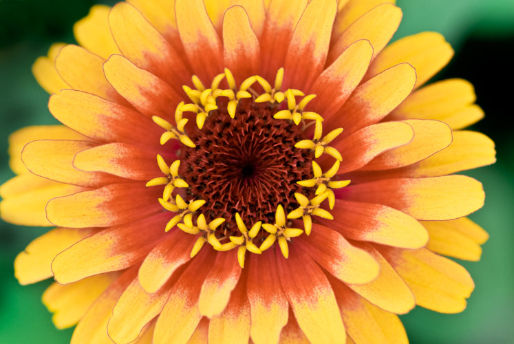
Hi Michele. Overall, nice comp and color. I do wish that one petal on the left wasn't touching the edge. Also, the center seems a tad soft to me. As that is the part of the image that catches my eye first, IMHO I would like to see it sharper. Hope the Face Book page works out well for you. I don't do Face Book (just a personal preference on my part), but if I did, I would surely be a fan.
Registered on July 15, 2007, 258 Posts, 3892 Comments
Comment posted by Dan Borzynski on February 3, 2010 at 9:52 PM
Hmm, I seem to have the complete opposite take on your image than Philip. I'd like to see the right side of the flower cut off a bit (to amtch the left side) and the pistils (??) seem sharp enough to me to match the mood of the images.
I guess you can win with the comments!
Thanks for posting.
Registered on November 1, 2003, 109 Posts, 799 Comments
Comment posted by Gary Yeoh on February 4, 2010 at 1:11 AM
I like this as it is. The central is sharp enough and the color is really pretty.
Registered on September 1, 2009, 588 Posts, 8184 Comments
Comment posted by Nathan Buck on February 4, 2010 at 2:48 AM
I like the color and the sharp look to the center Michele. The comp is a bit static to me.
Nathan
Registered on November 1, 2003, 1101 Posts, 13589 Comments
Comment posted by Catherine Reilly on February 4, 2010 at 7:22 AM
Zinnias are so cool for all that's going on with the center and all the layers of petals. I was wondering if this could benefit from a little bump in contrast and a different crop to add some zip to it. Fine how it is, too-- nice a symmetrical and colorful with lots to look at, but bet there's more zest in there somewhere.
Registered on August 16, 2006, 603 Posts, 9192 Comments
Comment posted by Morris McClung on February 4, 2010 at 12:21 PM
I like the comp, color, and lighting a lot. Your dof is just about perfect as well, I just would have liked the top pistils to be in focus also, but it works as is.
Registered on May 7, 2007, 670 Posts, 19650 Comments
Comment posted by Bill Fach on February 4, 2010 at 12:47 PM
Michelle: You have a good capture here. The softness is a sharpening issue. If you address that then I think the "pop" that others are looking for will be there. In general when shooting zinnia centers I think it works best if there is almost perfect symmetry. I like frame filling shots of these guys so I would be inclined to crop the BG. Nice DOF management. >=))>
Registered on November 1, 2003, 1805 Posts, 26981 Comments
Comment posted by Bob&Charly Nelson on February 4, 2010 at 1:11 PM
Michele, I like this alot with your DOF/POF. I am also one that might like the right side cropped, but, I do like this alot.
Bob
Registered on October 27, 2005, 289 Posts, 4202 Comments
Comment posted by Pat Sampson on February 4, 2010 at 9:49 PM
Michele,
Everything else has been covered so I'll just add that I really like the bg.
Pat
Registered on May 19, 2007, 953 Posts, 15989 Comments

Comments
9 commentsI guess you can win with the comments!
Thanks for posting.
Nathan
Bob
Everything else has been covered so I'll just add that I really like the bg.
Pat