Gallery: LandscapePosted February 6, 2010419 views19 comments
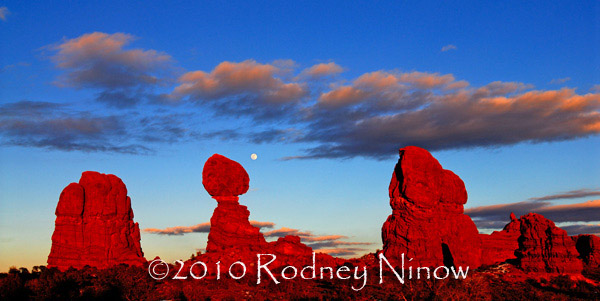
Balanced Rock in Arches National Park at sunset with the full moon rising.
Comments
19 comments
Comment posted by Robert Dayton on February 6, 2010 at 8:54 PM
Very vivid, Rodney. What season of the year was this?
Registered on November 11, 2008, 281 Posts, 3958 Comments
Comment posted by Rodney Ninow on February 6, 2010 at 9:14 PM
Thanks Robert, this was shot at the end of January a couple years ago.
Registered on January 11, 2009, 7 Posts, 123 Comments
Comment posted by Marc Adamus on February 6, 2010 at 10:06 PM
Welcome to NPN, Rodney! Stellar first post here. Something of a tired concept with this location, but seriously, this is as good as it gets so I don't mind The reds are an intense (though perhaps too intense) compliment to the blues behind and really set it off. The moon is a perfect addition. My only real critique is your name, which would be better off watermarked with some sort of translucence to it as to not distract as much.
Registered on September 17, 2005, 780 Posts, 8091 Comments
Comment posted by Tony Kuyper on February 6, 2010 at 10:36 PM
Did you ever get the perfect light and clouds, Rodney . . . and the moon for a bonus. It's once-in-a-lifetime.
Registered on November 1, 2003, 364 Posts, 22328 Comments
Comment posted by Youssef Ismail on February 6, 2010 at 11:59 PM
Welcome Rodney,
That is some intense color for sure. Don't you just love the southwest?
Registered on November 1, 2003, 474 Posts, 5555 Comments
Comment posted by Joseph Campisi on February 7, 2010 at 12:37 AM
Love this Rodney. The reds are a bit strong, maybe desaturating them a little might be in order. Would love to see this larger, and your name much smaller. Welcome!
Registered on November 24, 2008, 304 Posts, 3211 Comments
Comment posted by Joel Hazelton on February 7, 2010 at 12:44 AM
As others have said, the clouds could not have worked more in your favor! Also, as others have said, larger and a much smaller watermark would do this wonderful image much more justice ;)
Registered on August 6, 2008, 194 Posts, 1315 Comments
Comment posted by Floris van Breugel on February 7, 2010 at 1:03 AM
Man, you couldn't have asked for better cosmic and meteorological conditions! Way to be there. The colors do look a bit vibrant, and your watermark is quite distracting.
Registered on December 19, 2008, 306 Posts, 4840 Comments
Comment posted by Richard Wong on February 7, 2010 at 1:27 AM
Great light and composition. I love this. I think the blues could be less saturated but this is very pleasing to the eye regardless.
Registered on February 2, 2006, 79 Posts, 2629 Comments
Comment posted by R.Bill Moser on February 7, 2010 at 7:59 AM
I love this one. The colors may be a little bit vibrant. but I love it. Your name is a little bit distracting.
Registered on January 29, 2010, 285 Posts, 4281 Comments
Comment posted by Matt Anderson on February 7, 2010 at 8:33 AM
Nice twilight sky!
Your timing seems to be perfect!
Registered on September 6, 2007, 346 Posts, 2696 Comments
Comment posted by Eva McDermott on February 7, 2010 at 9:05 AM
Grand scene Rodney and welcome to NPN. I do find the colors a little over saturated for my taste.
Registered on January 4, 2009, 1015 Posts, 13229 Comments
Comment posted by Morris McClung on February 7, 2010 at 10:09 AM
I like the pano crop for the shot and the Velvia like vibrant colors. That is some intense red glow. Welcome.
Registered on May 7, 2007, 670 Posts, 19650 Comments
Comment posted by Rodney Ninow on February 7, 2010 at 12:49 PM
Thanks for all the comments. I'm still figuring out the watermark size. I have had images stolen in the past (not from here) and just don't know anyway to get around it. The size of the image is 600 pixels which was recommended for the portfolio site associated with NPN, but I agree it does look small.
As far as the colors, I shot velvia when I shot film. Now, I set my Nikon bodies to vivid with a slight increase in contrast. I shot a dozen or more compositions that evening, and the sun was popping in and out of clouds to the west, increasing and decreasing the colors in the rocks.
Colors in digital are a finicky, funny thing. Not like in the old days, where you shot on a particular slide film and what you got, was what you got. Frankly, I wish I didn't have to "interpret" the colors and just could have them appear as they would on film.
Registered on January 11, 2009, 7 Posts, 123 Comments
Comment posted by John&Patty Benway on February 7, 2010 at 1:19 PM
Welcome to NPN Rodney, and fantastic first post. you certainly have everything going in this. Beautiful work.
John
Registered on May 12, 2006, 626 Posts, 8700 Comments
Comment posted by Wade Hardy on February 7, 2010 at 2:41 PM
Fantastic shot of Arches! For me, the saturation could be toned down a little - minor though.
Registered on May 2, 2006, 121 Posts, 1824 Comments
Comment posted by Tom Nevesely on February 8, 2010 at 11:22 AM
Beautiful shot with great light and colours.
Welcome to NPN Rodney.
Registered on June 14, 2005, 147 Posts, 1550 Comments
Comment posted by Jimmy Gekas on February 8, 2010 at 3:04 PM
Welcome to NPN, Rodney. The colors are super intense and really show the viewer how red this section of the southwest can get with the setting sun. I'd have to echo the comments about your watermark....it's quite distracting and takes away from this fabulous image.
Registered on July 26, 2007, 244 Posts, 2807 Comments
Comment posted by Phil Pogledich on February 8, 2010 at 4:07 PM
One of the more interesting shots of Balanced Rock that I've seen . . . those clouds and the rising moon really help make this special. I have to agree that the reds are a bit strong, and I can see the watermark has already been mentioned. Cool font though!
Registered on August 24, 2009, 123 Posts, 3099 Comments

Comments
19 commentsThat is some intense color for sure. Don't you just love the southwest?
Your timing seems to be perfect!
As far as the colors, I shot velvia when I shot film. Now, I set my Nikon bodies to vivid with a slight increase in contrast. I shot a dozen or more compositions that evening, and the sun was popping in and out of clouds to the west, increasing and decreasing the colors in the rocks.
Colors in digital are a finicky, funny thing. Not like in the old days, where you shot on a particular slide film and what you got, was what you got. Frankly, I wish I didn't have to "interpret" the colors and just could have them appear as they would on film.
John
Welcome to NPN Rodney.