Gallery: WildlifePosted February 11, 2010140 views6 comments
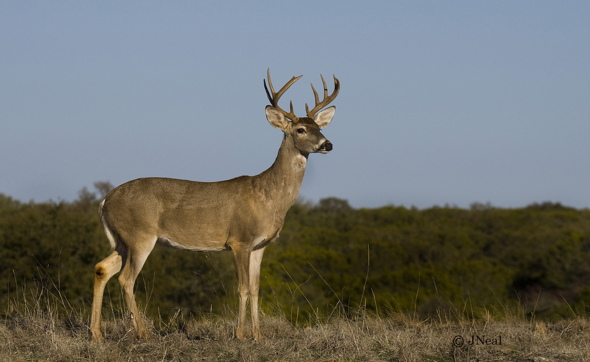
This is a Texas Hill Country buck that is almost a ten point. It was a beautiful day to be taking pictures.
50D
1/640
7.1
ISO 100
FL 140
Comments
6 comments
Comment posted by Luke Ormand on February 11, 2010 at 9:53 PM
A handsome buck with a nice rack. I like the composition and how the deer seems to be looking out over its surroundings. A touch more room on the bottom would have been nice.
- Luke
Registered on February 4, 2009, 1093 Posts, 7035 Comments
Comment posted by Robert Bunch on February 12, 2010 at 1:43 AM
A nice looking buck. Nice light, pose and clean BG.
Registered on May 18, 2004, 124 Posts, 2503 Comments
Comment posted by Lon Sharp on February 12, 2010 at 10:26 AM
This is a good clean capture with clear detail and a catchlight in the eye. Maybe more space at the bottom would have been better, but if that would have added OOF vegetation, then I prefer it as you posted. I suppose it would have been nice if you had conjured some clouds or weather to add drama to the all blue sky!?
Registered on December 9, 2007, 258 Posts, 9892 Comments
Comment posted by Ken Archer on February 12, 2010 at 5:48 PM
Sweet portrait of this handsome guy!
Ken Archer
Registered on October 28, 2004, 222 Posts, 6683 Comments
Comment posted by mark cillo on February 13, 2010 at 2:08 AM
Great pose from this whitetail. Nice shot
Registered on July 27, 2008, 143 Posts, 1483 Comments
Comment posted by Brad Hill on February 14, 2010 at 9:48 AM
Hi Jack,
A simple but pleasing composition (and with very nice detail on the buck). Lon has stole my thunder on this one - I totally agree with his statement "Maybe more space at the bottom would have been better, but if that would have added OOF vegetation, then I prefer it as you posted." I like the parallel line thing you have going on in the background - nice in-focus band of foreground, followed by that appropriately blurred band of green trees, and then the featureless blue sky. Maybe I've got used to looking at a lot of heavily saturated images, but I do wonder if a VERY slight increase in saturation here (maybe 5%) would add a little more life to the image? Just a thought...
Cheers...thanks for sharing this image...
Brad
Registered on May 29, 2007, 431 Posts, 6061 Comments

Comments
6 comments- Luke
Ken Archer
A simple but pleasing composition (and with very nice detail on the buck). Lon has stole my thunder on this one - I totally agree with his statement "Maybe more space at the bottom would have been better, but if that would have added OOF vegetation, then I prefer it as you posted." I like the parallel line thing you have going on in the background - nice in-focus band of foreground, followed by that appropriately blurred band of green trees, and then the featureless blue sky. Maybe I've got used to looking at a lot of heavily saturated images, but I do wonder if a VERY slight increase in saturation here (maybe 5%) would add a little more life to the image? Just a thought...
Cheers...thanks for sharing this image...
Brad