Nature Photographers Network
This is the preserved archive of the original Nature Photographers Network. The community continues at naturephotographers.network.
Repost (No Title yet)
‹ PreviousLandscape GalleryNext ›

Repost (No Title yet)

by Helio Cristovao

Gallery: LandscapePosted February 23, 2010235 views11 comments
Hi all,
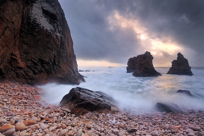
One more effort rendering Portuguese coastline.

I was apprehensive about publishing this photo, not sure about the comp. and sky. But the cliff details and light just draws my attention, so... along with some nice light and action, guess it may work after all.
What´s your opinion on this image?
Thanks for all comments/critiques.


This is one shot exposed at f/19 1/2s ISO100
It seems I can´t come up with a title for this just for about now. If anyone care for suggestions, are welcome and appreciated! :wink:

Comments

11 comments
Comment posted by Andreas Resch on February 23, 2010 at 5:30 AM
Nice one, Helio. Love the comp and the details. Some thoughts (tested in PS) - bring some warmth to the shore stones on the right. Boost saturation overall just a little. Darken the big rock and th upper sky next to it just a little.
Registered on November 14, 2007, 322 Posts, 6101 Comments
Comment posted by Rui Vieira on February 23, 2010 at 7:27 AM
Cool shot Hélio :toast: I like the comp and the sky as well
Registered on September 11, 2008, 39 Posts, 246 Comments
Comment posted by Paul Duval on February 23, 2010 at 8:25 AM
I like it, Portugal has some rugged coastline. My only small nit would be the sun glow in the clouds is just a hair too bright. But that's just a personal preference. It's a very strong and good image Helio.

Paul
Registered on June 30, 2009, 508 Posts, 1907 Comments
Comment posted by Dorin Bofan on February 23, 2010 at 8:29 AM
This is quite stunning, Helio! I looked at it for a while, but I just can't find something wrong with the composition. I think it's excellent. And the blown sky adds a lot imo. One very minor nit I'm seeing is the difference in exposure in the fg water. It's lighter on the left side. As for the title, nothing comes to mind right now (and I'm not good with titles anyway), but maybe you could relate it with the direct light coming from the hole in the clouds.
Registered on April 30, 2007, 122 Posts, 3086 Comments
Comment posted by Kurt Budliger on February 23, 2010 at 9:35 AM
Very pretty scene and nice comp, I particularly like the warm cobbles in the foreground. I agree with Dorin's suggested burning in of the brightest water in left foreground. Regardless, nice work.
Registered on June 11, 2006, 113 Posts, 2116 Comments
Comment posted by Helio Cristovao on February 23, 2010 at 11:11 AM
Yes guys, you´re right. I´ll get to that. Repost soon.
Registered on September 15, 2009, 83 Posts, 434 Comments
Comment posted by Helio Cristovao on February 23, 2010 at 11:44 AM
Repost.
Reviewed processing on this image on the following items:
fixed warmth tones on LRC and bottom stones and increased brightness a bit
added few warmth to the glowing sky area and water reflection
increased a bit more light on right side of the water, the darker area.
Hope to hear your thoughts about it.
Thanks

Registered on September 15, 2009, 83 Posts, 434 Comments
Comment posted by Luis Argerich on February 23, 2010 at 3:12 PM
Beautiful image I really love how the brigh "hole" in the sky gets framed between the two rocks, the foamy shoreline is also really interesting. Excellent shot!
Registered on December 22, 2009, 91 Posts, 1349 Comments
Comment posted by Tony Kuyper on February 23, 2010 at 4:39 PM
Very dramatic and well done, Hélio . I really like the texture of the foreground. Don't laugh, but it reminded me of lots of potatoes when I first saw it. You've really pulled a lot of light and texture out of this. The lights and darks are especially well-textured given the light. My only suggestion would be to maybe increase the contrast of the foreground rocks to make them a little lighter and add a bit of drama to them that increased contrast can sometimes provide.
Registered on November 1, 2003, 364 Posts, 22328 Comments
Comment posted by Will Campbell on February 23, 2010 at 5:28 PM
Yeah, I think I like the repost better. Very cool image... I like it a lot!
Registered on July 4, 2007, 38 Posts, 281 Comments
Comment posted by David Edwards on February 24, 2010 at 3:42 AM
Love this shot, Helio. I do like the structure of your comp, and the rock detail is very nice. For my tastes I would increase contrast and perhaps darken the fg stones. They just seem a bit too bright against the rest of the image.
:toast:
Registered on December 6, 2008, 142 Posts, 2623 Comments