Gallery: LandscapePosted February 28, 2010159 views8 comments
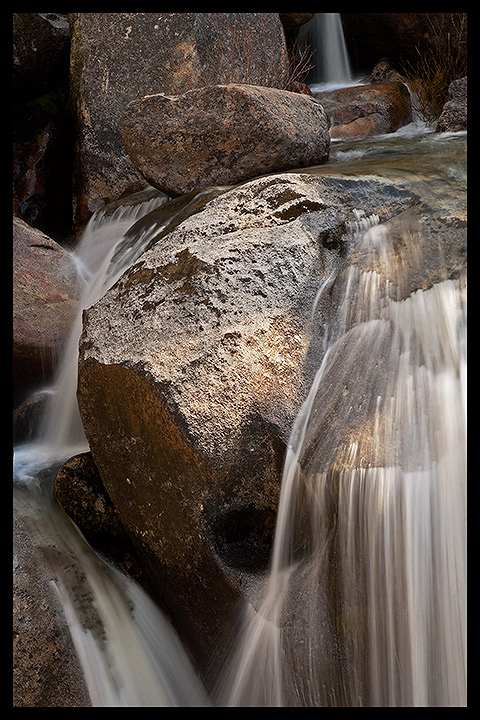
Taken in Yosemite National Park, June 14th, 2009.
All c&c appreciated.
Color or B&W?
Digital Rebel XTi
28-105mm at 70mm
ISO 100
0.4s
f/22
Jonathon Heywood,
Eastern Sierra
Comments
8 comments
Comment posted by Jonathan Heywood on February 28, 2010 at 8:02 PM
Here's the B&W version.
Registered on February 22, 2010, 18 Posts, 87 Comments
Comment posted by Patti McKinnon on February 28, 2010 at 8:34 PM
I prefer the earthy tones in the color version, and I like the juxtaposition of the rough rock and silky water.
Registered on September 4, 2009, 6 Posts, 14 Comments
Comment posted by Tony Kuyper on February 28, 2010 at 10:21 PM
I like the different textures in this. I think I prefer the B&W.
Registered on November 1, 2003, 364 Posts, 22328 Comments
Comment posted by Barry Vangrov on March 1, 2010 at 4:58 PM
I'd go with the B&W but maybe with some added contrast in the midtones. I'd also clone out the stray branches in front of the upper fall but it's that's a preference. Overall a well captured image.
Registered on September 1, 2009, 148 Posts, 749 Comments
Comment posted by Jonathan Heywood on March 1, 2010 at 6:49 PM
Thanks Barry. I applied the adjustments you recommended to the best of my abilities (I am a novice Photoshop user) and here is the result.
Jonathon Heywood
Registered on February 22, 2010, 18 Posts, 87 Comments
Comment posted by Ed Lowe on March 1, 2010 at 7:31 PM
The B&W for me, Jonathon. It seems to make the textures really pop verses the color version. I really like what you did with the repost.
Ed
Registered on February 7, 2004, 414 Posts, 7115 Comments
Comment posted by Chris Chamberlain on March 1, 2010 at 8:49 PM
I spent hours wandering around the boulders below lower Yosemite Falls last autumn. This is better than anything I got!!! It's challenging to overcome the relative lask of tonal contrast and there, but you did pretty well with this.
Chris
Registered on March 13, 2007, 500 Posts, 8365 Comments
Comment posted by Mel Ladewig on March 3, 2010 at 11:03 AM
In color, I think a slightly cooler white balance could help the water stand out a bit more. You might even consider blending two white balances together.
Mel-
Registered on July 24, 2005, 114 Posts, 1205 Comments

Comments
8 commentsJonathon Heywood
Ed
Chris
Mel-