Nature Photographers Network
This is the preserved archive of the original Nature Photographers Network. The community continues at naturephotographers.network.
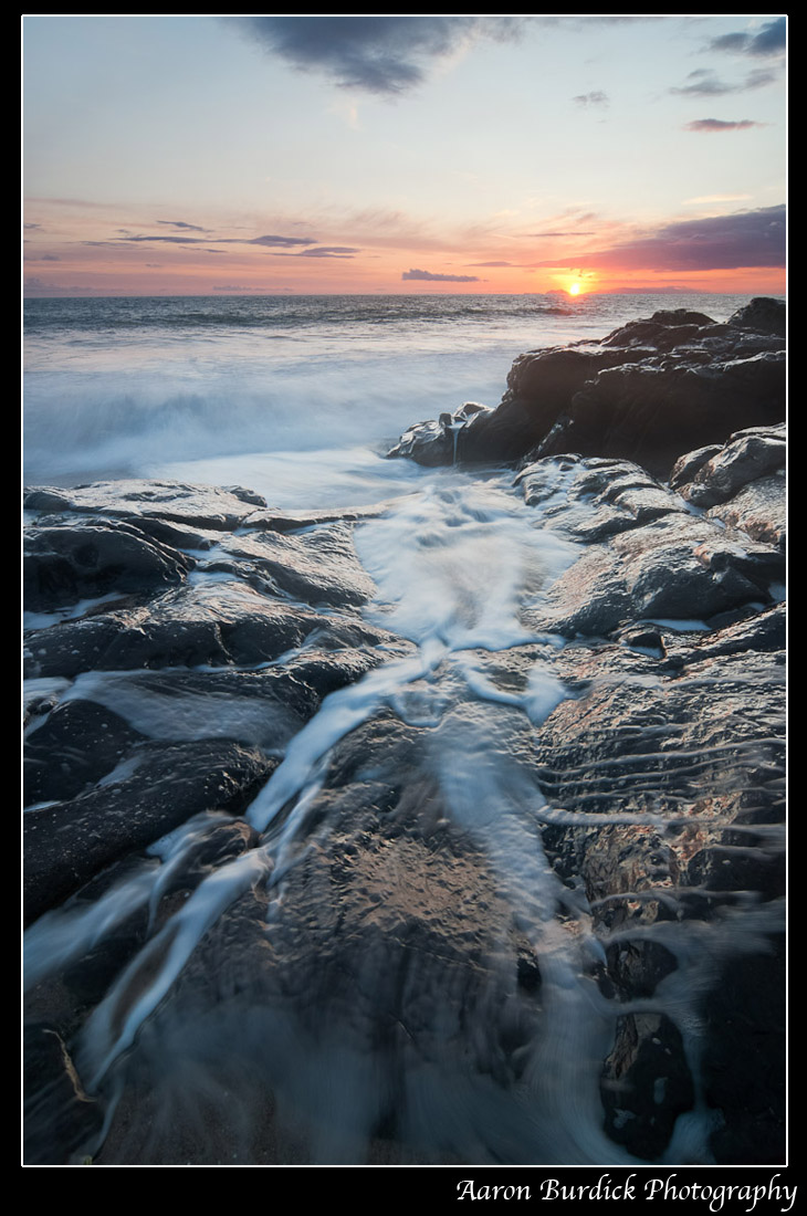
Point Mugu Sunset
‹ PreviousLandscape GalleryNext ›

Point Mugu Sunset

by Aaron Burdick

Gallery: LandscapePosted March 3, 2010158 views12 comments
It has been a long time since I posted to NPN. Life has kept me quite busy but I'm back and ready to hear your comments and post more comments on all of your wonderful work! :smile:

This shot was taken at Point Mugu State Park north of Malibu. It is a manual blend of two shots. This was quite difficult since every time a wave came in my tripod moved slightly, forcing me to recompose. The constant threat of sea spray was also a challenge (a fun challenge!). The blend was done using luminosity masks (via Jay and Varina Patel's iHDR technique), which were further refined using brushes and blurring.

Be sure to check out the larger version.

All comments welcome. Thanks!

Tech info:
Nikon D300
Tokina 12-24mm lens (at 12mm)
0.6 sec at f/13
1/20 sec at f/13
ISO 200

Comments

12 comments
Comment posted by Bret Edge on March 3, 2010 at 11:32 PM
Beautiful composition and subtle colors, Aaron. I'd be tempted to increase the contrast a bit as this seems a little low in mid-tone contrast as-is. Either way, very nice image and technique.
Registered on November 1, 2003, 711 Posts, 6363 Comments
Comment posted by Angela McCain on March 3, 2010 at 11:38 PM
Love the image. I like the depth of the photo. Agree with a little extra contrast. Also seems a bit soft.
Registered on April 19, 2009, 367 Posts, 3589 Comments
Comment posted by Aaron Burdick on March 4, 2010 at 12:01 AM
Here is a repost with a little more contrast, especially in the sky. What do you think? Is this a good amount now?

Thanks!

Aaron
Registered on May 1, 2009, 31 Posts, 197 Comments
Comment posted by Justin Reznick on March 4, 2010 at 12:16 AM
I dig the comp Aaron but would love the glare to be off the rocks so we can really see the black contrasting with the spray. Was a polarizer an option?
Registered on November 24, 2009, 79 Posts, 515 Comments
Comment posted by Daniel Cartamil on March 4, 2010 at 12:37 AM
Very cool, and glad you fixed the horizon tilt!
Registered on November 15, 2007, 50 Posts, 601 Comments
Comment posted by Aaron Burdick on March 4, 2010 at 2:51 AM
Justin - that is a good suggestion. I had my polarizer in my bag but there was too much going on (with the conditions) for me to realize to slap it on. It probably would have helped cool the highlights in the foreground. Hooray for lessons learned! :jump:
Registered on May 1, 2009, 31 Posts, 197 Comments
Comment posted by Bruno Silva on March 4, 2010 at 6:01 AM
nice seascape. the water lines here are great, they pull my eyes in, nice colors too. I was going to make the same question as Justin.R about the polarizer, there is too much glare. repost looks better but you could bring it a tad down still, imo. nice work, aaron.
Registered on May 6, 2009, 132 Posts, 1406 Comments
Comment posted by Daman Sidhu on March 4, 2010 at 11:19 AM
Very nice shot Aaron, the water on the fg rocks makes fantastic textures.. also agree with the polarizer option here.. it would have helped cut some glare off the rocks.
Registered on December 16, 2009, 21 Posts, 176 Comments
Comment posted by Phil Pogledich on March 4, 2010 at 1:19 PM
I don't really find the glare to be a deal-breaker here. It's still a very pleasing shot. I agree with Bret about increasing the contrast, even more than in the repost. The rocks seem like they should have more deep shadow areas than they presently do.
Registered on August 24, 2009, 123 Posts, 3099 Comments
Comment posted by Aaron Burdick on March 4, 2010 at 8:42 PM
Ok. I think this will be the final version. I removed the glare from the rocks using a luminosity mask on a curves layer. Next time I will bust out the polarizer but I think my mask did wonders. THANK YOU so much for the suggestions. Your input really helped me turn this photo into something great.
Registered on May 1, 2009, 31 Posts, 197 Comments
Comment posted by Tony Kuyper on March 4, 2010 at 9:17 PM
Final version much improved, Aaron. My preference would be for a bit more color saturation, but that's real personal.
Registered on November 1, 2003, 364 Posts, 22328 Comments
Comment posted by Paul Wegemann on March 5, 2010 at 8:01 AM
Wonderful comp, Aaron! I love the lines of water. I think it's still lacking in contrast and sharpness, but still pleasing to look at. Since the colors are not the main attraction here, have you considered a BW conversion?
Registered on December 14, 2006, 58 Posts, 1888 Comments