Nature Photographers Network
This is the preserved archive of the original Nature Photographers Network. The community continues at naturephotographers.network.
Chocomount + Repost
‹ PreviousLandscape GalleryNext ›

Chocomount + Repost

by Elliot Johnston

Gallery: LandscapePosted March 9, 201057 views6 comments
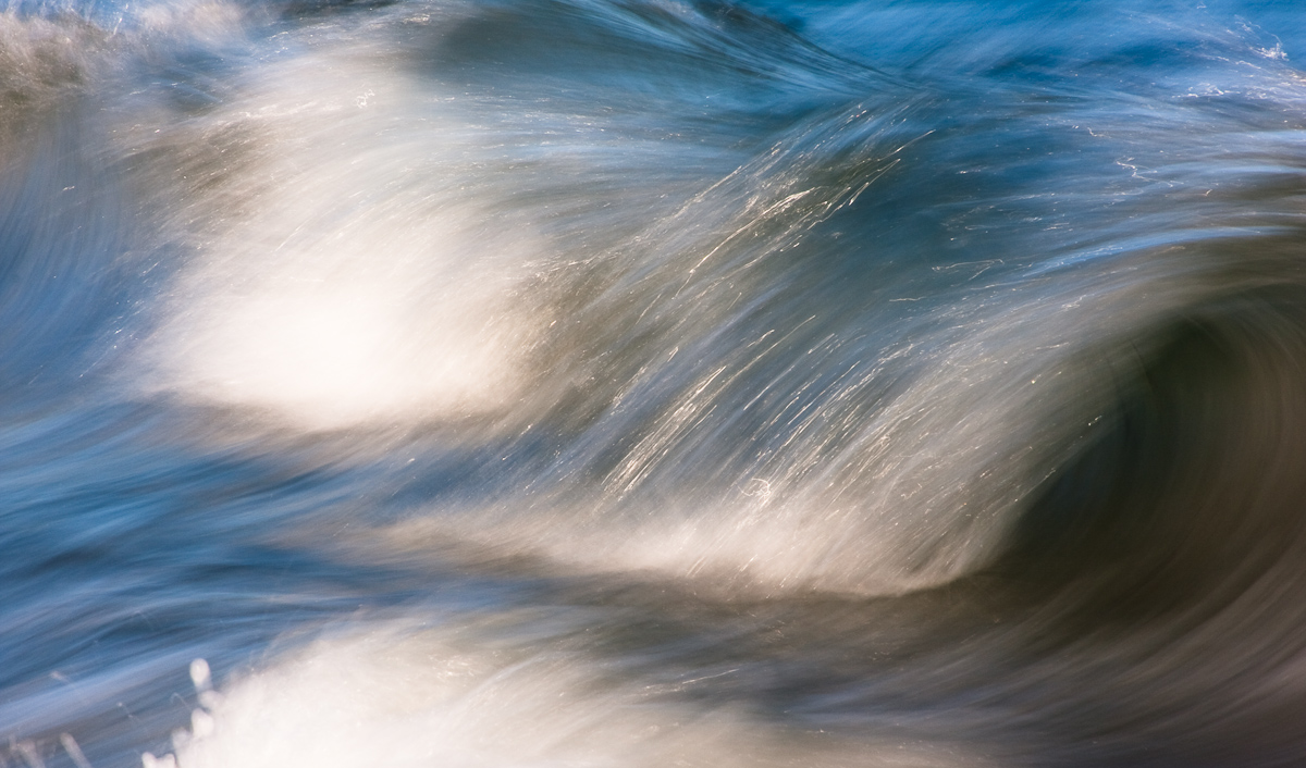
After seeing Daniel's abstract wave post I was reminded of an image that I took this past summer. At the time I was getting weird looks as I chased waves around the beach, but I was enjoying myself all the same. The crashing waves were so tempting in the late afternoon light - they were begging to be photographed :biggrin: I went with a shutter speed of 1/8 as it seemed to give the water the texture I was looking for. Couple of things: 1) Is the bright wave at the bottom of the frame a major distraction? I cropped out as much as I could without throwing off the composition (IMO). 2) Is the underside of the wave on the right too dark? Any feedback would be great.

All comments and suggestions greatly appreciated.

Chocomount Beach, Fishers Island, NY

40D, 28-135

Comments

6 comments
Comment posted by Bruno Silva on March 10, 2010 at 6:55 AM
nice work, elliot. I like these intimate nature scenes a lot. one can nearly feel the sea´s freshness. I think you could bring down the highlights a bit. wouldn´t mind seeing a bit more contrast and sharp to pull more textures out as well, but this really works nicely for me as is. well done.
Registered on May 6, 2009, 132 Posts, 1406 Comments
Comment posted by John&Patty Benway on March 10, 2010 at 9:33 AM
I find this very appealing, and I really like the way you composed it, may be a bit sharper and a touch of contrast, anyway, I like it very much. Nice work.
John
Registered on May 12, 2006, 626 Posts, 8700 Comments
Comment posted by R.Bill Moser on March 10, 2010 at 10:28 AM
This one works nicely for me. I like your composition. I would bring down the highlights just a bit.The underside of the wake to the right is not too dark for me. I agree to give a bit more contrast.
Registered on January 29, 2010, 285 Posts, 4281 Comments
Comment posted by Elliot Johnston on March 10, 2010 at 6:36 PM
Thanks for the comments. Here is a repost with some added contrast and sharpness. I also brought down the highlights some.

Let me know what you think.
Registered on November 11, 2009, 23 Posts, 288 Comments
Comment posted by Bruno Silva on March 10, 2010 at 7:21 PM
the repost looks much better, imo, Elliot! a keeper for sure..... :toast: !
Registered on May 6, 2009, 132 Posts, 1406 Comments
Comment posted by Daniel Ewert on March 10, 2010 at 11:36 PM
Very nice! Another vote for the repost. I am not bothered at all by the darker underside of the wave. These things are harder than they look. Takes a bazillion attempts sometimes to get it just right. Well done!
Registered on June 2, 2009, 103 Posts, 1500 Comments