Nature Photographers Network
This is the preserved archive of the original Nature Photographers Network. The community continues at naturephotographers.network.
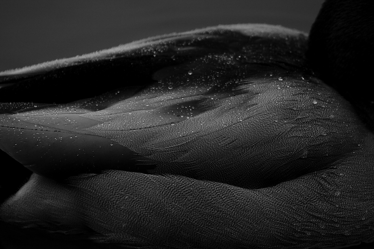
Featherdrops
‹ PreviousAvian GalleryNext ›

Featherdrops

by Erik Van de Water

Gallery: AvianPosted March 17, 201093 views7 comments
Also taken at Crystal Springs Rhododendron Garden. Please look at the larger image. I was wondering if anyone could tell that I just pulled the saturation bar all the way down in the tool box in Canon dpp and did not use the lengthy photoshop method. Should I have used more depth of field here? This isn't cropped at all so would anyone like to suggest a crop?
Thanks for your comments and critiques!
1/500 sec
f/5.6
-2/3 ev
iso 800
400mm

Comments

7 comments
Comment posted by Bryan Hix on March 17, 2010 at 11:40 PM
A few comments: I think this belongs more in the photo art gallery, I wouldn't use more DOF, but I would probably crop tighter, and lastly it's a little too dark on my monitor, so maybe just lightening a bit might help. Interesting concept though. :smile:
Registered on June 13, 2008, 117 Posts, 755 Comments
Comment posted by Diane Vatcher on March 18, 2010 at 12:53 AM
I like the subject and also the high lights on the drops. You may wish to go and adjust the individual color sliders to increase tone in the image. That might help the overall darkness.
I think the dof is fine. I also agree with Bryan, that it might do better in the Art Gallery section. I like the image a lot.

:smile:
Registered on November 30, 2009, 8 Posts, 27 Comments
Comment posted by Keith Bauer on March 18, 2010 at 9:26 AM
In your question about just pulling the saturation slider down.... No you can't tell. You could do exactly the same thing in Photoshop to remove all color. The image is way too dark to provide the impact it needs for me.
Registered on November 20, 2003, 458 Posts, 4836 Comments
Comment posted by Jim Hackley on March 18, 2010 at 5:05 PM
Interesting, if the goal is to portray a B&W bird abstract I might be inclined to do a little more with it.
More DOF would of helped in getting the top part of the image sharper. I do not think a crop would add anything. It would also be interesting to compare this with a color version with water droplets depending on the color variation of the feathers. I guess it just depends on what you were trying to convey with this image.
Registered on September 17, 2009, 302 Posts, 5535 Comments
Comment posted by Ron Bielefeld on March 18, 2010 at 5:58 PM
I am just not sure if this works for me. I agree with others that it may just be a bit too dark. The droplets on the very smooth tertial feathers grap my attention in the larger version. I would def work on a crop of this if it were mine, but I cannot suggest one. I would need the image to play around with. Interesting concept here.
Registered on December 6, 2008, 360 Posts, 7132 Comments
Comment posted by Nate Chappell on March 18, 2010 at 11:06 PM
I'd crop in from the top and the right and go a little lighter on this Erik, nice to see someone trying something different. :toast:
Registered on February 1, 2006, 1158 Posts, 19528 Comments
Comment posted by Jim DeWitt on March 19, 2010 at 12:20 AM
Interesting patterns in the feathers, but it doesn't really grab me. I suggest trying some of the suggestions above and seeing if it gives the image more punch. I do think that to work it's going to have to be razor-sharp.
Registered on August 28, 2006, 1240 Posts, 8506 Comments