Nature Photographers Network
This is the preserved archive of the original Nature Photographers Network. The community continues at naturephotographers.network.
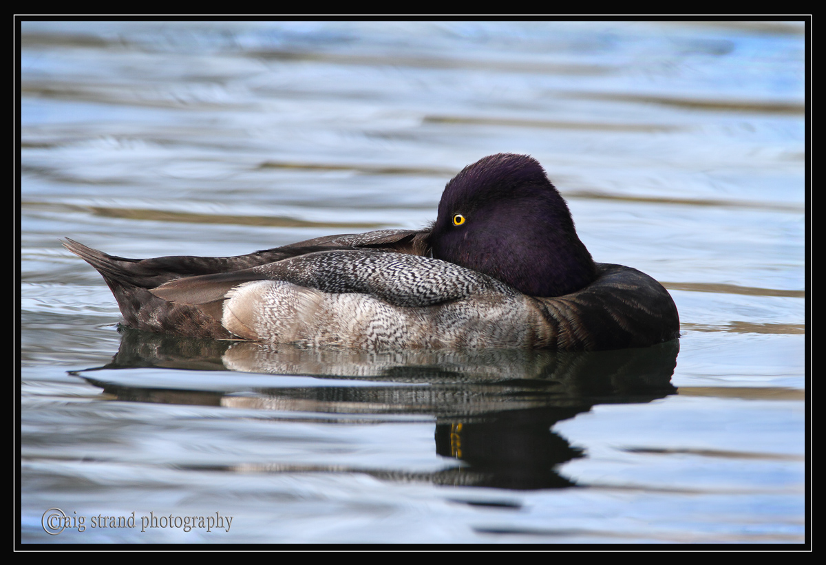
Lesser Scaup  with REPOST
‹ PreviousAvian GalleryNext ›

Lesser Scaup with REPOST

by Craig Strand

Gallery: AvianPosted March 21, 201076 views16 comments
I captured this Lesser Scaup a week or two ago, taking an afternoon break. Cropped to 80% in an effort to move him off dead center. I should have left the converter off to give more canvas and cropping options.
Larger version available

REPOST BELOW WITH BIRD MOVED TO RIGHT SIDE

canon 7D
caonon 600mm f4.L USM w/1/4 converter
F/9.5 1/350 ISO 500
Manfrotto tripod, Wimberly head

Comments

16 comments
Comment posted by Cheryl Molennor on March 21, 2010 at 4:34 PM
Beautiful light Craig showing the nice head and feather colors. I like the water ripples as well
Registered on June 30, 2009, 300 Posts, 5051 Comments
Comment posted by Terry Sohl on March 21, 2010 at 4:50 PM
Nice job Craig, love the open eye with the tucked bill. I never know what to do on composition on a shot like this, when the body is facing one way, and the head/eye the other. Which direction to put leading space?
Registered on November 1, 2003, 513 Posts, 6889 Comments
Comment posted by Monica Siri on March 21, 2010 at 4:52 PM
Craig,
excellent detail, nice water and lazy pose of this nice duck. Well done! :toast:
Registered on September 20, 2009, 132 Posts, 3764 Comments
Comment posted by Ron Bielefeld on March 21, 2010 at 5:16 PM
A very nice comp Craig. I like the water and the resting pose.
Registered on December 6, 2008, 360 Posts, 7132 Comments
Comment posted by Ron Dudley on March 21, 2010 at 7:21 PM
The pose makes the shot for me Craig - I've yet to see it in this species. I also like the water - especially the top third of the frame. Personally, I'd have put the "leading space" to the left of the bird but that's just me.
Registered on March 30, 2007, 437 Posts, 10915 Comments
Comment posted by Mia McPherson on March 21, 2010 at 7:34 PM
Craig,

I like the visible eye and the bill being tucked in, the reflection especially with the multiple eyes in it, the hues of the water and the resting pose.

I would allow for more space on the left side of the frame since that is the direction the duck is facing.
Registered on June 25, 2007, 491 Posts, 12566 Comments
Comment posted by Craig Strand on March 21, 2010 at 8:13 PM
I found the comments suggesting the crop should be in favor of less room on the right side and more room on the left, the side the turned head is facing. I could probably go either way but I've done just that with this 2nd image, and wonder if now the breast area and the way his BODY IS FACING, doesn't make the right side look crowded. Maybe the solution in this case would have been to leave him centered?
Registered on March 30, 2008, 416 Posts, 2885 Comments
Comment posted by Nate Chappell on March 21, 2010 at 9:50 PM
Great detail here Craig and nice to get the purples on the scaup's head, not always easy. I think you are right, dead center is probably the best for this particular image. :toast:
Registered on February 1, 2006, 1158 Posts, 19528 Comments
Comment posted by David Sparks on March 21, 2010 at 10:00 PM
Craig:
Centered would work for me. I like the pose (unlike Ron, I see it often in FL) and the excellent detail in black/white stripes. I don't recall seeing the feathers in positions that produced this much heterogeneity in the stripe pattern. I have trouble with proper exposure of scaups but your exposure looks perfect to me. :toast:
Registered on May 26, 2007, 290 Posts, 4270 Comments
Comment posted by Wayne Rhodus on March 21, 2010 at 10:15 PM
I prefer the first crop, excellent detail and relaxed pose. Very nice Craig.
Registered on November 16, 2003, 157 Posts, 3326 Comments
Comment posted by Kurt Bowman on March 21, 2010 at 11:42 PM
Beautiful shot Craig...love the detail!
Registered on June 19, 2008, 1005 Posts, 8028 Comments
Comment posted by Gary Gulash on March 22, 2010 at 1:54 AM
Larger view is tremendous, I love that shade of deep purple on the head with the yellow eye and the fine markings on the wing - mother nature is a heck of a designer. I prefer your original post.
Registered on January 28, 2005, 879 Posts, 12098 Comments
Comment posted by Rob Drummond on March 22, 2010 at 6:33 AM
Great detail in the larger image Craig - like the alertness despite having its head tucked away

cheers
Rob
Registered on November 8, 2003, 617 Posts, 8267 Comments
Comment posted by Brian Gatlin on March 22, 2010 at 8:50 AM
nicely exposed and great details, Craig. I think centered is probably the way to go here.
Registered on March 21, 2009, 202 Posts, 4187 Comments
Comment posted by Richard Ditch on March 22, 2010 at 1:17 PM
Nice detail; fine water.

I'd go with equal space on both sides here and prefer the original composition to that of the repost.
Registered on November 1, 2003, 1031 Posts, 12705 Comments
Comment posted by Simon Bennett on March 22, 2010 at 4:54 PM
I like the chill-out pose and detail. I'd go centred.
Registered on February 4, 2007, 350 Posts, 4614 Comments