Nature Photographers Network
This is the preserved archive of the original Nature Photographers Network. The community continues at naturephotographers.network.
Radiance
‹ PreviousLandscape GalleryNext ›

Radiance

by Cory O'Neill

Gallery: LandscapePosted April 9, 2010469 views23 comments
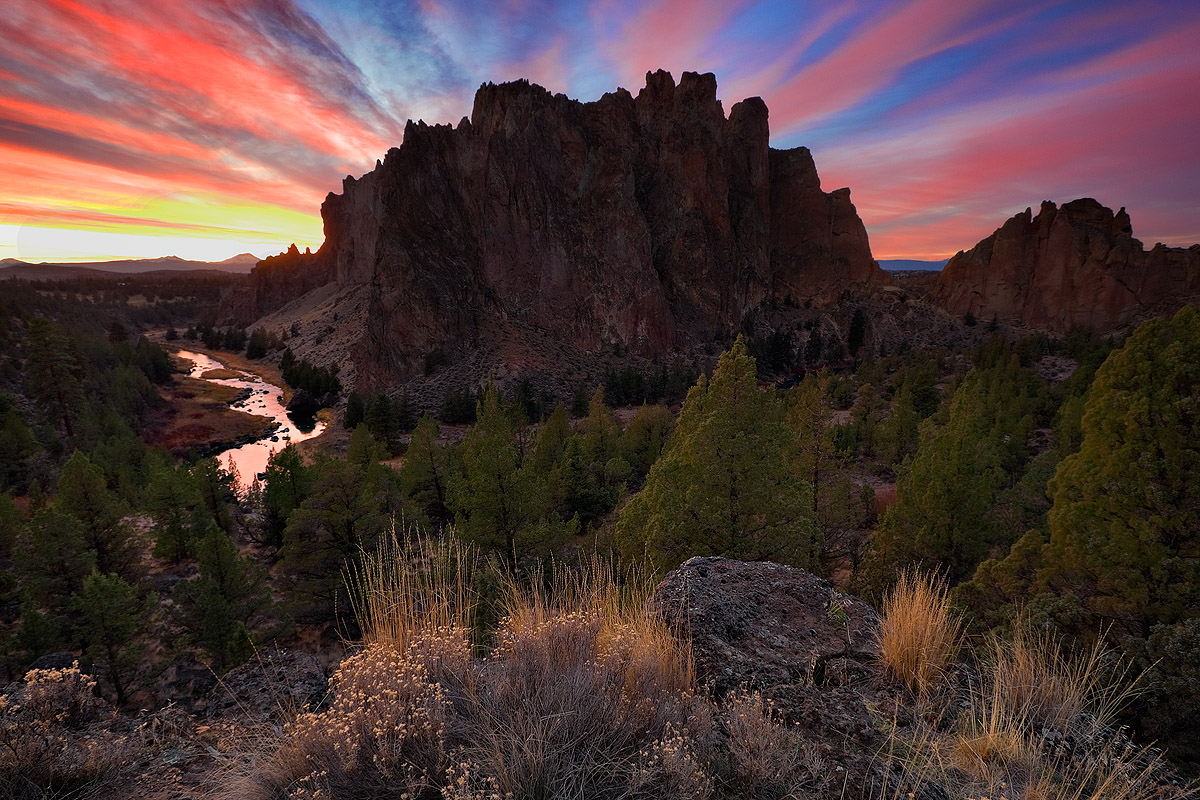
This is an older image from a few years ago, taken one evening as the sky cleared after a spring storm. After several attempts, I am finally feeling better about the processing, but I'd appreciate any feedback!

Yes, unfortunately, the background highlights on the left are blown (and this with bracketing!). This was a capture mistake, and I had originally decided to toss the image. But, after spending some good time (actually, way way too much time) trying virtually every possible method I could find to try to make it look "right", I've decided to simply accept the image as it is, blown highlights and all.

The larger view is worth the look.

Thanks!

Comments

23 comments
Comment posted by Neale Dyster on April 9, 2010 at 7:15 AM
I like the composition and don't mind the blown highlights, but man that sky! It just looks a little too unreal for me, but then again, I wasn't there!
Registered on February 19, 2008, 94 Posts, 738 Comments
Comment posted by Matt Anderson on April 9, 2010 at 7:49 AM
Thats quite the sky!
Lovely colors!
:toast:
Registered on September 6, 2007, 346 Posts, 2696 Comments
Comment posted by Aaron Feinberg on April 9, 2010 at 8:04 AM
That sky is unbelievable. The comp feels tight on the bottom for sure and maybe a bit of digital grad to brighten the lower 1/2 but def a keeper...if not for the sky alone :)

aF
Registered on October 26, 2009, 399 Posts, 2789 Comments
Comment posted by Nick Moore on April 9, 2010 at 8:52 AM
Definitely a keeper, even with the bright highlights. The sky is just amazing, love the way it radiates from the rock. I really like the light on the fg grasses too, if I was going to suggest any further PP, I'd maybe just lighen the main rock a tad more. Great image!.
Registered on May 23, 2006, 93 Posts, 2228 Comments
Comment posted by Larry Fischer on April 9, 2010 at 9:16 AM
The big rendition does show some detail on the shadow portion of the mountain. Not totally necessary with the silhouette effect.

I don't know how much manipulation you did but on my monitor the sky looks a bit overdone.

I know color sells but this is, for the lack of a better term, a little like a comic book color rendition. It seems out of sync with the foreground.

Can you put a toned done photos someplace for comparison and audience judgment?

the fisch
Registered on July 28, 2008, 155 Posts, 874 Comments
Comment posted by Bill Chambers on April 9, 2010 at 10:25 AM
A lovely scene and a nice image, even given the blown highlights. I'm on an uncalibrated monitor at the moment, but the sky looks good to me. I would like to see more details in the shadow portion of the peak though.
Registered on April 10, 2005, 753 Posts, 21216 Comments
Comment posted by Abdullaziz Bin Ali on April 9, 2010 at 11:35 AM
Wow
I love every pixel
the sky is gorgeous
Registered on May 31, 2009, 112 Posts, 1590 Comments
Comment posted by Floris van Breugel on April 9, 2010 at 12:04 PM
Incredible clouds Cory, though I wish the landscape itself had a bit more light on it. Regarding the blown highlights, you can try cloning a little of the yellow over them at a low opacity to make them look less blown.
Registered on December 19, 2008, 306 Posts, 4840 Comments
Comment posted by Mark Metternich on April 9, 2010 at 12:58 PM
Awesome color! Cool photo.

I would say the issue is (at least to me) that light is not hitting your main subject matter (Smith Rock Cliffs). It plays such a large role in the image but is dark... I remember learning this from a friend of mine Dan Sherwood when we were shooting Trillium Lake at sunrise. I was shooting off all my images when the sky lit up. He shot his when the mountain got the sidelight. I also shot with him during that time and the side lit images were much more appealing even though the "Wild Light" was not going on in the sky...

My 2 cents.
Registered on June 19, 2009, 276 Posts, 6240 Comments
Comment posted by R.Bill Moser on April 9, 2010 at 1:01 PM
The sky is awesome. i also like your comp. it is definetely a keeper. I don't mind the blown highlights here.
Registered on January 29, 2010, 285 Posts, 4281 Comments
Comment posted by Cory O'Neill on April 9, 2010 at 1:27 PM
Here's a version with desaturated sky and cooler shadow tones. Let me know what you think. Thanks!
Registered on October 4, 2008, 28 Posts, 273 Comments
Comment posted by Cory O'Neill on April 9, 2010 at 1:31 PM
Mark and Floris- I totally agree. I have come back many times in the morning to shoot this same comp, but never (yet) had the sky. This is a west-facing shot, so December mornings are ideal. I just haven't gotten the clouds. Do you think the second version improves on this?
Registered on October 4, 2008, 28 Posts, 273 Comments
Comment posted by Dean Sauskojus on April 9, 2010 at 4:27 PM
Fantastic image. Unbelievable sky. Only thing I would do is bring up the light on the monolith to match the foreground better. This is a keeper.

Sorry I didn't see the repost. Much better.
Registered on September 29, 2009, 137 Posts, 2659 Comments
Comment posted by Jeremy Kessler on April 9, 2010 at 5:13 PM
Repost is killer. Great shot.
Registered on September 13, 2007, 36 Posts, 1283 Comments
Comment posted by Kory Lidstrom on April 9, 2010 at 7:23 PM
It's a pretty darn nice image, I'd say. The blown highlights are only a minor nit for me. The composition is strong, and the clouds streaks are top notch in both color and direction.
Registered on November 19, 2008, 49 Posts, 1035 Comments
Comment posted by Kory Lidstrom on April 9, 2010 at 7:26 PM
Hmm, I guess I'm in the minority but I think the repost is far inferior. It doesn't look natural to me, and furthermore looks washed out.
Registered on November 19, 2008, 49 Posts, 1035 Comments
Comment posted by John Williams on April 9, 2010 at 7:43 PM
Nice Cory! The repost looks great, except that I would keep the foreground lighting of the original.
Registered on September 6, 2007, 221 Posts, 5985 Comments
Comment posted by Cory O'Neill on April 9, 2010 at 7:53 PM
Here's a second repost, somewhere in the middle of the original and the second. I pushed the fg contrast up a bit, and other minor color fixes.

Let me know what you think!
Registered on October 4, 2008, 28 Posts, 273 Comments
Comment posted by Joel Hazelton on April 9, 2010 at 9:53 PM
Hi Cory,

That is one amazing sky and a beautiful overlook. I absolutely love the light on the foreground grasses and the reflection of the sky on that stream is killer. The third post is my favorite.

Overall, however, I don't personally feel there's enough good light to hold my interest throughout the scene. I'm very drawn to the foreground, the stream and the sky, but my eye gets lost in the rest of the image. Lightening the highlights in the foreground would help, but for the most part, I think it's a scene extremely worth revisiting during sunrise. I'd love to see some beautiful lighting on that butte.
Registered on August 6, 2008, 194 Posts, 1315 Comments
Comment posted by Greg Cope on April 9, 2010 at 10:18 PM
This is pretty freekin' nice! It really sucks me in. My only minor critique would be the truncated foreground - which I'd like to see a bit more of. Processing wise, those highlights don't bother me a bit.
Registered on January 22, 2007, 212 Posts, 2737 Comments
Comment posted by Thomas Creel on April 10, 2010 at 12:28 AM
I think we make a much bigger deal than we should of blown highlights. It certainly doesn't ruin this shot for me.

On the larger version, though, I can see distinct circles in the areas around the highlights where you were doing the PS work.
Registered on November 1, 2003, 104 Posts, 852 Comments
Comment posted by Ken Johnson on April 10, 2010 at 9:16 PM
Cory, I personally like the scene. The sky is awesome colors. I also like the light & shadows. I think the comp is good. There's a little blow out in the sky, but no big deal in MHO! :toast:
Registered on March 7, 2010, 71 Posts, 272 Comments
Comment posted by David Edwards on April 12, 2010 at 6:11 AM
There are so many wonderful elements in this image that the blown sky is only a minor issue. The 2nd repost is my pick... beautiful warm tones and the lighter landscape looks a lot better. The fanning sky is just awesome. Must have been quite an experience. Excellent!
Registered on December 6, 2008, 142 Posts, 2623 Comments