Nature Photographers Network
This is the preserved archive of the original Nature Photographers Network. The community continues at naturephotographers.network.
High Tide Overflow
‹ PreviousLandscape GalleryNext ›

High Tide Overflow

by Doug Roane

Gallery: LandscapePosted May 7, 2010196 views12 comments
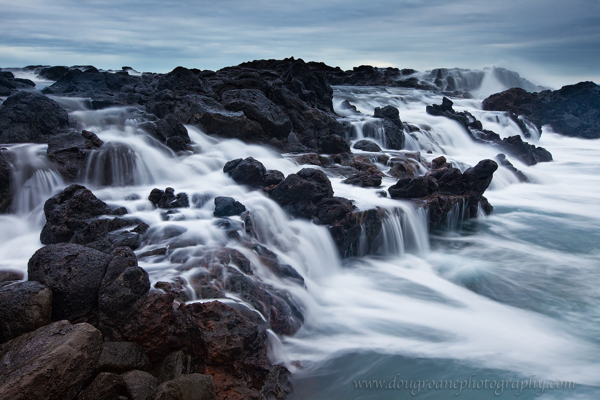
Near Honolua in Western Maui. I was so enchanted by this area that I went back 4 different times. Not being from the ocean, I was amazed at how this area changed from a calm, peaceful set of tide pools to a rushing, treacherous torrent.

I have provided both the color and B&W versions. The scene lends itself well to monochrome, but I feel like the color is more moody. I would love to hear your opinions.

Canon 5DII. 16-35. ISO 400. f/16. 2 sec. LARGER VERSION provided.

Comments

12 comments
Comment posted by Doug Roane on May 7, 2010 at 2:55 AM
Registered on December 12, 2008, 213 Posts, 2226 Comments
Comment posted by Stuart Williams on May 7, 2010 at 4:14 AM
doug, i love these kinds of scenes and have a few sitting around in various places in my hard drive and stored in sleeves. yours works well with nice diagonals and contrasts. i wouldn't have minded a slightly quicker shutter speed (+/- 1s) but you may have been constrained there. b&w vs colour - each has strenghts.
Registered on December 7, 2007, 247 Posts, 4792 Comments
Comment posted by Gary McGhee on May 7, 2010 at 6:55 AM
This is an incredible shot Doug, such a beautiful seascape. I think the movement of the sea is perfect. Definately the colour version for me.

Gary.
Registered on April 15, 2010, 142 Posts, 2416 Comments
Comment posted by Mitch Moraski on May 7, 2010 at 8:37 AM
I like the BW version better Doug. Great comp! Love the flow with perfect SS for my taste. Lovely patterns and texture here. :toast:
Registered on August 3, 2008, 105 Posts, 590 Comments
Comment posted by Nick Bristol on May 7, 2010 at 9:53 AM
This is really nice, Doug. The comp here is very nice and all the waterfalls created by that rushing water look great. I like both versions but like the mood with the color the best I think. I bet the b/w would make a very nice large print however. I can see why you went back 4 times.

Nick Bristol
Lone Rock, Wi
Registered on February 1, 2004, 752 Posts, 14140 Comments
Comment posted by John Williams on May 7, 2010 at 10:05 AM
What I really like here is cascades stack up in a diagonal across the photo; it holds the eye really well, especially with the flow of water running the opposite way. I vote color, but then I often do.
Registered on September 6, 2007, 221 Posts, 5985 Comments
Comment posted by Jeremy Kessler on May 7, 2010 at 12:14 PM
Great work Doug, I prefer the color.
Registered on September 13, 2007, 36 Posts, 1283 Comments
Comment posted by Eva McDermott on May 7, 2010 at 12:23 PM
Color for me this time Doug. The color is a lot more moody. I like the overall light quality as well. Reminds me of Maine.
Registered on January 4, 2009, 1015 Posts, 13229 Comments
Comment posted by Morris McClung on May 7, 2010 at 1:13 PM
Both work equally well. The color is gorgeous, and the b&w is quite evocative.
Registered on May 7, 2007, 670 Posts, 19650 Comments
Comment posted by Bill Chambers on May 7, 2010 at 2:15 PM
I agree that the color is more moody, much more in fact. I think this is very nice Doug.
Registered on April 10, 2005, 753 Posts, 21216 Comments
Comment posted by Tony Kuyper on May 7, 2010 at 3:54 PM
I prefer the B&W here. The textures and water movement seem to come through better. I really like the scene. Somewhat intimate, but with plenty to look at.
Registered on November 1, 2003, 364 Posts, 22328 Comments
Comment posted by Stan Rose on May 7, 2010 at 7:08 PM
Wow, one of the cooler seascapes ive seen recently--perfect exposure!
Registered on September 15, 2005, 836 Posts, 17099 Comments