Gallery: LandscapePosted May 7, 2010449 views23 comments
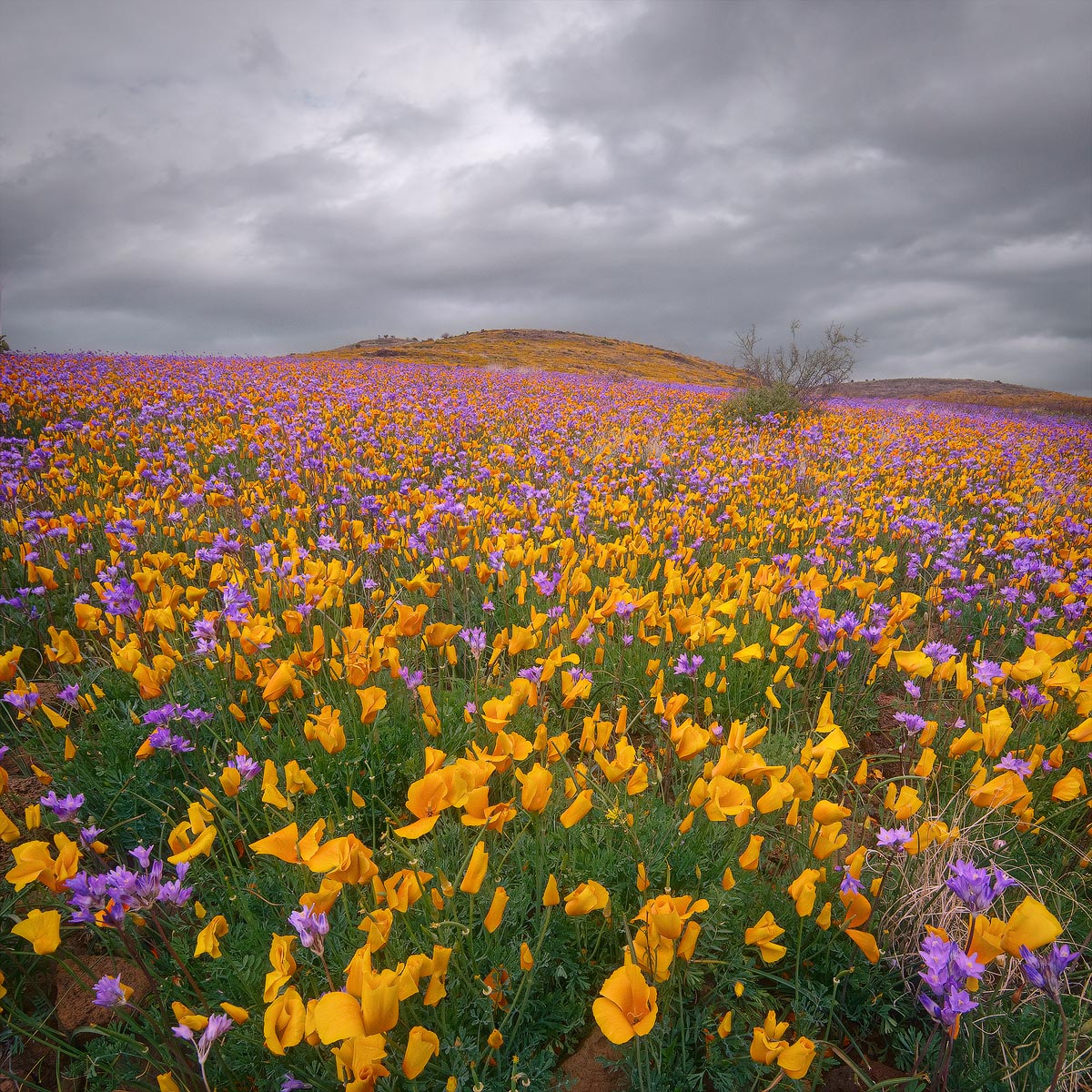
A second Arizona flower photo with a plain vanilla comp of what was an amazing show.
Nikon D80
Nikon 12.0-24.0 mm f/4.0 at 12 mm
1/180 sec at f/16 and ISO 400
Hand Blend of four photos, three for DOF and one more for vertical FOV
Traditional tripod
Comments
23 comments
Comment posted by Mohsen Al-Dajani on May 7, 2010 at 10:15 AM
A masterpiece John. If this scene will be within my reach I would camp for days close to them. Well done!
Registered on August 23, 2007, 160 Posts, 432 Comments
Comment posted by Kevin Trinkner on May 7, 2010 at 10:33 AM
That is an amazing field, I have to see something like this in person someday. Beautiful.
Registered on June 30, 2008, 203 Posts, 2641 Comments
Comment posted by Andreas Resch on May 7, 2010 at 11:00 AM
Awesome shot, John and excellent execution with all the blending. My only suggestion would be to add just a hint of blue to the sky to better integrate it into the scene and create some color tension.
Registered on November 14, 2007, 322 Posts, 6101 Comments
Comment posted by Jesse Speer on May 7, 2010 at 12:08 PM
I like this more than the other comp. And I'm on board with trying out Andreas' sky suggestion.
Amazing field of flowers.
Registered on September 18, 2004, 19 Posts, 339 Comments
Comment posted by Barry Vangrov on May 7, 2010 at 12:29 PM
I was thinking the same thing regarding the sky and then read Andreas' suggestion and I agree with it. It almost looks like the sky is a B&W blended into the color flower image which makes the image look a bit unreal. So maybe adding just a hint of color to the sky would fix that. Beautiful image otherwise.
Registered on September 1, 2009, 148 Posts, 749 Comments
Comment posted by Nick Bristol on May 7, 2010 at 12:43 PM
Fantastic, John. I like this one even better than the last one, and that is saying something. Like Kevin said, hope to see something like this one day too! Very nice work.
Nick Bristol
Lone Rock, Wi.
Registered on February 1, 2004, 752 Posts, 14140 Comments
Comment posted by Morris McClung on May 7, 2010 at 1:18 PM
You are killin' me with these! What an outstanding series! Oddly enough if you mix yellow and purple in the right ratio, you get grey! Which is what the sky is.
Registered on May 7, 2007, 670 Posts, 19650 Comments
Comment posted by Bill Fach on May 7, 2010 at 1:20 PM
John: Jaw dr pping fantastic. Superbly crafted image. >=))>
Registered on November 1, 2003, 1805 Posts, 26981 Comments
Comment posted by Mark Pelton on May 7, 2010 at 1:48 PM
Beautiful color palette and soft lighting. Great processing.
Registered on November 25, 2003, 380 Posts, 4647 Comments
Comment posted by Bill Chambers on May 7, 2010 at 2:13 PM
Fantastic monochromatic sky to go with the vibrant colors! Very nice John!
Registered on April 10, 2005, 753 Posts, 21216 Comments
Comment posted by Gabi Lach on May 7, 2010 at 2:37 PM
Beautiful carpet of flowers, John. Love this.
Registered on May 1, 2007, 101 Posts, 3187 Comments
Comment posted by Dean Sauskojus on May 7, 2010 at 3:09 PM
John, I think I actually like this a little better than the last because the foreground is filled in better. Nonetheless you really nailed the bloom. A photographers dream for sure. Did you just happen across it?
Registered on September 29, 2009, 137 Posts, 2659 Comments
Comment posted by Stuart Williams on May 7, 2010 at 3:29 PM
here the grey sky contrasts nicely with the extravagant display. wonderful!
Registered on December 7, 2007, 247 Posts, 4792 Comments
Comment posted by John Williams on May 7, 2010 at 3:40 PM
Here's a version with a touch of blue and magenta added to the sky.
Thanks so much for all the thoughts!
Dean- Amazingly that was just about it. I went to visit my folks and attend a high school reunion in AZ. My folks and I wanted to spend a bit of time chasing flowers, but we had no idea that the best by far would be where they live and time with my visit. Talking to old-timers, this was truly a lifetime event for Graham and Greenlee counties for flowers.
Registered on September 6, 2007, 221 Posts, 5985 Comments
Comment posted by Tony Kuyper on May 7, 2010 at 3:58 PM
Plain vanilla? Looks more like tooty-fruity to me. I really like the intermingling of the orange and purple . . . or should I say tangerine and grape. Cloud texture very nice too.
Registered on November 1, 2003, 364 Posts, 22328 Comments
Comment posted by Stan Rose on May 7, 2010 at 7:05 PM
Sweet!
Registered on September 15, 2005, 836 Posts, 17099 Comments
Comment posted by Dan Baumbach on May 7, 2010 at 9:10 PM
Great color. Beautiful work.
- Dan.
Registered on November 1, 2003, 473 Posts, 7980 Comments
Comment posted by Albert Darmo on May 7, 2010 at 10:11 PM
Hi John. . What a superb capture of color and form. Everything is so harmonious and pleasing. Its a joy to behold!!
Albert Darmo. Canada
Registered on November 25, 2008, 1386 Posts, 11978 Comments
Comment posted by Dorin Bofan on May 8, 2010 at 1:31 PM
Truly a dreamland for the photographer and there's no better way to show it to us! Perfect execution! I like the second version better.
Registered on April 30, 2007, 122 Posts, 3086 Comments
Comment posted by Bruno Silva on May 8, 2010 at 2:53 PM
this is awsome, John. man, this one works better than the last, for me. looks like you kept the best for the last. I believe you´re gonna come with one even stronger... ! just beautiful this image, mood, colors and details. the flowers really pop out the screen.
Registered on May 6, 2009, 132 Posts, 1406 Comments
Comment posted by Daniel Ewert on May 8, 2010 at 4:49 PM
That blaze of color in the meadow is wonderful! Thanks for sharing it.
Registered on June 2, 2009, 103 Posts, 1500 Comments
Comment posted by Doug Roane on May 8, 2010 at 6:06 PM
what a carpet! well captured, John. the 2nd version is a subtle but nice added touch
Registered on December 12, 2008, 213 Posts, 2226 Comments
Comment posted by Eva McDermott on May 9, 2010 at 1:18 AM
An explosion of color John. Lovely scene with nice contrast against the gray sky. Second version is better. Beautiful work in either case.
Registered on January 4, 2009, 1015 Posts, 13229 Comments


Comments
23 commentsAmazing field of flowers.
Nick Bristol
Lone Rock, Wi.
Thanks so much for all the thoughts!
Dean- Amazingly that was just about it. I went to visit my folks and attend a high school reunion in AZ. My folks and I wanted to spend a bit of time chasing flowers, but we had no idea that the best by far would be where they live and time with my visit. Talking to old-timers, this was truly a lifetime event for Graham and Greenlee counties for flowers.
- Dan.
Albert Darmo. Canada