Nature Photographers Network
This is the preserved archive of the original Nature Photographers Network. The community continues at naturephotographers.network.
Veratrum (revisited)
‹ PreviousLandscape GalleryNext ›

Veratrum (revisited)

by Dorin Bofan

Gallery: LandscapePosted May 10, 2010176 views15 comments
Hello!

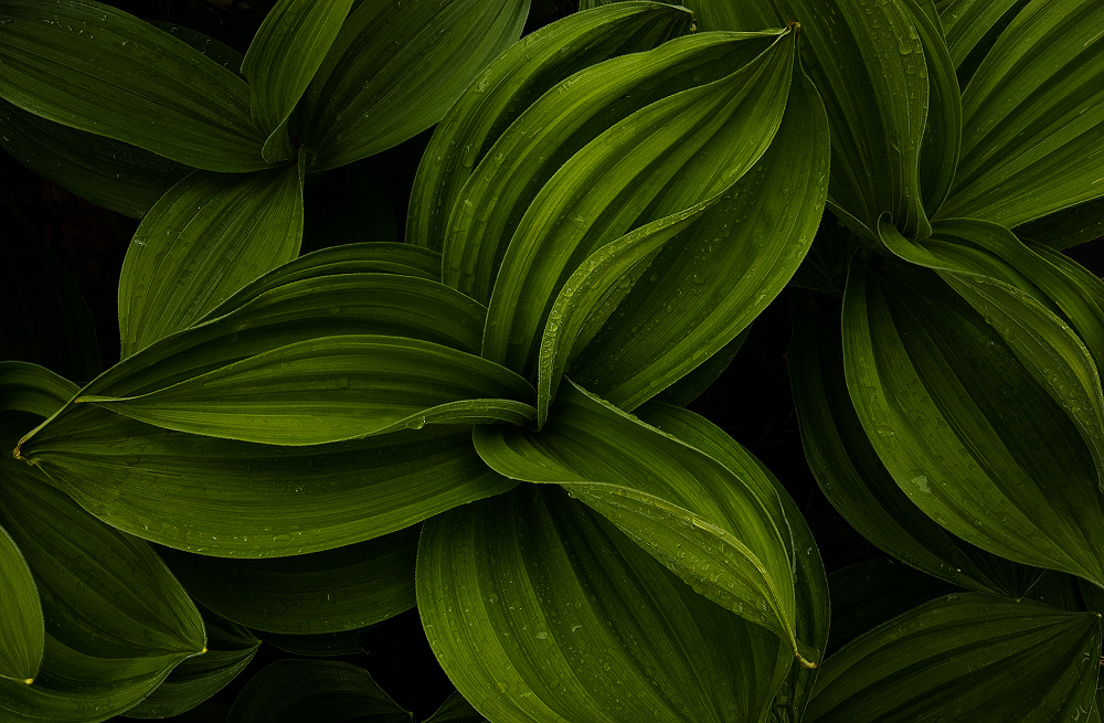
As I promised in my last post, I revisited (with a tripod) the place where I found the group of Veratrum Album. Of course, I was greeted with a different atmosphere that called for a different approach. Hope you like this interpretation too. And sorry for posting yet another image of these plants.

450d, Tokina 12-24, blend of 4 shots for dof

Check the LARGER version for better details

Comments

15 comments
Comment posted by Rick Gomez on May 10, 2010 at 7:06 PM
Beautiful shot and great details. It does appear a bit dark though. A simple curves adjustment might help here. Personally, I would keep the shadows as dark as they are, while bringing up those green mid-tones.
:toast: :jump:
Registered on March 3, 2007, 206 Posts, 1853 Comments
Comment posted by Bill Chambers on May 10, 2010 at 8:28 PM
Lovely shot Dorin. I do think Rick has a good idea about bringing out the green mid tones.
Registered on April 10, 2005, 753 Posts, 21216 Comments
Comment posted by Kris Johnson on May 10, 2010 at 9:15 PM
Very nice shot. I agree with the above that the midtones could use an adjustment.
Registered on March 6, 2010, 26 Posts, 299 Comments
Comment posted by Tony Kuyper on May 10, 2010 at 10:12 PM
It's excellent, Dorin. Could this plant be called an icon, or does that only apply to a specific place? DOF really makes this one special.
Registered on November 1, 2003, 364 Posts, 22328 Comments
Comment posted by Jeff Harrison on May 10, 2010 at 10:14 PM
Why be sorry, post more of these! Larger version is really nice and I agree that just a tad lighter in the mids might be good.
Jeff
Registered on April 4, 2007, 3 Posts, 8 Comments
Comment posted by Anthony Vincent on May 10, 2010 at 10:29 PM
Oh my.... wonderful and even as good as the mono. Killer shot and execution.
Can I ask what time of day and conditions you took this? Seems dark and intimate unless thats the post processing.
Great job Dorin
Registered on February 5, 2009, 199 Posts, 2775 Comments
Comment posted by Vance Gese on May 11, 2010 at 1:23 AM
Beautiful form and lines as your b/w image but with the added gorgeous greens. Tremendous depth. I too might try and bring up the midtones slightly, which would also bring out those lovely raindrops, keeping the deep shadows though. Excellent.
Registered on November 13, 2008, 298 Posts, 6629 Comments
Comment posted by Stuart Williams on May 11, 2010 at 6:29 AM
superb DOF blending to make this sing! i don't mind the 'darkness' of the exposure and the droplets really add ...
Registered on December 7, 2007, 247 Posts, 4792 Comments
Comment posted by Bruno Silva on May 11, 2010 at 6:49 AM
yeah, this rocks for me as you know, mate! beautifuly presented. nice lines and shapes, these leafs are really fabulous. I feel you could bring some more light here, specially in the mids and leave the darks as is. just to emphasize the drops a bit. great work my friend!
Registered on May 6, 2009, 132 Posts, 1406 Comments
Comment posted by Alexandre Deschaum on May 11, 2010 at 9:04 AM
Really Excellent
Registered on May 10, 2010, 29 Posts, 101 Comments
Comment posted by Nicolas Belokurov on May 11, 2010 at 9:32 AM
What a shot! Great work.
Registered on July 22, 2009, 41 Posts, 533 Comments
Comment posted by Dorin Bofan on May 11, 2010 at 10:31 AM
Thanks for all the comments and suggestions, guys. The dark processing was intentional here. I didn't want to state that in the description in order to get your first impressions. I really like it like that, but I'll play with the midtones to see what comes up.
Tony, you could easily call Veratrum an icon. Its leaves are a perfect creation and the way they catch the light is simply amazing.
Anthony, this was shot at noon and it was overcast. The way I processed it comes from the feelings I experienced in the last weeks. I just needed the right image to express them.
Registered on April 30, 2007, 122 Posts, 3086 Comments
Comment posted by Stan Rose on May 11, 2010 at 1:30 PM
Well, this is real nice, and expertly presented. I would probably prefer it a tad lighter, but your comments on that issue justify a dark presentation.
I'll be picky and say that i think the B&W was a much stronger comp. The lines in that version flowed out of the frame, whereas here they are confined, and the edges of the leaves nearly touch the sides of the frame. This adds tension, and while tension may be appropriate for the 'darker' view here, i feel the plants are elegant, and the tension robs some of the elegance i feel. :wavey:
Registered on September 15, 2005, 836 Posts, 17099 Comments
Comment posted by Jorne de Bruin on May 11, 2010 at 2:13 PM
No need to apologize Dorin, this is great! I really liek this one as well as the other version, bith work very well. Good stuff! :toast:
Registered on June 26, 2008, 178 Posts, 2136 Comments
Comment posted by Albert Darmo on May 16, 2010 at 10:58 PM
Hi Doran :wavey: Better late than never, I always enjoy your work. The mood and light are so well captured. beautiful work.
Albert Darmo Canada
Registered on November 25, 2008, 1386 Posts, 11978 Comments