Nature Photographers Network
This is the preserved archive of the original Nature Photographers Network. The community continues at naturephotographers.network.
Sunrise on the Badlands
‹ PreviousLandscape GalleryNext ›

Sunrise on the Badlands

by Jared Atencio

Gallery: LandscapePosted May 11, 2010241 views10 comments
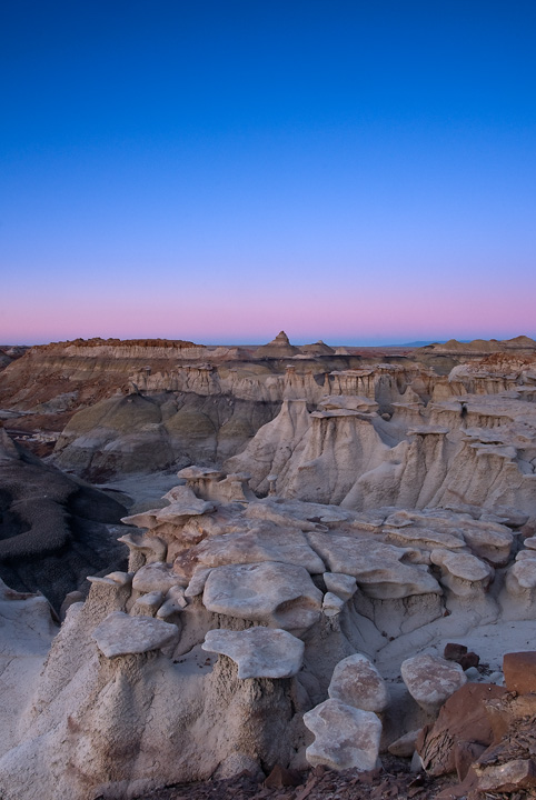
First post here on ESS, so my apologies if this doesn't turn out. This was shot late April in the New Mexico badlands which have been very popular on this gallery as of late (I'm sure most of you know the spot). Not a cloud in the sky this morning, but was able to get a higher vantage point to take advantage of the color on the horizon as the sun emerged. I would appreciate any honest and brutal critique on this image. I'm still trying to solidify a solid PP workflow and any suggestions on how to improve my images would be terrific. Thanks in advance for any honest feedback.

-Jared

Comments

10 comments
Comment posted by Stuart Williams on May 11, 2010 at 6:27 AM
welcome jared. nice first post. you've got some great forms and colours in the sky. i'd be inclined to chop some from the top ... perhaps into a square (but that's just me - people here vary in their opinion of square comps!).
Registered on December 7, 2007, 247 Posts, 4792 Comments
Comment posted by Kenn Leonhardt on May 11, 2010 at 7:38 AM
Looks really good, Jared. Going with the rule of thirds and cropping away some of the empty sky would make the composition stronger. Wouldn't go as far as a square crop, but maybe a 4x5.

Welcome to NPN.
Registered on March 29, 2008, 27 Posts, 1710 Comments
Comment posted by Gary Regner on May 11, 2010 at 10:41 AM
You asked for brutal so here it is. Nice scene with some great color and good job on the exposure, but I would crop off at least half of the sky and the area of brown "dirt" off of the bottom. The dirt area on the bottom is distracting for me, and all the extra blue sky doesn't really add to the overall image.
Registered on February 10, 2008, 17 Posts, 169 Comments
Comment posted by Jared Atencio on May 11, 2010 at 11:11 AM
Thanks for the C&C and honest feedback. I agree with the ROT suggestion to crop off the top and was just afraid this might make a seemingly awkward square image, but agree the blue sky doesn't add any interest and actually detracts from the photo. I will trim from the bottom to remove some of the "dirt" as Gary suggests, maybe right above the smallest rock in the RHC and see if this helps? I will repost here once I am able to make the recommended suggestions. How about any nits on saturation (I made no adjustments), contrast, sharpness etc? I am here to learn, so anything you see is welcomed. Thanks again.
Registered on June 23, 2009, 21 Posts, 422 Comments
Comment posted by Wayne Simpson on May 11, 2010 at 11:12 AM
Welcome to ESS Jared! I agree with the 4x5 crop, however I think the more brown area at the bottom should stay so that those dominant foreground forms remain giving the eye something to settle on. This shot may still be useful with all the sky if you are into selling stock photos at all (copy space). The processing looks very natural to me, and the exposure spot on.

Wayne
Registered on December 11, 2006, 303 Posts, 924 Comments
Comment posted by Michael J Greene, on May 11, 2010 at 11:35 AM
Welcom aboard! The processing on this one looks great. Sharp and clean. Looking forward to seeing more of your work Jared!
Registered on June 18, 2009, 86 Posts, 2317 Comments
Comment posted by Jorne de Bruin on May 11, 2010 at 1:57 PM
welcome to NPn Jared, nice first post! I like the subject and the colours here, agree with cropping a little, not too much though (no square! :jump: )
Registered on June 26, 2008, 178 Posts, 2136 Comments
Comment posted by Jared Atencio on May 11, 2010 at 7:19 PM
**Repost**Here's with a rough 4X5 Crop...
Registered on June 23, 2009, 21 Posts, 422 Comments
Comment posted by Jared Atencio on May 11, 2010 at 7:20 PM
A little more off the top, and instead of removing the brown "dirt" altogether, I tried to just use some selective vignetting to steer the focus away from that area...
Registered on June 23, 2009, 21 Posts, 422 Comments
Comment posted by Tony Kuyper on May 11, 2010 at 9:44 PM
Welcome. I like the scene just fine, but would consider cropping some of the sky. 4x5 aspect ratio feels like it might work.

Oops, just noticed I'm late to the party. Crop looks good.

OK, then how 'bout a bit more sharpness in the foreground elements. They look a bit soft. Just a thought though. The crop was the main thing I saw.
Registered on November 1, 2003, 364 Posts, 22328 Comments