Nature Photographers Network
This is the preserved archive of the original Nature Photographers Network. The community continues at naturephotographers.network.
Tumbling - WC #434
‹ PreviousWeekly Challenge GalleryNext ›

Tumbling - WC #434

by David Bostedo

Gallery: Weekly ChallengePosted June 4, 2010764 views7 comments
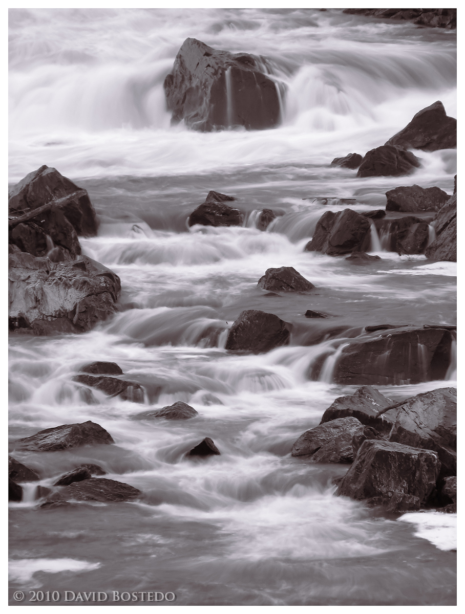
I think I may have posted this one before in 2008 - but with the title I chose, I figured I had to post it again for this week's WC.

This is a small part of Great Falls NP down river from the main falls. I took it from high up across the gorge at a long focal length, so the compression really shows. I liked the stacked feel and movement. I intended this to be B&W, but this is also a slight split tone, which I decided I liked better.

Thanks for looking!

Canon S2 IS
72mm (432 mm-e)
f/5.0
0.8s
ISO 100 (maybe 50?)
Probably a polarizer or ND filter
Tripod
PS CS4 for JPG processing and conversion, web prep

Comments

7 comments
Comment posted by Stuart Williams on June 5, 2010 at 2:12 AM
super david - i like this very much. the only thing that my eye hesitates on is the very top right corner - crop or clone job to remove?
Registered on December 7, 2007, 247 Posts, 4792 Comments
Comment posted by Stan Rose on June 5, 2010 at 3:48 AM
Nice! I pretty much agree with Stuart's assessment. :smile:
Registered on September 15, 2005, 836 Posts, 17099 Comments
Comment posted by Monica Siri on June 5, 2010 at 3:55 PM
Very nice image, David. I like the contrast between the stones and the water foam.
Registered on September 20, 2009, 132 Posts, 3764 Comments
Comment posted by scott lanz on June 5, 2010 at 4:10 PM
Nice comp. Great water action. I like the tone as well.
Registered on November 14, 2003, 840 Posts, 12902 Comments
Comment posted by Rob Graham on June 5, 2010 at 6:20 PM
I like the tumbling action and I think the toning works well. I agree with the comments about the upper right corner.
Registered on August 22, 2006, 842 Posts, 2824 Comments
Comment posted by Catherine Reilly on June 6, 2010 at 2:10 AM
Great exposure for the water flow, David. I like it. For a straight-on shot of water coming at the viewer, I notice how important the placement of the boulders are in your comp, as they sort of herd the flow along, if that makes any sense. :rolleyes: Anyway, yep, I like it.
Registered on August 16, 2006, 603 Posts, 9192 Comments
Comment posted by Barry Vangrov on June 6, 2010 at 10:09 AM
What I like is the very subtle color, sort of like a toned B&W. Same comment as most everyone else re the upper right corner.
Registered on September 1, 2009, 148 Posts, 749 Comments