Nature Photographers Network
This is the preserved archive of the original Nature Photographers Network. The community continues at naturephotographers.network.
Less out on the limb
‹ PreviousLandscape GalleryNext ›

Less out on the limb

by Lon Overacker

Gallery: LandscapePosted June 8, 2010342 views29 comments
I want to thank everyone for their upfront and honest opinions on the previous image. Varied responses with many insightful comments. I would agree that the previous post may very well be suited for hanging in the hallway of a Dr's office or perhaps in a gallery setting as a part of larger, similar body of work (which I don't have...) But in the context of a bunch of photographers viewing images on the web, it certainly lacks substance and I can also agree for the need of some sort of anchor. And so it goes...

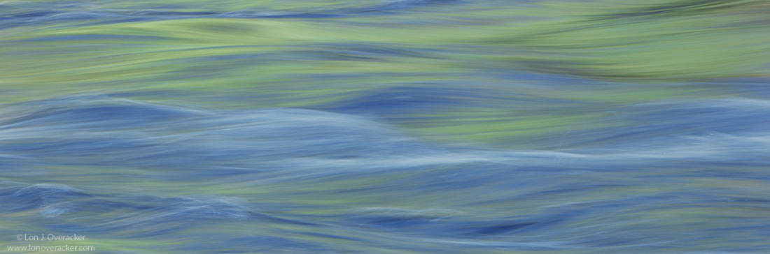
I exposed 4 sheets of film on this little section of the Merced. I don't have the benefit of chimping the ground glass... I just have to hope and pray. :wink: So my 8sec attempt of the previous post was more of an educated guess than it was with anything of purpose. This one here was the first in the set exposed at 1/4s.

This is a pano crop of the original 4x5 slide. Here is the original image for reference. Lot's of cropping possibilities with this one I think. But I really liked the graceful flow of the crop. So I'd love to hear your thoughts with this entry in the series.

The larger version of course works better with the pano crop.

Thank you again for your honest comments and critique.

Lon

Oh yeah, 4x5, V100, Nikkor 300mm f/9 @ 1/4s

Comments

29 comments
Comment posted by Kah Kit Yoong on June 8, 2010 at 3:29 AM
The stronger textures in the water seem work better here. I like the crop as presented and the emphasis on the green hues. A pleasing shot that would also go well hanging in a doctor's image. Or a dentist, relaxation before the drill.
Registered on September 27, 2006, 636 Posts, 10682 Comments
Comment posted by Stan Rose on June 8, 2010 at 3:51 AM
Yeah, this is nicer than the last :smile: I agree about cropping ops--but i think theres really only two successful ones, the pano crop that you posted and then the remainder of the original (bottom 2/3). A terrific subject, great presentation!
Registered on September 15, 2005, 836 Posts, 17099 Comments
Comment posted by Andreas Resch on June 8, 2010 at 4:33 AM
The wide format suits the ave motion very well and I like this even more than the previous one. Looking at the full image I can also think of a nice abstract from the lower half of the shot.
Registered on November 14, 2007, 322 Posts, 6101 Comments
Comment posted by Stuart Williams on June 8, 2010 at 5:04 AM
this works tremendously well ... but the bottom half of the full image is also fascinating. great eye here.
Registered on December 7, 2007, 247 Posts, 4792 Comments
Comment posted by Bill Maile on June 8, 2010 at 6:10 AM
Two very different images all within the same original it appears! I for one definitely prefer this exposure over the first, nice first crop here too. Sweet flowing colors! :toast:
Registered on March 2, 2009, 984 Posts, 2518 Comments
Comment posted by Anthony Vincent on June 8, 2010 at 7:56 AM
I can see this hanging over somebody's bed. Modern and simplistic at the same time. Nature can be so beautiful when simplified.
Wonderful vision Lon :toast:
Registered on February 5, 2009, 199 Posts, 2775 Comments
Comment posted by Bill Chambers on June 8, 2010 at 8:10 AM
I would have a hard time choosing between the two images Lon. Both have their strong points. If I absolutely had to choose, I THINK I would choose this version, but that might be because it's the version in front of me at the moment. Would really like to see them side by side. Both are wonderful IMO.
Registered on April 10, 2005, 753 Posts, 21216 Comments
Comment posted by Daniel Ewert on June 8, 2010 at 9:05 AM
Dreamy and beautiful, Lon. This would work very well alone or in a series. Really nice presentation.
Registered on June 2, 2009, 103 Posts, 1500 Comments
Comment posted by Nick Bristol on June 8, 2010 at 9:46 AM
I like this one, and prefer it over the last one. I went back and forth looking at both and this works for me. Great flowing lines and nice soft color. The 1/4 sec exposure worked very nice here. I like the pano crop that you chose out of the full image for this to finish it off.

Nick Bristol
Lone Rock, Wi
Registered on February 1, 2004, 752 Posts, 14140 Comments
Comment posted by Eva McDermott on June 8, 2010 at 10:07 AM
This works much better Lon. The structure of the waves keeps my eye moving through the scene. Beautifully tranquil.
Registered on January 4, 2009, 1015 Posts, 13229 Comments
Comment posted by Michael E. Gordon on June 8, 2010 at 11:15 AM
I really like it, Lon! It's rare when one can land a two-fer on a single sheet of film, but you got one! :biggrin:
Registered on November 1, 2003, 90 Posts, 2482 Comments
Comment posted by Jim Hackley on June 8, 2010 at 11:23 AM
Wonderful abstract of the flowing water. I happen to like this image better than your previous post. I like this crop showing more of the flowing water with those wonderful colors. Well seen.
Registered on September 17, 2009, 302 Posts, 5535 Comments
Comment posted by Bill Dark on June 8, 2010 at 11:52 AM
I'm enjoying everything about this one, Lon. Soothing color and texture, and a good choice using the wide format composition. Wouldn't change a thing...
Registered on May 27, 2005, 148 Posts, 1121 Comments
Comment posted by Tom Kennon on June 8, 2010 at 1:21 PM
Lon, I really like this version.
Registered on August 20, 2005, 6 Posts, 132 Comments
Comment posted by scott lanz on June 8, 2010 at 1:33 PM
I agree with the majority - this is much stronger than the previous image due to the texture in the water. This image really works well. I also agree with Stan that the bottom 2/3 of the original would also work well as an abstract image with an interesting pattern.
Registered on November 14, 2003, 840 Posts, 12902 Comments
Comment posted by Rick Lundh on June 8, 2010 at 2:12 PM
THIS IS THE TICKET! I love this Lon... very beautiful image, and perfect choice to crop this to a pano... :toast:
Registered on April 28, 2004, 774 Posts, 4351 Comments
Comment posted by Karsten Wrobel on June 8, 2010 at 2:25 PM
Lon, previous one didn't do much for me... this is just beautiful... am with Stan that the bottom of your orginal might make for another strong, possibly still stronger image...
Registered on November 1, 2008, 117 Posts, 851 Comments
Comment posted by Floris van Breugel on June 8, 2010 at 7:28 PM
I do like this one more than the other.. more to look at (structure in the stream), and the wide format works well. I think both would have to be printed big and hung in an appropriately barren/simple room to really have full impact.
Registered on December 19, 2008, 306 Posts, 4840 Comments
Comment posted by Lon Overacker on June 8, 2010 at 8:32 PM
Thanks for the responses and straight forward feedback. General consensus seems to be a bit more structure is better - at least for us photography crowd. :wink: And for those who saw interest in the lower portion of the full sized image.... well, I'll close this series with that very crop. Next.

Thanks again!

Lon
Registered on November 24, 2006, 521 Posts, 19147 Comments
Comment posted by Bruno Silva on June 8, 2010 at 8:45 PM
very artistic and painterly. lon! great nature abstract. the pano looks nice here. works nicely for me. great work!!!!
Registered on May 6, 2009, 132 Posts, 1406 Comments
Comment posted by Ben Horne on June 8, 2010 at 9:08 PM
I do like the panoramic crop here. However, when I viewed the original file, I was more captivated by the lower section. The top section is great, but the wonderful fluid nature of the bottom is more dynamic for me. The original shot looks like 2 photos in one, and doesn't seem as cohesive as cropping either the top or bottom.

If you choose to print any of these, the grain structure will be beautiful in print. That's the sort of thing that a web view never accurately depicts. I love the look of grain on paper.

I know what you mean about the lack of chimping when shooting these sort of fluid shots on LF. I took 3 exposures of the Virgin River with reflected sandstone, and chose different shutter speeds just to cover the bases. When I got them back from the lab, I really didn't like any of them. At least I had a choice of which one I liked the least. :wink:
Registered on August 27, 2009, 51 Posts, 959 Comments
Comment posted by Tony Kuyper on June 8, 2010 at 9:44 PM
Perfect crop, Lon. Maybe it's the frame, but the larger image doesn't work nearly as well. I have no trouble going against the grain and saying I like the first one best. Felt brighter and more abstract.
Registered on November 1, 2003, 364 Posts, 22328 Comments
Comment posted by Morris McClung on June 8, 2010 at 11:41 PM
Well this is an image that one can "immerse" himself into. :biggrin: It really is almost transcendental. I love the muted colors and light as well as the lines and tones.
Registered on May 7, 2007, 670 Posts, 19650 Comments
Comment posted by Dietrich Gloger on June 9, 2010 at 1:02 AM
As commented last time - this offers the stronger structure which the other one was kind of lacking. For the crop, you have selected the best area of the "full frame" so this works great. But the un cropped image is pretty interesting too. What I like in that one are all the different wave shapes and the repeated blue/gold interplay.
Registered on January 26, 2007, 360 Posts, 9876 Comments
Comment posted by Anil Rao on June 9, 2010 at 1:26 AM
Hi Lon,

I love these minimal compositions that are based on color, patterns and the interplay of light. You have created a really nice one here. I can already imagine what this will look like when presented as a large framed print.
Registered on November 15, 2003, 234 Posts, 4923 Comments
Comment posted by Youssef Ismail on June 9, 2010 at 2:04 AM
Lon,

I have been fascinated with water for about three years now. It is hard to work with and yes without the ability to chimp it is a real gamble. But you did well here and I think the overall image could yield several fine abstracts.
Registered on November 1, 2003, 474 Posts, 5555 Comments
Comment posted by Ricardo La Piettra on June 9, 2010 at 10:31 AM
Indeed, this one was maded to be hanging on a wall Lon. Great work, i love it.
Registered on July 22, 2009, 62 Posts, 730 Comments
Comment posted by Harley Goldman on June 9, 2010 at 10:54 PM
This is really nice, but count me as a contrarian, I prefer the previous image. You could also use the lower 2/3 of the uncropped nicely. As you said, lots of cropping options. Sweet colors.
Registered on November 19, 2003, 586 Posts, 11271 Comments
Comment posted by Jimmy Gekas on June 10, 2010 at 3:36 PM
Oh, the larger version really sings. I love the pano crop choice, along with the fantastic color combinations! :toast:
Registered on July 26, 2007, 244 Posts, 2807 Comments