Nature Photographers Network
This is the preserved archive of the original Nature Photographers Network. The community continues at naturephotographers.network.
Silver And Gold
‹ PreviousLandscape GalleryNext ›

Silver And Gold

by Alexandre Deschaum

Gallery: LandscapePosted June 27, 2010573 views22 comments
Hello !

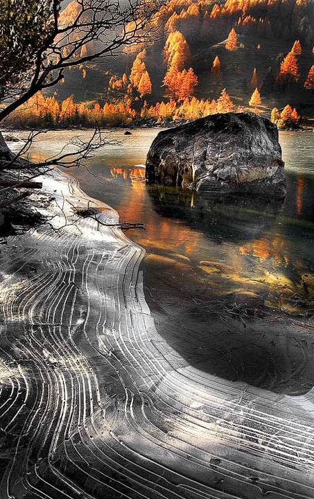
This is a picture from the "derborence Lake" in Switzerland. I've chosen autumn for the larches in Fire .. And hoping to have some ice in the lake. In the darkened area , there was these strange lines ... I've never seen such an Ice structure before ... really creative.

I know there is still a sligh problem with the strong light on the upper side . I should try to fix it .

It was just difficult to mix different exposures to get a good light for the scene .
And to find a good place to set the tripod here ;)

I felt inspired by the lines and the idea of Silver Ice / and golden trees . I have removed a blue hue quite disturbing in the water and ice.




:razz:

Comments

22 comments
Comment posted by mark cillo on June 27, 2010 at 12:34 PM
I like it. The contrast is really strong but it works for me in this one. The lines in the ice are really interesting :wavey:
Registered on July 27, 2008, 143 Posts, 1483 Comments
Comment posted by Dorin Bofan on June 27, 2010 at 12:54 PM
The elements shown here are very striking and interesting, especially the lines in the ice. Amazing, indeed. I feel the boulder blocks the view a bit, but not much you could do about that. What you could do is to work more on the exposure, especially around the boulder where you have a halo and right above the ice on the right side where there's a black spot. Nicely done, Alexandre!
Registered on April 30, 2007, 122 Posts, 3086 Comments
Comment posted by Alexandre Deschaum on June 27, 2010 at 12:56 PM
thank you very much.
Registered on May 10, 2010, 29 Posts, 101 Comments
Comment posted by Patricia Brundage on June 27, 2010 at 1:05 PM
Awesome composition and content. Love the colors and their reflection and the ice combination. Well done!
Registered on March 23, 2006, 1111 Posts, 6531 Comments
Comment posted by Winnie Ho on June 27, 2010 at 1:30 PM
Intriguing ice formation and composition overall. I see what you were going for with the silver and gold, but I would keep some blues in there too. The top of the boulder seems a bit dark, not sure if that is due to shadow. Halo is easily fixed. this shot is worth the effort.
Registered on January 6, 2008, 93 Posts, 1788 Comments
Comment posted by Kah Kit Yoong on June 27, 2010 at 1:35 PM
Wonderful shot. Actually the lack of blue in the ice feels somewhat unnatural and would have made a nice complement with the gold.
Registered on September 27, 2006, 636 Posts, 10682 Comments
Comment posted by Alexandre Deschaum on June 27, 2010 at 1:39 PM
Thank you.

@Kah Kit Yoong : Actually this is a new processing on this picture , the old version, still here on my website , shows more blue in the foreground . I'm curious about what is the best choice .
from an artistic view , I'm still disturbed with the idea of a blue tone here .. But at the same time .. I'm used to see my old picture with the blue , so .. I don't know!! ;)
Registered on May 10, 2010, 29 Posts, 101 Comments
Comment posted by Larry Gloth on June 27, 2010 at 1:55 PM
Really dramatic, eye-catching image. Thise larches are amazing and really pop against the dark background. Nicely composed. The contrast is strong but suits the image. Touch up that boulder and it will be just right.
Registered on August 29, 2007, 96 Posts, 1003 Comments
Comment posted by Pat Sampson on June 27, 2010 at 2:50 PM
Dramatic image Alexandre. I'd brighten the top of the boulder a touch. Don't know that I'd change anything else. Great scene. the light, reflections and patterns are beautiful.

Pat
Registered on May 19, 2007, 953 Posts, 15989 Comments
Comment posted by Michael Hackett on June 27, 2010 at 3:25 PM
personally, I wouldn't change anything. I like the light filtering into the frame in the upper left corner.
Registered on January 12, 2008, 71 Posts, 192 Comments
Comment posted by Kah Kit Yoong on June 27, 2010 at 5:24 PM
I prefer the version on the website. Both are excellent though.
Registered on September 27, 2006, 636 Posts, 10682 Comments
Comment posted by Lon Overacker on June 27, 2010 at 6:11 PM
Alexandre,

First of all let me say that this is a unique and striking image; very dynamic. And I think it's an image that would raise more discussion and opinions among the photographers here than it would for the general public.

Having said that, I'll offer my impression of this and some critique. I'm wondering how much more processing beside just "removing a blue hue." It looks more like this was selectively masked to make the ice and rock straight b&w - or silver if you like. The color combo with the strong, warm and golden light in the background does make for that striking contrast with the silver - it just doesn't seem naturally occurring to me. The haloing also says that there was some work to emphasize and perhaps selectively work on that rock. Seems that is part b&w and part color. The darkness at top could be natural from varying water levels, but it's still dark and looks like a hard stop GND was used to tone down the highlights in the background?

Alexandre, I'm sorry if I'm being too critical here, I'm still enjoying this image and am actually intrigued with what you've captured and created. Striking, yet somehow a bit unreal. (nothing says it has to be BTW.)

Thanks for posting and listening...

Lon
Registered on November 24, 2006, 521 Posts, 19147 Comments
Comment posted by Ron Pullen on June 27, 2010 at 8:00 PM
I too like the contrast here, beautiful image. :toast: :toast: Ron
Registered on December 18, 2005, 74 Posts, 1413 Comments
Comment posted by Daniel Cartamil on June 27, 2010 at 10:07 PM
there is a slight problem with the strong light on the upper side, you should try to fix it!

Other than that, sweet comp, brother!
Registered on November 15, 2007, 50 Posts, 601 Comments
Comment posted by Mark Pelton on June 27, 2010 at 10:22 PM
very interesting image; I also prefer the version on your website.
Registered on November 25, 2003, 380 Posts, 4647 Comments
Comment posted by Youssef Ismail on June 27, 2010 at 10:27 PM
Alexandre,

I think you have a very interesting photograph. Really unique. I hope you can figure out how to fix the halo problems around the branches upper left and around the main stone.
Registered on November 1, 2003, 474 Posts, 5555 Comments
Comment posted by Aaron Feinberg on June 27, 2010 at 10:55 PM
Pretty amazing comp and light. Seeing some halo'ing and issues with the blacks that could be fixed up to improve the image. Very very cool scene and well...well, seen. :P

aF
Registered on October 26, 2009, 399 Posts, 2789 Comments
Comment posted by Alexandre Deschaum on June 28, 2010 at 3:53 AM
@Lon Overacker

Thank you again ! .. This picture is edited , yes .. but "in a good way " I hope . . Most of time I'm using a graduated filter on the field , but here it was quite 'tricky' there was brightness at the top but also on the ice , .. I've chosen to bracket 3 exposure and done the subtle blending to recover some contrasts & details .. on the rock for exemple . There is also a work on the colors to get an interesting mix .

I have made a mistake with the upper part , maybe too much contrasts ... and there is now the Halo of light .. This is an old shot now .. I can try to do the processing again but .. Sometimes it's a bit 'magical' and we never get the same result when we try again ;)

no problems for the "critique" , I want to 'evolve' , so ...
Registered on May 10, 2010, 29 Posts, 101 Comments
Comment posted by Stuart Williams on June 28, 2010 at 4:53 AM
fabulous gold and silver. the lines are fascinating and the colours light work well. a little oversharpened in top left.
Registered on December 7, 2007, 247 Posts, 4792 Comments
Comment posted by Guy Tal on June 28, 2010 at 9:41 AM
That is an amazing image, Alexandre! I love everything about it. Perfect composition and wonderful color palette.

Guy
Registered on November 1, 2003, 566 Posts, 15507 Comments
Comment posted by Bill Chambers on June 28, 2010 at 1:13 PM
Sweet image Alexandre. Excellent compostion and very striking color combinations. My only nit is the slight haloing around the upper branches of the tree but overall this is very enjoyable.
Registered on April 10, 2005, 753 Posts, 21216 Comments
Comment posted by Raymond Marlow on June 29, 2010 at 12:12 AM
Love the ice elements in this image. The tree seems a bit strange against the background as far as contrast but can probably be corrected. great find and a great location
Registered on October 15, 2008, 158 Posts, 531 Comments