Nature Photographers Network
This is the preserved archive of the original Nature Photographers Network. The community continues at naturephotographers.network.
Bierstadt  for Isabelle
‹ PreviousLandscape GalleryNext ›

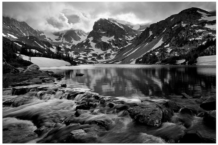
Bierstadt for Isabelle

by Stan Rose

Gallery: LandscapePosted July 3, 2010301 views35 comments
It kind of reminded me of those paintings, anyhow. This is from Lake Isabelle, some spot as my last shot, only late afternoon the day before when there were thunderstorms hanging round the peaks, made for some dramatic lighting. I thought B&W was the way to go, but ill post the color version below and would be interested in your thoghts. Happy 4th, everyone! :smile:
5Dmkii; 17-40; 2 exp blend at f/16
C&C Welcome!

Comments

35 comments
Comment posted by Stan Rose on July 3, 2010 at 7:47 PM
Heres the color...
Registered on September 15, 2005, 836 Posts, 17099 Comments
Comment posted by Bruce King on July 3, 2010 at 7:51 PM
Simply WOW Stan. Both are great, but I gotta go with the color version. :toast:
Registered on January 14, 2010, 276 Posts, 2212 Comments
Comment posted by Bill Dark on July 3, 2010 at 7:53 PM
Holy cow, these are both great! The patches of snow keep me exploring the top half, while the calm water below lends a calming counterpoint to the stormy clouds. Awesome work, Stan. Happy 4th to you as well.
Registered on May 27, 2005, 148 Posts, 1121 Comments
Comment posted by Nick Bristol on July 3, 2010 at 8:15 PM
These are really nice! I like the darker clouds over the mountains with that little touch of blue. The reflection in the smooth part of the lake is very nice and I especially like the water over the rocks. I think the b/w looks very good, but after seeing the color I like it even better. I just really like the tones of the color it has. Happy 4th!

Nick Bristol
Lone Rock, Wi
Registered on February 1, 2004, 752 Posts, 14140 Comments
Comment posted by Philip Hodgkins on July 3, 2010 at 8:18 PM
B & W for me, all the way. The tonal range is fabulous! B/W also takes away the shift from brown to blue color cast and relieves the funky dark cloud cover at the top of the frame. When you can go from black black to bone white, with a wide range of grays in between, the little bit of color becomes superfluous and actually takes away from the image. In my opinion.
Registered on July 24, 2006, 2741 Posts, 12349 Comments
Comment posted by Lon Overacker on July 3, 2010 at 8:35 PM
Stan,

I loved the previous image from here, but between these two, the b&w is much stronger IMHO - and here's why. Not sure why, but in the color version, the blue from the sky just seems out of place to me. Sure, it's the sky, and there's an opening in the clouds and it's suppose to be blue, but for some reason just doesn't mix with the subdued monochrome browns of the rest of the scene.

That same patch of blue and clouds in the b&w version create drama for an already pretty dynamic alpine scene; with the patches of snow, rocks and cascades at the outlet, and you yeah, the reflections too. And ditto to what Phil wrote before me. My only suggestion would be to perhaps raise the midtones just a smidge - but that's a matter of taste of course.

Got some keepers from this hike!

Lon
Registered on November 24, 2006, 521 Posts, 19147 Comments
Comment posted by Michael R Reynolds on July 3, 2010 at 8:38 PM
Stan, definitely think you made the right call on the B&W. Very dramatic and pleasing image. I think you got the contrast in the B&W just right. Well composed image. Best Regards.
Registered on February 26, 2008, 54 Posts, 812 Comments
Comment posted by Harley Goldman on July 3, 2010 at 9:28 PM
I much prefer the B&W. It has the classic landscape look. Nicely done! I want your 5D2/17-40. Mine does not go to f/167. Nice that diffraction did not kick in at that. :biggrin:
Registered on November 19, 2003, 586 Posts, 11271 Comments
Comment posted by Stan Rose on July 3, 2010 at 9:33 PM
I was going to edit that, but i decided to leave it in to see how long it would take for some wise guy to make a comment on it :wink: :biggrin:
Registered on September 15, 2005, 836 Posts, 17099 Comments
Comment posted by Danny Laureys on July 3, 2010 at 9:40 PM
B&W all the way,very nice tones. Great shot. :toast: :toast: :toast:
Registered on January 5, 2008, 590 Posts, 1261 Comments
Comment posted by Rob Graham on July 3, 2010 at 10:20 PM
another vote for the B/W version, again it something about the color palette that although natural just doesn't feel right, especially against the B/W version
Registered on August 22, 2006, 842 Posts, 2824 Comments
Comment posted by Morris McClung on July 3, 2010 at 10:20 PM
While the color version is quite beautiful, the conversion upped the drama by a factor of 10! Talk about an epic shot! Sorry I lost track of where you were this morning, I kind of got engrossed. :biggrin: Really enjoyed our shoot together, and I can't wait to see what you captured from there.
Registered on May 7, 2007, 670 Posts, 19650 Comments
Comment posted by Matthew Goldsmith on July 3, 2010 at 10:26 PM
I like the color image, but I love the B&W. Fantastic tonal range.
Registered on June 29, 2010, 37 Posts, 286 Comments
Comment posted by Richard Sogn on July 3, 2010 at 10:36 PM
For those who love B&W photography, this one is special.
Registered on January 17, 2007, 68 Posts, 210 Comments
Comment posted by Wade Hardy on July 3, 2010 at 11:37 PM
B&W all the way. Fantastic shot!!!!!!
Registered on May 2, 2006, 121 Posts, 1824 Comments
Comment posted by Pam Colander on July 3, 2010 at 11:44 PM
Geeze Stan, it's darn good thing you're such a good photographer because you can't spell for &@!% ! Beard-stadt??? Both versions are amazing BTW ;-)
Registered on December 7, 2006, 210 Posts, 1062 Comments
Comment posted by Mark Pelton on July 4, 2010 at 12:14 AM
Geez, Stan, this (b&W) is almost as good as your last post; actually I like the foreground riffles better in this than the previous shot. Both of these shots are outstanding.
Registered on November 25, 2003, 380 Posts, 4647 Comments
Comment posted by Stan Rose on July 4, 2010 at 12:18 AM
Actually it aint my spelling that's attrocious Pam (altho it is :wink: ) its my typing that really sucks--i was only one letter off :biggrin:
Registered on September 15, 2005, 836 Posts, 17099 Comments
Comment posted by Stuart Williams on July 4, 2010 at 1:54 AM
b&w, no question in my mind :wink: wonderful, stan, i like this very much not least for the mottled effect that is rendered here. wonderful!
Registered on December 7, 2007, 247 Posts, 4792 Comments
Comment posted by Eva McDermott on July 4, 2010 at 10:19 AM
Definitely the B&W Stan. It is more dramatic especially the sky. Beautiful and majestic.
Registered on January 4, 2009, 1015 Posts, 13229 Comments
Comment posted by Bruno Silva on July 4, 2010 at 10:31 AM
I think you´ll know which version I´m gonna vote for, the b&w. great conversion with whites/mids/darks, all in harmony. nice to see a b&w comp from you. love it!!!!!!
Registered on May 6, 2009, 132 Posts, 1406 Comments
Comment posted by Bill Maile on July 4, 2010 at 10:50 AM
Wow, beautiful capture of an amazing scene Stan!! I always love B&W and this one is especially sharp for all the reasons already mentioned, BUT, I'm going against the vote I guess, and take the color version. Love the combination of browns and blues, with a little green thrown in for good measure. That dark patch of clouds above the TRC is a bit ehhh, but I'll stick w/ the color. I think!! :smile:
Registered on March 2, 2009, 984 Posts, 2518 Comments
Comment posted by Luis Argerich on July 4, 2010 at 12:13 PM
Hi Stan,
I like the color version more than the B&W conversion, the soft subdued colors make it a very pleasant image to my eyes. I like the way you framed the shot and I like the clouds at the top as a way to finish the frame.
Registered on December 22, 2009, 91 Posts, 1349 Comments
Comment posted by Pat Sampson on July 4, 2010 at 12:13 PM
Great scene Stan and I like both images of it but I'd definitely go with the conversion.

Pat
Registered on May 19, 2007, 953 Posts, 15989 Comments
Comment posted by Doug Keech on July 4, 2010 at 1:38 PM
Both versions are great Stan. I tend to agree with Lon though and prefer the B&W. I am especially enjoying the dramatic look in the clouds that the conversion give it. Great stuff!
Registered on June 30, 2010, 12 Posts, 28 Comments
Comment posted by Ricardo La Piettra on July 4, 2010 at 2:10 PM
Color version for me Stan, Beautiful.
Registered on July 22, 2009, 62 Posts, 730 Comments
Comment posted by scott lanz on July 4, 2010 at 5:44 PM
Stan, 90% of the time I'll prefer the color landscape over the BW. Just looks more natural to me because we see in color. This one is the exception. In fact, I much prefer the BW. Very dramatic, superior image. :toast:
Registered on November 14, 2003, 840 Posts, 12902 Comments
Comment posted by Kyle L. Krause on July 4, 2010 at 7:00 PM
Stan,

Wow! Beautiful Image, stunning composition love the B&W. Great work. :toast:
Registered on June 15, 2010, 29 Posts, 605 Comments
Comment posted by Gary McGhee on July 5, 2010 at 11:24 AM
Without doubt it is the colour version that ticks all the boxes for me Stan. The colours are very natural looking and the comp is spot on.

Gary.
Registered on April 15, 2010, 142 Posts, 2416 Comments
Comment posted by Art Escobado on July 5, 2010 at 1:57 PM
The B&W just stomps all over the place. Man, I'm off my duff-you inspired me to get and see that Colorado beauty.
Registered on January 7, 2007, 0 Posts, 775 Comments
Comment posted by Jeremy Kessler on July 5, 2010 at 5:38 PM
This is beautiful, almost missed it, glad I didn't. B&w for me. :toast:
Registered on September 13, 2007, 36 Posts, 1283 Comments
Comment posted by Stan Rose on July 5, 2010 at 6:34 PM
Thanks for all the comments folks! Im not surprised B&W is the preference--i thought it was no contest--but i did like the aqua color on the far peaks, which is what attracted me to the scene in the first place.
Registered on September 15, 2005, 836 Posts, 17099 Comments
Comment posted by Raymond Marlow on July 5, 2010 at 11:07 PM
Stan Im favoring the color version as it seems a bit brighter whereas the black and white version feels like it needs a touch of brightness. I do however like the clouds in the black and whiter version better as it feels more dramatic. Beautiful location and a great shot here
Registered on October 15, 2008, 158 Posts, 531 Comments
Comment posted by David Edwards on July 6, 2010 at 3:36 AM
Beautiful shot, Stan. The b/w version is outstanding.
:toast:
Registered on December 6, 2008, 142 Posts, 2623 Comments
Comment posted by Winnie Ho on July 6, 2010 at 10:43 AM
hey Stan, this is absolutely stunning! Jaw dropper, fantastic comp. I do prefer the colour if you are taking a survey, but if it were my image, I would print both and see. :toast:
Registered on January 6, 2008, 93 Posts, 1788 Comments