Nature Photographers Network
This is the preserved archive of the original Nature Photographers Network. The community continues at naturephotographers.network.
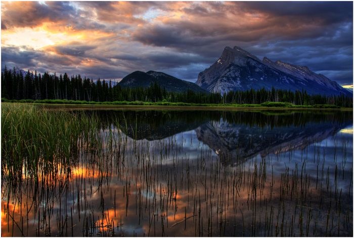
Vermillion Sunrise #3
‹ PreviousLandscape GalleryNext ›

Vermillion Sunrise #3

by SimonRumford

Gallery: LandscapePosted July 8, 2010322 views11 comments
I know for now all it seems is that I have shots of the Vermillion Lakes but I do have others, I live a 10 min bike ride from these lakes and it is the best area I have to practice and some of my favorite shots are from here, so since I am just starting out on NPN I may flood the galleries with shots from this over photographed area...

Mt.Rundle reflected in the first Vermillion Lake, using the the reeds as the forground this was the sunrise on July 7th, 2010

Comments

11 comments
Comment posted by Michael J Greene, on July 8, 2010 at 1:06 PM
Hi Simon,

This is a gorgeous composition and the light is really special. I really like the reeds in the forgeround as well. If it were mine, I'd real it in a bit on the processing. The reflection has a bit of an HDR feel to it and colors look oversaturated to me, most notably the background greens and blues, and the gold in the reflection. Also, for future reference, on the far left side a little more breathing room would have been nice between the FG and BG greens. This is a spectacular shot and I think you can improve upon it for print. I hope this helps.

Michael :wink:
Registered on June 18, 2009, 86 Posts, 2317 Comments
Comment posted by David Cobb on July 8, 2010 at 1:53 PM
Love those foreground reeds, and the light in the sky and on the water.
Registered on December 14, 2007, 312 Posts, 3243 Comments
Comment posted by Andreas Resch on July 8, 2010 at 2:02 PM
Very well chosen spot and great conditions. The thumbnail looked fine but the higher resolution shows some little issues. Michael already mentioned most of them. I'd like to add that I find the bright spot on the very right a little too strong and distracting. So basically this is a lovely shot but I would have wished for a little more subtlety and moderate processing.
Registered on November 14, 2007, 322 Posts, 6101 Comments
Comment posted by Stuart Williams on July 8, 2010 at 2:29 PM
simon - i like the composition here but the others have taken the words out of my mouth. i'd try a little re-processing and my guess is that this will make a fabulous image.
Registered on December 7, 2007, 247 Posts, 4792 Comments
Comment posted by Ed Lowe on July 8, 2010 at 4:59 PM
It must be fantastic to live so close to this magestic view. Other than the already mentioned tweeking of the processing this is fantastic. Keep them coming, Simon.

Ed
Registered on February 7, 2004, 414 Posts, 7115 Comments
Comment posted by SimonRumford on July 8, 2010 at 6:59 PM
Thanks for your critiques, I will relook at a couple things when I do it up to print, adjust the saturation a bit....and try and tone down the area where the sun breaks through in the top left...

thanks guys :)
Registered on June 25, 2010, 28 Posts, 80 Comments
Comment posted by Tony Kuyper on July 8, 2010 at 10:19 PM
Unique take on this place. I really like the comp and the different elements. Sort of with the white highlight was manageable, but it's only a small part of the frame.
Registered on November 1, 2003, 364 Posts, 22328 Comments
Comment posted by Lon Overacker on July 9, 2010 at 12:38 AM
Simon,

This is a fantastic "reflectionscape" from the Vermillion Lakes and Rundle. The reflection amongst the reeds really makes this image stand out; a wonderful composition.

Overall, the colors and saturation look pretty good with two exceptions. First, the far shoreline is over saturated with the greens for my taste. Second, and this is similar to my comments on your previous image of Rundle, in that the mountain is quite purple to my eye. What is interesting, and I think you should look closely at this, is that the reflection of Rundle in the water has a pretty neutral color balance to it, and much more purple above the reflection? Maybe it's me, but that's what really stands out for me.

This is a killer image for sure though and worthy making the very best of this one.

Lon
Registered on November 24, 2006, 521 Posts, 19147 Comments
Comment posted by SimonRumford on July 9, 2010 at 1:23 AM
Thanks Lon, I do notice the neutral colours in the water and the slight purple on the mountain, I would like to say its supposed to be like that, but I really dont know if it is...when I print this one I will tone down the saturation a slight bit mainly the greens and blues....

Thanks for your comments everyone
Registered on June 25, 2010, 28 Posts, 80 Comments
Comment posted by Mike Leakey on July 10, 2010 at 10:25 AM
Wonderful capture. I won't repeat what the others have said...with a little processing this could be really special. To my eye the lake shore has a slight left to right slant...however that could be an optical illusion caused by the contour of the shoreline. Good work.

Mike
Registered on November 13, 2003, 2 Posts, 92 Comments
Comment posted by Steve Sieren on July 10, 2010 at 6:54 PM
:toast:
Registered on January 2, 2008, 360 Posts, 5321 Comments