Nature Photographers Network
This is the preserved archive of the original Nature Photographers Network. The community continues at naturephotographers.network.
Strike Valley Overlook
‹ PreviousLandscape GalleryNext ›

Strike Valley Overlook

by Tony Kuyper

Gallery: LandscapePosted July 9, 2010723 views34 comments
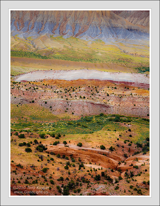
This is an image from an overlook where the light turned overcast just as we arrived. This is one of my favorite photography conditions, so I composed with the idea of trying to develop it like I would sandstone in shadows.

In the end, it didn't quite turn out as I had planned. The comp doesn't feel quite as strong as a sandstone detail to me, and I found I had to actually add some blur to make if feel right. But this is also one of those memory type pictures where I just wanted to record the event and work on it in PS to make it feel even closer. So even if this isn't my best image, the act of taking and developing it is worth it just to re-live the moment.

Your thoughts and recommendations would, as always, be appreciated.

Canon camera, 28-200 lens, Photoshop.

Comments

34 comments
Comment posted by Bruce King on July 9, 2010 at 10:40 PM
I really like it Tony. For a "Grand Vista" landscape it has a very abstract feel. The colors jump off the monitor and the detail is superb, a hallmark of your work. :toast:
Registered on January 14, 2010, 276 Posts, 2212 Comments
Comment posted by Mark Pelton on July 9, 2010 at 10:50 PM
Tony, the variety and richness of colors are amazing. This is gorgeous. Each layer from the top down invites you to stop, explore, and then move on down to the next. I love it. :toast:
Registered on November 25, 2003, 380 Posts, 4647 Comments
Comment posted by Eva McDermott on July 9, 2010 at 11:14 PM
A little bite more pasytel than what I am used to seeing from you, but this works perfectley. A grand abstract. I especially love the blues on the upper talus.
Registered on January 4, 2009, 1015 Posts, 13229 Comments
Comment posted by Eva McDermott on July 9, 2010 at 11:18 PM
A little bite more pastel than what I am used to seeing from you Tony, but this works perfectley. A grand abstract. I especially love the blues on the upper talus.
Registered on January 4, 2009, 1015 Posts, 13229 Comments
Comment posted by The Critic on July 9, 2010 at 11:20 PM
Where is this place, the color looks like nothing I have ever witnessed on this earth!

Very nice processing, but is it too much ?
Registered on July 9, 2010, 0 Posts, 1 Comments
Comment posted by Nicolaus Wegner on July 10, 2010 at 12:01 AM
Quite a palette of pastels here Tony. I'd really like to see some focused shots on those hills on the top portion of the image. Looks like a plethora of patterns there.
Registered on February 21, 2010, 133 Posts, 1509 Comments
Comment posted by Kah Kit Yoong on July 10, 2010 at 12:50 AM
Looks like a pizza with too many toppings :) Seriously this is really nice interpretation of the large landscape. Not sure whether it's up to the standards of your very best work, I'm not sure but it's very close.
Registered on September 27, 2006, 636 Posts, 10682 Comments
Comment posted by Benjamin Olson on July 10, 2010 at 1:15 AM
Much different than your more intimate work, but just as strong. I personally would like to see the bottom cropped up to the beginning of the smaller out crop of rocks so it comes out from the corner. My other reason for wanting the crop is because the upper part of the image is much stronger and I feel like the bottom is lacking the same impact. Wonderfully done though!
Registered on April 7, 2007, 169 Posts, 725 Comments
Comment posted by Mark Metternich on July 10, 2010 at 1:36 AM
Love the layers and amazing color variety and don't have a nit. I don't think every photo we post has to be over the top amazing. Beautiful is just beautiful IMO. :toast:

Mark
Registered on June 19, 2009, 276 Posts, 6240 Comments
Comment posted by Kent Mearig on July 10, 2010 at 1:48 AM
Tony - This is a color overload in a good way. Composition...schmomposition! It looks perfect to me.
Registered on September 4, 2006, 237 Posts, 4748 Comments
Comment posted by Mathieu Hoareau on July 10, 2010 at 2:14 AM
Hi Tony,

great amazement for the panel of colors =O this location seems to be imposing wow and the abstrait here is good!!!

Registered on July 9, 2010, 4 Posts, 120 Comments
Comment posted by Stan Rose on July 10, 2010 at 2:40 AM
I think its awesome Tony. Almost like two shots though--the abstract top portion and the 'real' bottom portion. I can't say for sure whether they work together in one shot. But my gut tells me this works--so ill go with my gut! :wink:
Registered on September 15, 2005, 836 Posts, 17099 Comments
Comment posted by Youssef Ismail on July 10, 2010 at 2:43 AM
Tony,

I like the variation in the textures, colors and lines from all over to horizontal to vertical. I think it is very nicely done. But then again I am biased to your work.
Registered on November 1, 2003, 474 Posts, 5555 Comments
Comment posted by Prashant Khapane on July 10, 2010 at 3:15 AM
:toast: :toast: :toast:
Registered on November 1, 2003, 492 Posts, 4580 Comments
Comment posted by Robert Dayton on July 10, 2010 at 9:22 AM
Although it may not be one of your best, I find it quite enjoyable to view.
The variations in the colors and textures are extraordinary. There are
also some great lines.
Registered on November 11, 2008, 281 Posts, 3958 Comments
Comment posted by Kevin Trinkner on July 10, 2010 at 9:25 AM
Certainly a different subject matter from your norm, but unmistakably your style. Wonderful colors here, the colors themselves have created some layers to enjoy. As you stated not one of your strongest images, but we all have these memory shots that we keep on file and return to every so often.
Nice work.
Registered on June 30, 2008, 203 Posts, 2641 Comments
Comment posted by Nick Bristol on July 10, 2010 at 9:31 AM
I think this is is wonderful. A very interesting image to me. I like the horz & vert combination of lines. This has great color and must be something to see. I agree with a small crop from the bottom. This is very nice to look at, and I like it alot.

Nick Bristol
Lone Rock, Wi
Registered on February 1, 2004, 752 Posts, 14140 Comments
Comment posted by Mike Leakey on July 10, 2010 at 10:04 AM
Beautiful colors and perfectly processed as usual. When the image first came up on my iPad I could only see the upper 2/3rds of the image. After viewing the whole image I found that I kinda liked the initial view best. It might be because by removing the trees/shrubs from the bottom it becomes more abstract due to the loss of scale. A wonderful image either way.

Mike
Registered on November 13, 2003, 2 Posts, 92 Comments
Comment posted by Mohsen Al-Dajani on July 10, 2010 at 10:46 AM
Great color and beautifully composed Tony. I like it.
Registered on August 23, 2007, 160 Posts, 432 Comments
Comment posted by Bill Maile on July 10, 2010 at 10:56 AM
Kind of like an 18-layer cake Tony?? Wow, a bit of sensory overload. The "lay of the land" almost throws my eye off a bit as it slopes to the right, but the tremendous colors and the wonderful effect of how the detail gradually decreases as you go from FG to BG (top) really make it stand out for me. Thanks!! :smile:
Registered on March 2, 2009, 984 Posts, 2518 Comments
Comment posted by Bill Chambers on July 10, 2010 at 11:52 AM
Wow, not your usual fare at all, but still superb. So much to see here, and the varied and distinct colors really catch the eye. A wonderful grand scenic. The color of the distant mountains really strikes me. Great work Tony.
Registered on April 10, 2005, 753 Posts, 21216 Comments
Comment posted by Abdullaziz Bin Ali on July 10, 2010 at 12:09 PM
What a beautiful scene Tony
as usual, you look to the world from your unique vision
Registered on May 31, 2009, 112 Posts, 1590 Comments
Comment posted by Angela Classen on July 10, 2010 at 12:17 PM
Great landscape abstract. Love, love, love the colors! Excellent in every way.
Registered on June 13, 2007, 434 Posts, 2742 Comments
Comment posted by Dan Baumbach on July 10, 2010 at 12:48 PM
It's not as strong as your closeups but it is very nice.

- Dan
Registered on November 1, 2003, 473 Posts, 7980 Comments
Comment posted by David Cobb on July 10, 2010 at 1:13 PM
So many different colors of the palette here, and so many wonderful layers and lines. This is a scene to revisit under many different varities of light.
Registered on December 14, 2007, 312 Posts, 3243 Comments
Comment posted by Morris McClung on July 10, 2010 at 1:17 PM
Talk about getting every nuance out of a landscape. :eek: A very fascinating image.
Registered on May 7, 2007, 670 Posts, 19650 Comments
Comment posted by Bill Dark on July 10, 2010 at 1:46 PM
I knew from the thumbnail that this would be nice. What more can I say, but that I love it. I'm sure you will re-live this moment many times over in the years to come. :toast:
Registered on May 27, 2005, 148 Posts, 1121 Comments
Comment posted by Lon Overacker on July 10, 2010 at 5:58 PM
Tony,

I think this is just as strong as much of your sandstone detail, all in terms of colors, patterns, texture, detail and layers. It's all there and I think this is wonderful. It has your saturation signature as well and while I don't think the saturation is overdone in the least, I am amazed at your ability and vision to pull colors from a scene; just amazing range of colors here. I think you could invent your own color space.... :wink:

Another thing that really stands out for me with this image is how this looks like the "false miniature" photography that we sometimes see. The vegetation, trees and such don't just look small because they're probably far away with your zoom lens, but they look miniature to me - as if part of a model railroad landscape. For those who haven't seen "false miniature" photography, here's a WIKI example.

I love this Tony!

Lon
Registered on November 24, 2006, 521 Posts, 19147 Comments
Comment posted by Sebastien Lamadon on July 11, 2010 at 8:47 AM
I think you have capture all the rianbow colors on this picture. Great color mixture.

Seb
Registered on April 7, 2008, 23 Posts, 97 Comments
Comment posted by Dietrich Gloger on July 11, 2010 at 9:26 AM
I think this is very strong Tony! Best image or not, it is really really good!. Love all the colors and layers here.
Registered on January 26, 2007, 360 Posts, 9876 Comments
Comment posted by Chris Chamberlain on July 11, 2010 at 6:06 PM
If this was in the anonymous gallery, I'd have guessed someone else. It doesn't matter though. This is a great wider view of the landscape there. Someone mentioned every little nuance. I think that sums it up perfectly.

Chris
Registered on March 13, 2007, 500 Posts, 8365 Comments
Comment posted by Ricardo La Piettra on July 12, 2010 at 8:53 AM
There is so much to look at, seems to be endless shapes and colors there. Awesome photo Tony.
Registered on July 22, 2009, 62 Posts, 730 Comments
Comment posted by Ian Haskell on July 12, 2010 at 3:52 PM
Great layers and patterns within the landscape. Really nicely presented with a nice pastel feel to the shot.

Ian
Registered on October 30, 2008, 24 Posts, 673 Comments
Comment posted by Bruno Silva on July 13, 2010 at 3:03 PM
yep, I´m runing late, but not that late.... :wink: !! beautiful tony, even when you go wide you´re work is fabulous. very nice....
Registered on May 6, 2009, 132 Posts, 1406 Comments