Gallery: FloraPosted July 14, 2010226 views25 comments
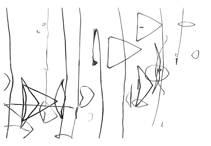
Taken at a reservoir in Mississippi in winter - from a lotus stand. Contrast adjustments and cloning out a couple spots on the water surface.
Canon 100mm
Comments
25 comments
Comment posted by Rachel Blaser on July 14, 2010 at 7:24 PM
sorry - I'm really wiped out today! Meant to also add a pre-emptive thanks for your comments or suggestions!
Registered on June 8, 2010, 6 Posts, 28 Comments
Comment posted by Luke Ormand on July 14, 2010 at 8:10 PM
I have to admit that when I saw the thumbnail I thought it was some little kids drawing that was posted on NPN... but now that I can see the "big picture" I can see that it's a beautiful rendition of nature.
Registered on February 4, 2009, 1093 Posts, 7035 Comments
Comment posted by Gary Yeoh on July 14, 2010 at 8:33 PM
Rachel:
A very creative high key rendition! Love this and well done.
Registered on September 1, 2009, 588 Posts, 8184 Comments
Comment posted by Matthew Goldsmith on July 14, 2010 at 8:57 PM
Very creative rendition. I like it a lot.
Registered on June 29, 2010, 37 Posts, 286 Comments
Comment posted by Morris McClung on July 14, 2010 at 9:11 PM
Looks like a pencil drawing. Very artistic!
Registered on May 7, 2007, 670 Posts, 19650 Comments
Comment posted by scott lanz on July 14, 2010 at 9:28 PM
I love all the different geometric shapes. Terrific.
Registered on November 14, 2003, 840 Posts, 12902 Comments
Comment posted by Angela McCain on July 14, 2010 at 10:44 PM
Looks like something really expensive in the modern art gallery. Well done.
Registered on April 19, 2009, 367 Posts, 3589 Comments
Comment posted by Rachel Blaser on July 14, 2010 at 11:56 PM
Angela -
Awesome - now if only I can convince some really rich people that that's what it is....
Registered on June 8, 2010, 6 Posts, 28 Comments
Comment posted by Balan Vinod on July 15, 2010 at 4:52 AM
Very creative ...well done
Balan Vinod
Registered on March 20, 2006, 889 Posts, 2312 Comments
Comment posted by Miro Susta on July 15, 2010 at 5:50 AM
I'm very sorry, but I try my best bu still can't see any relations to flora in this image.
Registered on August 18, 2006, 719 Posts, 3736 Comments
Comment posted by Katja Rosvall on July 15, 2010 at 6:22 AM
I must agree with Miro; I just have no inkling what's going on here
Registered on August 16, 2009, 28 Posts, 636 Comments
Comment posted by Steven M Kahn on July 15, 2010 at 7:14 AM
When I saw the thumbnail I knew I had to open it. It has a litle kids drawing quality which makes the capture all the more awesome. You evidently still have the little kid in you to see this. Cool! Could just sit here and look and look and look. And see something new and different all the time. I see the love.
Registered on July 20, 2009, 140 Posts, 1198 Comments
Comment posted by Doug Benner on July 15, 2010 at 7:18 AM
One of the most different and creative compositions I've seen in a long time. Just terrific.
Registered on December 8, 2003, 482 Posts, 1868 Comments
Comment posted by Pete D on July 15, 2010 at 8:06 AM
This is great. I like that it confuses people.
Pete D. also confused, but that's just me.
Registered on November 1, 2003, 590 Posts, 1794 Comments
Comment posted by Ramamohan Pai on July 15, 2010 at 9:32 AM
Rachel, Class Vision - Love everything about this. I can see that this came from a Lotus Pond and I like the inclusion of the spent Lotus Pod just to give us a clue of what this might be.
Don't worry about folks giving you a tough time here
Registered on November 1, 2003, 550 Posts, 9037 Comments
Comment posted by David Cobb on July 15, 2010 at 10:33 AM
What a great and simple abstract this is Rachel, love the simplicity and the flow of the lines. It looks like long-lost script. Absolutely beautiful. Great use of negative space too.
Registered on December 14, 2007, 312 Posts, 3243 Comments
Comment posted by Rachel Blaser on July 15, 2010 at 11:28 AM
I know - the 'floral' element here isn't strong...but it's a straight shot of plants on still water, so this seemed like the best place for it. 'Confusing' was the goal, though - I got to the patch and thought "Oh no...it's cloudy, and grey, and the light's rotten...." and then I looked through my lens and thought "Oh - yes!" and took several like this. Does the composition work, though?
Registered on June 8, 2010, 6 Posts, 28 Comments
Comment posted by June Marie Wingert on July 15, 2010 at 2:16 PM
I like this very much, I am completely drawn into the broken thistle in the center of the pic, excellent composition Rachel.
You hjave a fantastic eye for simplicity. it's wonderful to look at.
Registered on July 1, 2010, 8 Posts, 137 Comments
Comment posted by Mark Windom on July 15, 2010 at 2:28 PM
It took me awhile but I finally figured out what I was seeing. Must say this is one of the more unique images I've seen on NPN. Well done!
Registered on November 1, 2003, 176 Posts, 2302 Comments
Comment posted by May Haga on July 15, 2010 at 7:54 PM
Love it. Looks like one of those composistions that we all think we can pull off but for me, at least, it never works. This works very well.
May
Registered on February 22, 2007, 714 Posts, 8470 Comments
Comment posted by Albert Darmo on July 15, 2010 at 10:18 PM
Hi Rachel Very creative. But not the image i would hang on my wall
Albert Darmo. Canada
Registered on November 25, 2008, 1386 Posts, 11978 Comments
Comment posted by Marc Ward on July 16, 2010 at 6:01 PM
Rachel,
I like this a lot, but... I'm odd. I share some of the other critiques about the the incomprehensible aspects of this image as a marketable image. But, I still like it. I would be interested to see the response if you posted the vertical image from this series that has a wider, more inclusive view. I find that image far more cohesive and recognizable. Thanks for your help with my redbud image... still playing around with it.
Registered on February 26, 2009, 304 Posts, 1365 Comments
Comment posted by Catherine Reilly on July 17, 2010 at 4:25 AM
Exquisite!! A contemplative abstract par excellance! Great eye for this fabulous comp. Hat's off to you for a creative coup.
Registered on August 16, 2006, 603 Posts, 9192 Comments
Comment posted by Bill Fach on July 17, 2010 at 6:54 PM
Rachel: Looks like a kids line drawings and I mean that in a good way. Well seen! >=))>
Registered on November 1, 2003, 1805 Posts, 26981 Comments
Comment posted by Ken Smith on July 18, 2010 at 12:39 PM
Cool!
Registered on September 5, 2008, 449 Posts, 2444 Comments

Comments
25 commentsA very creative high key rendition! Love this and well done.
Awesome - now if only I can convince some really rich people that that's what it is....
Balan Vinod
Pete D. also confused, but that's just me.
Don't worry about folks giving you a tough time here
You hjave a fantastic eye for simplicity. it's wonderful to look at.
May
Albert Darmo. Canada
I like this a lot, but... I'm odd. I share some of the other critiques about the the incomprehensible aspects of this image as a marketable image. But, I still like it. I would be interested to see the response if you posted the vertical image from this series that has a wider, more inclusive view. I find that image far more cohesive and recognizable. Thanks for your help with my redbud image... still playing around with it.