Nature Photographers Network
This is the preserved archive of the original Nature Photographers Network. The community continues at naturephotographers.network.
Waxwing+Repost
‹ PreviousAvian GalleryNext ›

Waxwing+Repost

by Steve Balke

Gallery: AvianPosted August 7, 2010135 views14 comments
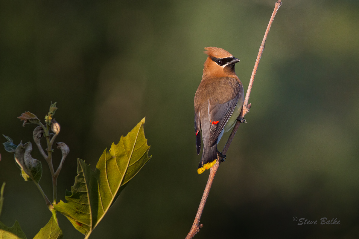
Cedar Waxwing (Bombycilla cedrorum)

This morning, I was pursuing a Kingfisher which refused to allow me to get close enough for a shot when this fellow suddenly showed up. With the bright early morning sun at my back, I think he was surprised to eventually see me. I like this image because the colors of the bird are displayed quite well, notably the little “wax-like” red “droplets” on the secondary flight feathers responsible for the name of this species.

I wasn’t sure how best to compose this image. This crop is 9.6 MP. I could have reduced it further by going for a vertical and removing the vegetation on the LHS. The detail would likely have been retained. However, in the end I decided to lower the exposure on those green leaves a bit. I think that they add some habitat information to the image without distracting. However, I would enjoy seeing your comments with regards to this or any other aspect of this image.

7D, 400 mm f/5.6: ISO 500, 1/640 s, f/8.0, 9.6 MP, light noise reduction, exposure changes and sharpening.

Comments

14 comments
Comment posted by Brian Gatlin on August 7, 2010 at 4:24 PM
Steve, I like this. A nice pose, good light, and pleasant setting. I think your comp works very well and the leaves add some interest to what otherwise might feel like too much empty space. I also like how well the eye stands out from the mask. A little more fine detail in the head would be nice, but I know details are tough to get on this species, and they look good elsewhere. :toast:
Registered on March 21, 2009, 202 Posts, 4187 Comments
Comment posted by KC Choo on August 7, 2010 at 4:32 PM
This presentation seems to work better when viewed 'larger'. With that nice look-back, I think a vertical BOAS would work pretty well.
Registered on November 15, 2004, 519 Posts, 8278 Comments
Comment posted by Rob Drummond on August 7, 2010 at 8:32 PM
I like this Steve - the vegetation adds something. Lovely light and head turn.

cheers
Rob
Registered on November 8, 2003, 617 Posts, 8267 Comments
Comment posted by denise ippolito on August 7, 2010 at 8:37 PM
I love the pose and the perch. If it were mine I'd crop to a vertical.
Registered on December 17, 2009, 202 Posts, 1529 Comments
Comment posted by Steve Balke on August 7, 2010 at 9:22 PM
Thank you everyone for your comments: very interesting and helpful as always. Perhaps if there were more bird pixels in the original I could see more detail in the head, Brian. The light was fine. However, this is as close as I could get. I'm commenting so soon after posting because I see that some of you would like to see a vertical crop. So, here's one as a repost. The repost is only 4.3 MP. However, I think the existing detail is holding up. Actually, I like both the original and the repost: two quite different impressions I think.
:smile:
Registered on June 18, 2009, 229 Posts, 2915 Comments
Comment posted by Dennis Plank on August 7, 2010 at 10:40 PM
Excellent, Steve. I really love the light in this image. I think I lean toward a preference for the original, but both are very good. :toast:
Registered on January 28, 2008, 1767 Posts, 23192 Comments
Comment posted by Ronnie Gaubert on August 7, 2010 at 10:56 PM
Hi Steve,
First I'll say the light, background and feather details are all spot on. Here is my opinion on the composition of the original post. I think by including the leaves you split the image with two focal points. I don't think the leaves should be made a focal point in a bird image. It causes the viewer's eye to bounce back and forth between the two focal points. I also find you have placed the bird in an odd place off centered to the right. The repost is the correct composition for this image.
Thanks for posting,
Ronnie G.
Registered on November 1, 2003, 810 Posts, 3495 Comments
Comment posted by Gary Gulash on August 8, 2010 at 12:44 AM
Hi Steve. You had some very nice lighting and a beautiful setting to work with. My vote goes to the vertical, for the reasons that Mr. Gaubert has given. :smile:
Registered on January 28, 2005, 879 Posts, 12098 Comments
Comment posted by Jim DeWitt on August 8, 2010 at 1:49 AM
Terrific shot, Steve. I prefer the repost for the reasons Ronnie gave.
Registered on August 28, 2006, 1240 Posts, 8506 Comments
Comment posted by Daniel & Loana on August 8, 2010 at 10:31 AM
Very nice light and subject. I like both versions a lot.

D&L
Registered on October 7, 2008, 166 Posts, 3044 Comments
Comment posted by Nate Chappell on August 8, 2010 at 11:21 AM
The repost looks excellent Steve, I was thinking vertical when I first looked at your post. As Ronnie said the bird was a little too far right in the frame in your first post. The repost detail is very good, gotta love those 18mp! :toast:
Registered on February 1, 2006, 1158 Posts, 19528 Comments
Comment posted by Sharon Hallowell on August 8, 2010 at 2:53 PM
Plenty of detail here for the vert post. Lovely! Sharon
Registered on November 1, 2003, 392 Posts, 4810 Comments
Comment posted by Steve Balke on August 8, 2010 at 3:53 PM
Thank you all for such thoughtful and encouraging comments. It was fun to see the different opinions on these images. Special thanks to Rich M for his recent post showing us what detail there is in a close-up of this species and to Ronnie for providing an analysis of the composition. :smile:
Registered on June 18, 2009, 229 Posts, 2915 Comments
Comment posted by Ron Dudley on August 8, 2010 at 9:15 PM
I too prefer the repost Steve, but just barely. I also quite like your original composition.
Registered on March 30, 2007, 437 Posts, 10915 Comments