Nature Photographers Network
This is the preserved archive of the original Nature Photographers Network. The community continues at naturephotographers.network.
Refreshingly Simple
‹ PreviousLandscape GalleryNext ›

Refreshingly Simple

by Lon Overacker

Gallery: LandscapePosted August 15, 2010222 views26 comments
Thanks very much for the response on the Juniper image. Honestly, I didn't think it would resonate. Which now has got me asking myself about this one. Funny, I only came home with one tree image from the weekend on the Sonora Pass. Spent more time along the creek, falls and flowers than I did with the trees. Maybe next time I need to spend more time in trees... :wink:

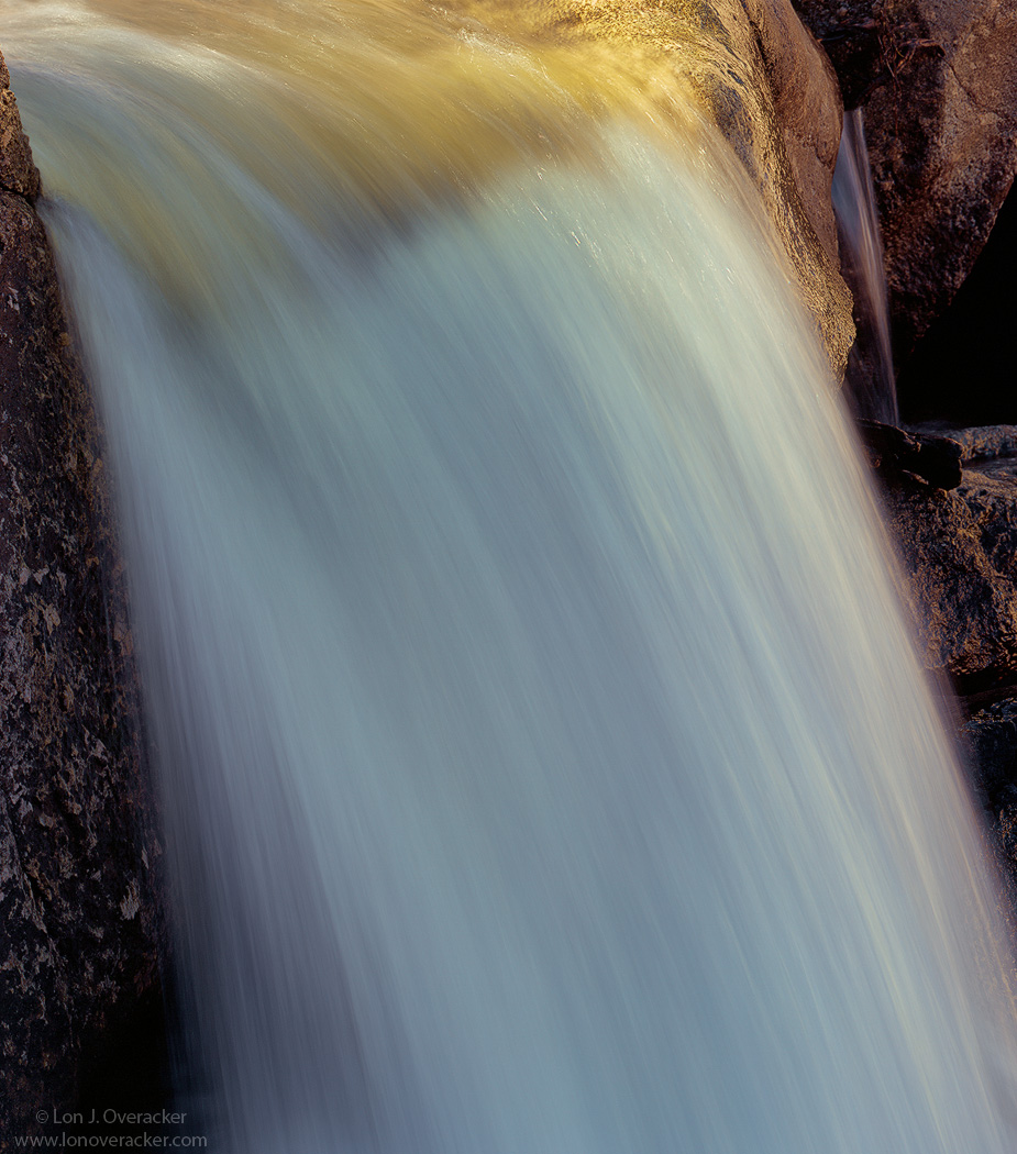
One of the many beautiful cascades along Deadman's Creek. This was a timing image more than anything as the sun was creeping in to the scene. I had noticed in another location earlier how there was a glow beneath the surface of the water as it cascaded over these granite boulders and I wanted to try and capture that. I was pretty happy with the golden light and reflections, but am wondering if it's too bright?

Also, in this crop I chose to leave in the little tiny cascade in the BG. Would love to hear your thoughts on this one.

4x5, V100, f/16.5 @ 1/4s

Thanks!

Lon

Comments

26 comments
Comment posted by Daniel Ewert on August 15, 2010 at 11:40 PM
Well chosen exposure time here, Lon. Beautiful closeup of this scene of nature.
Registered on June 2, 2009, 103 Posts, 1500 Comments
Comment posted by Kent Mearig on August 16, 2010 at 12:51 AM
I don't find anything about this too bright, and to be honest, it's the dark areas that I'm still not quite in tune with. To me, they are at conflict with the idea of simplicity (not as much as I thought they would be from the thumbnail though). The golden color extending under the rushing water is very wonderful. I also notice a few streaking specular highlights, and I only wish that they were even more prominent.
Registered on September 4, 2006, 237 Posts, 4748 Comments
Comment posted by Guy Tal on August 16, 2010 at 1:25 AM
I like the warm hues and abstract composition here, Lon. Wonderful detail in the flowing water.

Guy
Registered on November 1, 2003, 566 Posts, 15507 Comments
Comment posted by Stuart Williams on August 16, 2010 at 2:15 AM
simple and effective, it is the subtle variations in colour that make this. very nice.
Registered on December 7, 2007, 247 Posts, 4792 Comments
Comment posted by Stan Rose on August 16, 2010 at 3:48 AM
I agree with Kent. Simplicity is the strength here. Love the top portion, but then it gets a bit repetitious on the way down, and the rock deatil on the side corners just gets in the way. Nice, but not your best.
Registered on September 15, 2005, 836 Posts, 17099 Comments
Comment posted by John&Patty Benway on August 16, 2010 at 4:49 AM
Your composition works very well in my opinion, and I especially like the touch of gold.It works for me, I like it. Haven't been on the streams as long as I can remember, and this little cascade is string up some fond memories, so I'm hoping for rain, and a colorful Fall. Nicely done Lon
John
Registered on May 12, 2006, 626 Posts, 8700 Comments
Comment posted by Ron Pederson on August 16, 2010 at 7:54 AM
Nice exposure on the water, and I like the tiny cascade and surrounding rocks on the RH side - they add some depth. I think I would like it better if the LH side was cropped at just about where the "J" in your watermark is...that would keep some perspective and eliminate what I find slightly distracting from the dark rockface.
Registered on August 12, 2010, 29 Posts, 108 Comments
Comment posted by Bill Chambers on August 16, 2010 at 8:16 AM
Very pretty Lon. Excellent shutter speed, and lovely golden color aty the top. I do wish there was a little more room at the top.
Registered on April 10, 2005, 753 Posts, 21216 Comments
Comment posted by Paul Breitkreuz on August 16, 2010 at 10:16 AM
I really like the placement of the falls flowing from ULC to LRC, Lon. The contrasting light exposure is perfect without any blowouts. Nice job on the water flow and timing overall. :cool:
Registered on February 25, 2006, 525 Posts, 8448 Comments
Comment posted by Lon Overacker on August 16, 2010 at 10:43 AM
Thanks very much for the feedback. I've taken a number of the comments and come up with this crop. What do you think? I had never considered it and I'm not sure it's an improvement, but one this is definitely for sure, the crop has changed the whole dynamics of the comp because now the RHS and the tiny cascade seem to be much more prominent. But I do like that the left side is gone and there aren't dark areas on both sides - now only one side. :wink: The effect of the water are still there, but the right is much more in play. Thanks for the feedback!

Lon
Registered on November 24, 2006, 521 Posts, 19147 Comments
Comment posted by Bill Maile on August 16, 2010 at 11:11 AM
Very nice exposure on the water Lon, good speed and comp!
Registered on March 2, 2009, 984 Posts, 2518 Comments
Comment posted by Nick Bristol on August 16, 2010 at 12:59 PM
I think this shot is really nice. I love the looks of the water and think the exposure and shutter speed are just right (not to bright). That golden light is very nice too. I also like the little falls in the background. Repost... I like the original version, but I think this is even better with the left side rock gone. Looks great.

Nick Bristol
Lone Rock, WI
Registered on February 1, 2004, 752 Posts, 14140 Comments
Comment posted by Tony Kuyper on August 16, 2010 at 1:07 PM
Wow, Lon. The essential waterfall, like Bill Chambers' essential beach. Just the right amount of stuff to define a wf and nothing to needed to add or subtract IMO. Light and texture are perfect.
Registered on November 1, 2003, 364 Posts, 22328 Comments
Comment posted by Phil Pogledich on August 16, 2010 at 1:33 PM
Doesn't seem too bright to me. I love the texture of the water, and that light adds a very nice touch. Simple but effective capture.
Registered on August 24, 2009, 123 Posts, 3099 Comments
Comment posted by Steve Sieren on August 16, 2010 at 2:05 PM
I think both work but your crop enhances the simplicity.
Registered on January 2, 2008, 360 Posts, 5321 Comments
Comment posted by Kevin Trinkner on August 16, 2010 at 2:31 PM
Very nice Lon, I enjoy the touches of light and perfect shutter speed. The little falls in the back adds some nice depth. I wouldn't mind just a tad more room at the top. Nice capture.
Registered on June 30, 2008, 203 Posts, 2641 Comments
Comment posted by Harley Goldman on August 16, 2010 at 2:49 PM
I like this one and I think the cropped version works even better. As Steve said, it nicely simplifies the comp.
Registered on November 19, 2003, 586 Posts, 11271 Comments
Comment posted by Karsten Wrobel on August 16, 2010 at 3:18 PM
I much prefer the repost, Lon. the beautiful texture of the main wf is more prominent and the comp leads my eye nicely towards the rhs wf
Registered on November 1, 2008, 117 Posts, 851 Comments
Comment posted by Morris McClung on August 16, 2010 at 9:38 PM
Looks great to me. I really love that golden light!
Registered on May 7, 2007, 670 Posts, 19650 Comments
Comment posted by Kah Kit Yoong on August 16, 2010 at 9:47 PM
Some delicious details here. I prefer the original version and the contrast between the water and the rocks on the left. Simple and beautiful.
Registered on September 27, 2006, 636 Posts, 10682 Comments
Comment posted by Kent Mearig on August 17, 2010 at 1:26 AM
I think you lost some really nice parts from the left in the crop, so I prefer the original. What about coming up from the bottom to square?
Registered on September 4, 2006, 237 Posts, 4748 Comments
Comment posted by Rafael Rojas on August 17, 2010 at 3:02 AM
simple and effective. Well done Lon. I like this...
Registered on March 1, 2009, 56 Posts, 623 Comments
Comment posted by Mathieu Hoareau on August 17, 2010 at 3:50 AM
Hello Lon,

wow really original close-up, the light on the water is delightful, splendid!!! :smile:
Registered on July 9, 2010, 4 Posts, 120 Comments
Comment posted by Gabi Lach on August 17, 2010 at 10:40 AM
Very nice, Lon. It looks like melting gold, flowing down with the fall. Creative and beautiful.
Registered on May 1, 2007, 101 Posts, 3187 Comments
Comment posted by Jay Nielsen on August 17, 2010 at 8:27 PM
Actually you got the title wrong...I would say it is simply refreshing ha ha! Seriously it is a very nice refreshing and simple comp that is beautiful. I think I do prefer the repost being tighter on the water, the colors and flow of the water are very nice.
Registered on October 6, 2008, 137 Posts, 720 Comments
Comment posted by Youssef Ismail on August 17, 2010 at 8:58 PM
Lon,

The original crop, the one you initially posted did not thrill me all that much. I liked the light at the top and the texture in the water but that was about it. The second crop is much more thrilling and really pulls me in. It has all the elements I liked from the first crop but now I can appreciate the subtle nuances in the water texture. Go with the second crop for sure!
Registered on November 1, 2003, 474 Posts, 5555 Comments