Fishermen's Paradise
by Dean Sauskojus
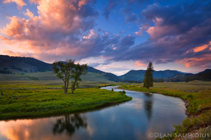
I posted an image similar to this some time ago. Some of you may remember. This image has a totally different sky but taken in the same area. A couple of things I would like an opinion on is whether you think the sky is a distraction in the ULC. I thinks its somewhat bright but I don't have the skills to correct it. The other thing I don't like is the bare ground in the LRC. Am I being to critical? What do you think?
Thanks
Repost below.

Comments
36 commentsThanks for the comment Ben.
you are right about the bare ground. However, it still beautiful
All the best
Nick Bristol
Lone Rock, WI
I knew this was yours as soon as I saw the thumbnail. Lovely composition and wonderful conditions. I have no issues with either of the aforementioned "issues"...I do think a slight crop down on the sky, maybe 1/16 of inch, would do the trick there and focus the attention a little better. Also IMO, I think I would prefer about a 3 - 5% reduction in saturation of the image. (Greens in grassy bank on left and blues in sky) Overall, I love all your captures of Yellowstone. It is such a fascnating place and this a well seen representation of the world's first national park.
Michael
Thanks for all your comments. Thanks for taking the time.
Congrats:István
Michael
- Dan.
Chris
are minor.
Thanks all for your comments. Very helpful.