Nature Photographers Network
This is the preserved archive of the original Nature Photographers Network. The community continues at naturephotographers.network.
Alpine Garden + Repost  x 2
‹ PreviousLandscape GalleryNext ›

Alpine Garden + Repost x 2

by Michael J Greene,

Gallery: LandscapePosted August 23, 2010331 views18 comments
Mount Rainier NP

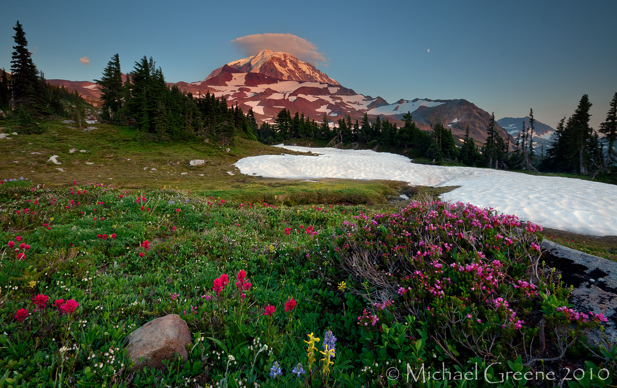
This was taken last year and recently reprocessed. I was wondering what you all thought of the image as it was difficult to process. My goal was to make the light look natural and seemless...

I can't really lighten the sky too much, but I can certainly lighten the fg if you think that would help. I purposedly kept it a little dark to match the light in the sky. It was hard to keep the highlights in the snow down and still have the brightness match-up properly everywhere.

I am on the fence about it and the problems I encountered while recalibrating my monitor this morning didn't help clarify my feelings. Please check out the large version too. Thanks for your time and comments.


5DMK2

16-35

Comments

18 comments
Comment posted by Ricardo La Piettra on August 23, 2010 at 2:47 PM
Beautiful
Light looks very natural to me and it´s great.
I think cropping a little from the left will help to balance the comp.
Wonderful scene Michael.
Registered on July 22, 2009, 62 Posts, 730 Comments
Comment posted by Floris van Breugel on August 23, 2010 at 2:48 PM
It's a lovely scene, Michael. I like how you've focused on the variety and somewhat sparser flower arrangement than the usual lupine/paintbrush combo. I like the snow patch in the midground as well. The mountain and sky seem rather dark for the luminosity of the foreground... the mountain should be brighter than the foreground, not darker - it's the part of the landscape with light on it!
Registered on December 19, 2008, 306 Posts, 4840 Comments
Comment posted by Michael J Greene, on August 23, 2010 at 3:45 PM
Thanks Ricardo and Floris. I made a slight crop to the left side of the image and lightened the sky more. I hope this works better.
Registered on June 18, 2009, 86 Posts, 2317 Comments
Comment posted by Floris van Breugel on August 23, 2010 at 3:50 PM
Better, but I would lighten the sky more still, particularly the right side. I generally like brighter skies though, I think they look more natural, and feel more uplifting.
Registered on December 19, 2008, 306 Posts, 4840 Comments
Comment posted by Rick Goldwasser on August 23, 2010 at 3:57 PM
I like this one a lot, lots of interesting elements. Not sure if the re-post is an improvement - the crop kind of pushes the tree too close to the edge and you've lost some of the richness in tone by lightening the top. All of this is just my personal taste and I think you should go with what your gut tells you - which I guess you would have done without me telling you...OK, I'm done.
Registered on May 10, 2009, 127 Posts, 970 Comments
Comment posted by Michael J Greene, on August 23, 2010 at 4:19 PM
Rick - I am glad you like the original as presented. I was hoping it would work for some, but I didn't think everyone would like it. I've add more contrast to this next re-post so maybe you'll like that one even more. I also understand about the crop; I am a little on the fence about it myself.
Floris - Thanks again for your honesty, feedback, and time. I ran a TK super midtone on it to brighten and then selectively lightened the right side with his actions too.
Registered on June 18, 2009, 86 Posts, 2317 Comments
Comment posted by Dean Sauskojus on August 23, 2010 at 4:43 PM
The third is a great improvement Michael. Gave the whole image more punch. You really captured some nice elements, the cloud above the peak, the wildflowers, the snow, all put together very well. Great job!
Registered on September 29, 2009, 137 Posts, 2659 Comments
Comment posted by Nick Bristol on August 23, 2010 at 5:02 PM
This is a very pretty scene, Michael. I like the first post quite alot, but after looking for awhile I do like the 3rd post. The moon (even though small) is a nice touch too. The crop is such a small amount that I think I would go back to the original on that, just my thought. This is a very nice image as it was posted and I can see Rick's points on this too. If I would vote for one now I think it might be #3, but heck...I like them all! :toast:

Nick Bristol
Lone Rock, WI
Registered on February 1, 2004, 752 Posts, 14140 Comments
Comment posted by John Williams on August 23, 2010 at 5:08 PM
As noted, what a great combination of elements. Very nice. The latest rendition is even better.
Registered on September 6, 2007, 221 Posts, 5985 Comments
Comment posted by Philip Hodgkins on August 23, 2010 at 5:16 PM
I like the last best, although I don't see a great deal of difference. My only nit is the moon. It is somewhat of a non sequitur to the image as a whole.
Registered on July 24, 2006, 2741 Posts, 12349 Comments
Comment posted by Sulaiman Al-Riyami on August 23, 2010 at 5:36 PM
Well cone Michael ,, great work

Sulaiman,
Registered on July 19, 2010, 4 Posts, 24 Comments
Comment posted by Rudy Ruberti on August 23, 2010 at 5:58 PM
Very nice scene Michael and I think the repost is an improvement. Very natural as well.
Registered on October 28, 2008, 179 Posts, 1875 Comments
Comment posted by Jeremy Kessler on August 23, 2010 at 7:52 PM
Beautiful Image Michael, I like the third best but I still wouldn't mind seeing the right and left side of the sky just a hair brighter. The sky seems a bit bright in the area just around the mountain (comparatively) at least on this monitor. Great work though. :toast:

P.s The link to your blog in your sig doesn't work.
Registered on September 13, 2007, 36 Posts, 1283 Comments
Comment posted by Dan Baumbach on August 23, 2010 at 8:22 PM
It's a beautiful image. I think I like the first one best but I could definitely live with the third one too.

- Dan.
Registered on November 1, 2003, 473 Posts, 7980 Comments
Comment posted by scott lanz on August 23, 2010 at 9:35 PM
As other have said, lots of great elements. I think like the original the best, but all three are excellent.
Registered on November 14, 2003, 840 Posts, 12902 Comments
Comment posted by Chris Chamberlain on August 23, 2010 at 9:46 PM
I think it's a gorgeous scene, and composition! I have no issues with the original presentation, but Floris makes a good point. I would not have noticed that myself though. The crop really does nothing to change the feel of the shot IMO, but it does no harm either. So I can go either way with that. It's a fine shot! I think due to it's small presence in the overall scheme of the shot, you could lose the moon?????

Chris
Registered on March 13, 2007, 500 Posts, 8365 Comments
Comment posted by Robert Dayton on August 23, 2010 at 10:44 PM
I prefer the second version. The foreground flowers got my attention
immediately. That's a neat cloud atop the mountain. This is fine
scenic, Michael.
Registered on November 11, 2008, 281 Posts, 3958 Comments
Comment posted by Wade Hardy on August 23, 2010 at 11:34 PM
The first version looks ok to me but the light seems to be more balanced in the 3rd image. Wonderful comp as well - great shot!
Registered on May 2, 2006, 121 Posts, 1824 Comments