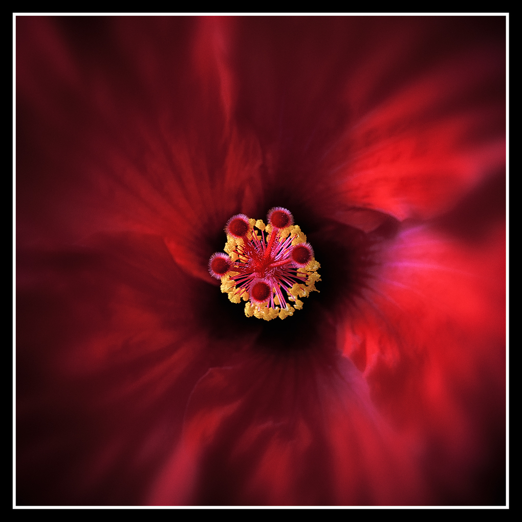
Red Nebula
by Pat Sampson
Another hibiscus image. Hope to get some black and whites later today.
This is a two image stack and I would have had the f/stop somewhere around f/8. I mostly used LR 3 gradients in post processing but also used Viveza and PS to introduce more bg blur.
In the past I haven't sharpened my jpegs again as I create them but in this case I used NPNer's Andreas Resch's Photoshop sharpening script. I liked the functionality and control it provides. If you would, see what you think of the sharpness in the image - the center of course, the petals aren't supposed to be sharp. (smile)
Nikon D700
Zeiss 50 mm
2 image stack near or at F/8
Helicon Focus, RAW, ISO 100, Lightroom III, the entire NIK studio of applications except the HDR product, CS5, MacBook Pro 17, tripod, rail, release.
Comments and suggestions welcome.
Pat

Comments
46 commentsBrigitte
Thanks,
Carol
Lovely lighting. Might darken the right-mid regions (in the petals) to match it with left half. But that's just my tastes :)
Bob
When you use a rail with Helicon in mind are you focussing by moving the camera along the rail or by turning the focussing ring on the lens?? And, which rail are you using?
Nathan
Mark,
I'm using the Kirk macro focusing rail and am very pleased with it. I've got it mounted on a RRS BH 40 ball head which I'm also very pleased with. I use the rail to find my starting place for the series of images going into the stack but then I use the manual focus ring on the Zeiss to move the plane of focus through the subject. I've tried doing the movement using the rail but Helicon creates more artifacts for me that way, so I've gone back to the manual focus ring. The Zeiss lenses are particularly well suited to the process in that they provide very precise focusing control manually.
Luke,
I did consider posting this in Photo Art but decided I hadn't done enough with it to justify placing it there. My reason for considering it was the blur I introduced on the petals but given the quality and nature of the manipulations I see in that gallery I decided that the gaussian and mid grey additions didn't warrant it. I view dodging and burning with gradients as pretty tame stuff. Regardless of where it's at, I'm glad you like the image. Thank you very much for the comment.
Pat
I might have to check out Andreas' technique. How do I find it?
Albert Darmo.. Canada
I actually shot some like that. The reason that I moved down and over was to put more of the yellow column in the image. I did hate giving up the symmetry but thought I got a little better sense of depth in the image by introducing the off center point of view. I still want to do one the other way but when I do, I'll take the whole flower in focus. Thank you for the comment and suggestion.
Andreas' script is in the digital gallery with a date near mid August. It's on the first page about a third of the way down.
Pat
Sooner or later I'll try the stacking job.
Mauro
Now this is probably an idiotic and insulting question, given all your work to create this beautiful and evocative image... But... wouldn't it be easier to choose a different aperture or (gad!) try a Lensbaby?? Easy isn't always as fun though. And I expect that all this was done for "just that certain look" that you are getting well known for.
An interesting and amusing question. I don't have a Lensbaby. My plan as I shot this was to get a sharp center all the way through the yellow and a bg that wouldn't just be a red wash but would show some detail. To do that I probably should have done a stack of five or six images at f/5.6. or less. I misjudged the amount of detail in the bg - when I looked at the little screen on the back of the camera. (smile) When I got the two image stack merged and started looking at it on a real monitor, I realized I needed to soften the bg. It's not like a had a definite idea of what I wanted though. I just played with it until I got something I liked. To be honest, i've never done an image where I knew up front exactly what I wanted. I may have a general plan like I did here but certainly no idea what the final image is supposed to look like. I wish I did. I admire those who have that kind of imagination. I don't. (smile)
Pat
Congrats
D&L
May
Really a master piece of creativity and taste.
Amazing!!!
I am a little late to the table but I just saw this. It deserves all the accolades. Beautiful!
Peter