Nature Photographers Network
This is the preserved archive of the original Nature Photographers Network. The community continues at naturephotographers.network.
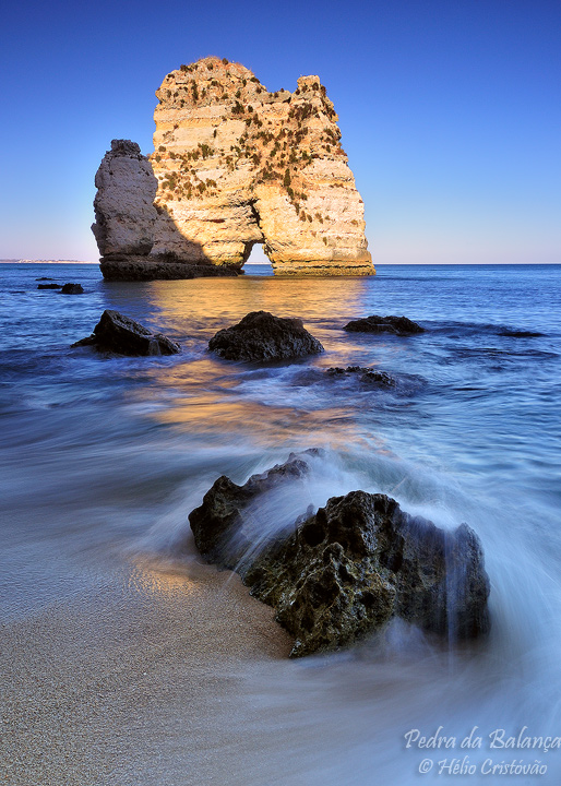
Pedra da Balança
‹ PreviousLandscape GalleryNext ›

Pedra da Balança

by Helio Cristovao

Gallery: LandscapePosted September 5, 2010166 views11 comments

Algarve "Costa d´Oiro" (The Golden Coast), Portugal

During 3 weeks on south Portugal, I explored by land and sea part of Algarve coastline.
I´m starting to process some of the photo sessions, and here is a first post of the series.

It´s one single exposure, used an HE 3 stop ND filter.
I´m having some doubts on colors though, do you notice some bit of extra red tint on the image?

Thanks for your thoughts.

Comments

11 comments
Comment posted by Lon Overacker on September 5, 2010 at 3:05 PM
Helio,

This is a terrific near/far composition and seascape. I love the sand, water and rock in the foreground; the light, reflected light, details and water motion are all wonderful in this capture.

Getting the the midground/sea the color shifts a little to the purple side of blue. I might try and adjust the hue a little bit in the middle area. But the reflected light on the sea and the inclusion of the seastack all work so well together. Great job crafting this seascape.

Lon

edit: I guess I should have read your question more closely. I think when you add red to blue you get purple, so I think my comments would mean yes, there is a hint of red - but only in the middle sea part around the grouping of rocks. And it's very slight btw.
Registered on November 24, 2006, 521 Posts, 19147 Comments
Comment posted by Gary McGhee on September 5, 2010 at 3:18 PM
I think you've nailed the comp here Helio and exposure looks good. Your timing with the wave hitting the foreground rock is spot on.

I don't see any red tint you mention.

Gary.
Registered on April 15, 2010, 142 Posts, 2416 Comments
Comment posted by Eva McDermott on September 5, 2010 at 5:07 PM
Perfect timing Heilo! really like the wave action on the foreground rock and the golden glow on the water. I do not notice the red tint you mention. Beautiful capture.
Registered on January 4, 2009, 1015 Posts, 13229 Comments
Comment posted by Andrew Finlayson on September 5, 2010 at 5:23 PM
I really like this one, the detail in the sand is fantastic and the comp is great too. Nice shot.
Registered on July 29, 2010, 26 Posts, 404 Comments
Comment posted by Paulo A.Lopes on September 5, 2010 at 5:28 PM
Lovely scene Helio. One nit for me, the FG and MG shadows are a bit strong for my taste but i think thats your choice. Also think that you should include a bit more sky just to let the sea stack breathe a bit. :smile:
Registered on October 14, 2008, 122 Posts, 836 Comments
Comment posted by Helio Cristovao on September 5, 2010 at 5:55 PM
Thanks for feedback so far, something I forgot to mention:
This is on 5x7 cropped format, I took off some sky, minor portion of it, but I guess it made more sense like this.

@Lon,
I agree, I made some post processing on that areas to balance the cold blue/ warm tones. Maybe that´s were the purple side of blue came from... must review

@Paulo,
I have indeed a bit more portion of sky to work with. Maybe it can make a difference
Registered on September 15, 2009, 83 Posts, 434 Comments
Comment posted by Chris Chamberlain on September 5, 2010 at 5:56 PM
Nice warm "golden" light. This is a real nice comp. This might sound strange, but my favorite part of this shot isz that little patch of reflected light on the sand!

Chris
Registered on March 13, 2007, 500 Posts, 8365 Comments
Comment posted by Tony Kuyper on September 5, 2010 at 8:55 PM
No hint of red on my monitor, Hélio. My only thought might be to tone down the sunlit portion of the rock as it seems a bit bright relative to the rest of the scene. Comp is really good. Can't wait to see what else you have for us from this locations.
Registered on November 1, 2003, 364 Posts, 22328 Comments
Comment posted by dean hebert on September 5, 2010 at 10:01 PM
I love the FG rock and the wave, as well as the reflection.Good comp. Maybe a tad less brightness on the rock.
Registered on August 4, 2010, 70 Posts, 1132 Comments
Comment posted by Giovanni Allievi on September 6, 2010 at 3:23 AM
Hélio,

it looks wonderful to me, I wouldn't change a bit.

Giovanni
Registered on March 26, 2008, 87 Posts, 379 Comments
Comment posted by Morris McClung on September 6, 2010 at 10:01 AM
Beautiful warm light and color. Also, a really nice comp.
Registered on May 7, 2007, 670 Posts, 19650 Comments