Nature Photographers Network
This is the preserved archive of the original Nature Photographers Network. The community continues at naturephotographers.network.
Nature's Canvas
‹ PreviousLandscape GalleryNext ›

Nature's Canvas

by Jorne de Bruin

Gallery: LandscapePosted September 9, 2010115 views9 comments
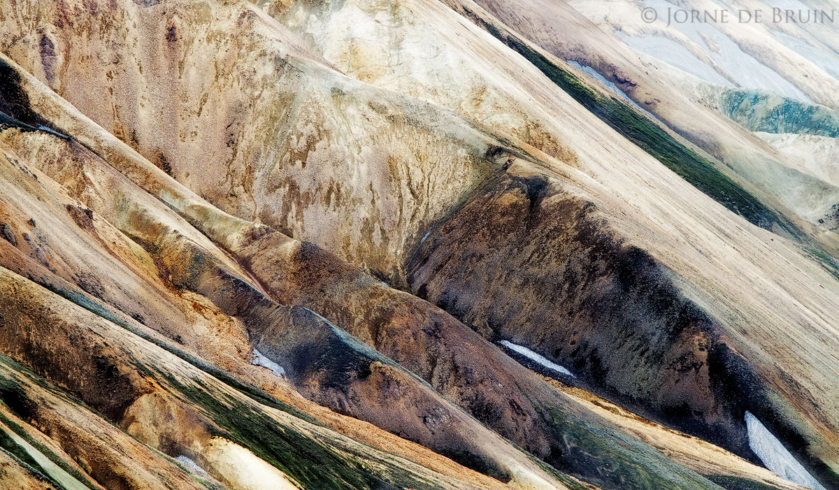
The Mountains of Landmannalaugar look like an abstract painting of nature, making this a very surreal place to walk around. Due to the overwelming amount of colour and mountains it's actually quite hard to get a composition that works without being overdone. This was one of my favourite images from that place.


Tech: 7D, 200mm f/11

Comments

9 comments
Comment posted by Bill Chambers on September 9, 2010 at 4:43 PM
A lot of subtle but beautiful colors here. I actually find myself looking more at the gorgeous color and texture of the URC than the main subject, but I guess that's just personal preference.
Registered on April 10, 2005, 753 Posts, 21216 Comments
Comment posted by Luis Argerich on September 9, 2010 at 5:26 PM
A nice display of lines and tonalities, I like it even if it doesn't make me say wow.
Registered on December 22, 2009, 91 Posts, 1349 Comments
Comment posted by Stan Rose on September 9, 2010 at 6:29 PM
This has potential, but i think you included a bit too much; personally i'd crop just left of your watermark. The urhc is fairly bright and pulls the eye there (right to the watermark--you'd probably want people to look more at the subject and less at the copyright :wink: ) The subtle colors and nice diaganols are great, though! :smile:
EDIT: I just read Bill's comment--i think he has a point, the urc could stand on its own also, it just doesnt seem to gel with the balance of the shot.
Registered on September 15, 2005, 836 Posts, 17099 Comments
Comment posted by Tony Kuyper on September 9, 2010 at 10:36 PM
I really like the abstractness of this. Could see going a little darker to bring out the colors and textures more.
Registered on November 1, 2003, 364 Posts, 22328 Comments
Comment posted by Vance Gese on September 10, 2010 at 12:51 AM
The design, textures, and color of these ridges are superb. As suggested by others, I would definitely consider cropping out the right hand side of the image right at or a little to the right of the copyright sign, to give about a 4x5 aspect ratio as I believe the left 2/3 to 3/4 of the image is phenomenal. Just a thought of course. Those diagonals are amazing.
Registered on November 13, 2008, 298 Posts, 6629 Comments
Comment posted by Jorne de Bruin on September 10, 2010 at 2:05 AM
Thanks guys, I considered a crop but I liked the line of the black ridge to end up in the bottom of the frame, but you might be right about the URC. UI'll definitly try a slight reworks of this one! :wavey:
Registered on June 26, 2008, 178 Posts, 2136 Comments
Comment posted by Gary McGhee on September 10, 2010 at 10:48 AM
This looks great Jorne, I'd imagine this would look very impressive printed large.

Gary.
Registered on April 15, 2010, 142 Posts, 2416 Comments
Comment posted by Ron Pederson on September 10, 2010 at 1:32 PM
The potential is there for this to have a big wow factor. Really like the abstract nature of this and the colors, textures, shapes of the mountains. I first thought this was tree roots in the thumbnail. I agree with the other comments about the upper right...could use darkening and contrast. Perhaps a tad darker overall, and a little more saturation. Very nice capture.
Registered on August 12, 2010, 29 Posts, 108 Comments
Comment posted by Eva McDermott on September 11, 2010 at 5:12 PM
Overall I like the lines and textures Jorne. I agree with others on the URC. Maybe darkening a bit instead of cropping my work better. I kind of like the turquoise color up there.
Registered on January 4, 2009, 1015 Posts, 13229 Comments