Nature Photographers Network
This is the preserved archive of the original Nature Photographers Network. The community continues at naturephotographers.network.
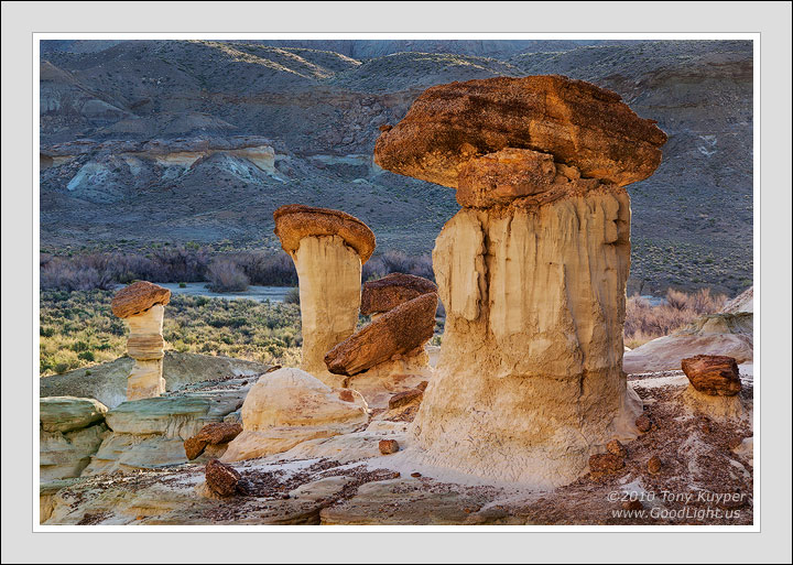
Hoodoo Line-up
‹ PreviousLandscape GalleryNext ›

Hoodoo Line-up

by Tony Kuyper

Gallery: LandscapePosted September 17, 2010715 views32 comments
This image was somewhat inspired by Michael Fatali's Earth Bones image. I thought I had figured out the light in his image, but in the end, I'm not so sure. Maybe it was a different time of year.

Still, I do like this light. The balanced rocks (hoodoos) are backlit by the sun which has just risen over the hills to the east. Behind me is a large wall that's catching full sun and reflecting the warm light onto the shadowed side of the pedestals.

This image was taken in May and the light was really changing fast. I was quite rushed and my comp doesn't quite feel optimal with the baby hoodoo on the right, but cropping it off doesn't feel quite right either.

This is the first image that I've done entirely on the new computer. I'd been resisting upgrading for a long time because I was worried about calibration issues. Old Sony CRT was great and the thought of losing the tight congruence with my prints scared me. However, this thread happened along just as my old computer bit its last byte and it's turned out to be an excellent monitor. The NEC Display MultiSync P221W-BK-SV Widescreen LCD Monitor calibrates very easily with the accompanying software and X-rite sensor and is every bit as good as the old CRT. Key, I think, is turning down the brightness as explained in the links on Youssef Ismail's thread linked above.

As always, I would really appreciate your thoughts and recommendations regarding this image.

Photoshopping for this image can be found at the bottom of this page.

5D2, Tamron 28-200

Comments

32 comments
Comment posted by Nick Bristol on September 17, 2010 at 4:22 PM
Looks like some great light. I really like the contrast between the foregrounf and the background. Very nice warm color on the balanced rocks too. I think the comp looks very good. I can see your point about the small rock on the right side, but that really does not bother me at all. Better there than cropped off. Very nice, Tony. Looks like the new computer and monitor is working fine for you.

Nick Bristol
Lone Rock, WI
Registered on February 1, 2004, 752 Posts, 14140 Comments
Comment posted by Hamed Musharbak on September 17, 2010 at 4:22 PM
i like it Tony

it looks like Mushroom :biggrin:

the light behind the subjects amazing

good job

Hamed
Registered on June 1, 2009, 372 Posts, 2282 Comments
Comment posted by Marc Adamus on September 17, 2010 at 4:26 PM
>>"This image was somewhat inspired by Michael Fatali's Earth Bones image. I thought I had figured out the light in his image, but in the end, I'm not so sure. Maybe it was a different time of year."

Or maybe Fatali uses Photoshop afterall :biggrin:

I like this and having been here myself I must say the light is quite nice. I didn't find any that was nearly as interesting in my trip there. It doesn't have the luminosity of much of your work but showcases this landscape about as well as I can imagine.
Registered on September 17, 2005, 780 Posts, 8091 Comments
Comment posted by Bill Chambers on September 17, 2010 at 4:52 PM
I love this comp, and the light is classic Kuyper. Super pretty!
Registered on April 10, 2005, 753 Posts, 21216 Comments
Comment posted by Anthony Gibson on September 17, 2010 at 4:54 PM
This is very interesting Tony. It is subtle in terms of the light, but strong in terms of composition. The hoodoos so three dimensional, that they almost look as is they were placed there in PS. Fantastic work on them with the scene.
Registered on June 11, 2008, 19 Posts, 130 Comments
Comment posted by Taylor Reed on September 17, 2010 at 5:59 PM
Lookin' good, Tony. The "baby hoodoo" doesn't bug me. I think it's in the same boat as the leaf you suggested cloning in my waterfall shot a couple weeks ago; something that photographers might view as a distraction but would appeal to the average viewer.
Registered on February 18, 2010, 26 Posts, 556 Comments
Comment posted by Dean Sauskojus on September 17, 2010 at 6:00 PM
The repetition of the pedestals and the light, especially the fill light, make this an exceptional image Tony. The baby hoodoo, IMO really doesn't take away from the image because there are so many other interesting things to look at. A fine image front to back. It certainly has Tony Kuyper's stamp on it. Nice work!
Registered on September 29, 2009, 137 Posts, 2659 Comments
Comment posted by Buck Ward on September 17, 2010 at 6:11 PM
The baby on the right is just fine. Glad it doesn't merge with the edge, but it just seems part of the texture of the surrounding land.

I like the colors of this picture, the light orangey hue of the main characters set against the earthy almost-blueshness of the far hills.
Registered on December 8, 2003, 96 Posts, 1917 Comments
Comment posted by Barry Ashenhurst on September 17, 2010 at 6:38 PM
Lovely TK. The detail in a big print would be fascinating.
Registered on August 4, 2009, 253 Posts, 455 Comments
Comment posted by Cory O'Neill on September 17, 2010 at 6:46 PM
Beautiful work, Tony! I really like the tonal nuances across the image.
Registered on October 4, 2008, 28 Posts, 273 Comments
Comment posted by Mark Capurso on September 17, 2010 at 7:03 PM
Tony, I think you've improved upon the inspiration--I like your comp. The reflected light is very nice too.

Mark Capurso
Phoenix, AZ
Registered on January 4, 2008, 47 Posts, 321 Comments
Comment posted by Eva McDermott on September 17, 2010 at 7:13 PM
I like your version a lot Tony. The warm hoodoos against the cool background make this a winner in my mind.

It does not have the yellowness that Michael Fatali's work has but I like it. I followed MF's work but became disheartened when someone pointed out to me on DA that he was up on charges for using flares to get some of images in a NP (comfirmed via internet search). In one case it charred the wall in that said particular NP. After hearing that, I get suspicious of the reality his work wondering what pyrotechnics he used to create the image you mention. BTW - I do not really like light painting with flash lights or head lamps either. I do not even own a flash except for the one on my snap shot camera only used for family snaps or events at work.

In any case, your image is gorgeous and stands on its own. No comparison applies....... Beautiful work as usual TK.
Registered on January 4, 2009, 1015 Posts, 13229 Comments
Comment posted by Kartik Venkatarama on September 17, 2010 at 8:08 PM
I love it...great depth and presence here
Registered on July 27, 2007, 197 Posts, 830 Comments
Comment posted by Dan Baumbach on September 17, 2010 at 8:59 PM
I like the light in this image a lot. Nice work. It's put together very well.

- Dan.
Registered on November 1, 2003, 473 Posts, 7980 Comments
Comment posted by Rick Goldwasser on September 17, 2010 at 9:02 PM
Looks great Tony! The contrast of the reflected light on the hoodoos against the darker background is awesome and I love all the textures - no problem with your comp.
Registered on May 10, 2009, 127 Posts, 970 Comments
Comment posted by Morris McClung on September 17, 2010 at 9:14 PM
Marvelous balance in the light, Tony! And in the comp. At first I thought it was a little right heavy, but the more I looked at it, I realized the stronger lighting on the left balances out the bigger formations on the right. Excellent depth as well. Strong image! :toast:
Registered on May 7, 2007, 670 Posts, 19650 Comments
Comment posted by Harry Lichtman on September 17, 2010 at 9:19 PM
Tony - I think your composition is a bit more balanced - not pun -than th Fatali image you linked to. I feel a bit congested looking at the Fatali shot, wheras your has some breathing room and depth. The far right is a little tight, but not sure if you had the option to include more on that side. Looks like a unique area.

Harry
Registered on September 17, 2010, 304 Posts, 3507 Comments
Comment posted by Vance Gese on September 17, 2010 at 11:46 PM
Incredible image Tony. Your composition is fantastic; the small hoodoo on the right works very well in my opinion and actually seems to complete the grouping to my eye. Love the light as always and those colors and textures. This beats Fatali's image hand down in my book. Superb work as always.
Registered on November 13, 2008, 298 Posts, 6629 Comments
Comment posted by John Williams on September 18, 2010 at 12:38 AM
I agree, that light is very nice. The little guy on the right works fine for me. I'll take a contrasting view, the busy texture of the background hills distracts just a little from the taller hoodoo. The one thing I like about Michael's photo is the higher view minimizes this.
Registered on September 6, 2007, 221 Posts, 5985 Comments
Comment posted by Doug Roane on September 18, 2010 at 2:03 AM
This is quite nice, Tony. No nits here!
Registered on December 12, 2008, 213 Posts, 2226 Comments
Comment posted by Stan Rose on September 18, 2010 at 2:46 AM
Anyone else and id say "awesome photo" and leave it at that--but i just dont think this holds up to your standards of perfection, mainly for the reeasons John mentions, also the hoodoos have kind of a cut-n-paste look (especially large one on right) which may or may not be the result of pp--or maybe this might have worked better with shallow DOF. A great subject, arranged nicely with nice light--just doesnt inspire me the way most of your posts do. :wavey:
Registered on September 15, 2005, 836 Posts, 17099 Comments
Comment posted by Mark Pelton on September 18, 2010 at 9:01 AM
I love the color contrasts here and the pleasing patterns of composition.
Registered on November 25, 2003, 380 Posts, 4647 Comments
Comment posted by Wendy Blanchard on September 18, 2010 at 10:20 AM
I love the color, detail and the lighting behind the subject. Sweat shot! :toast:
Registered on June 11, 2006, 58 Posts, 647 Comments
Comment posted by Ned Fenimore on September 18, 2010 at 12:27 PM
Nice contrast against the cool hills, Tony..
Registered on November 1, 2003, 467 Posts, 2803 Comments
Comment posted by Michael R Reynolds on September 18, 2010 at 12:36 PM
Tony,
This is a beautiful image. I can see your point about the small hoodoo on the right, but I don't think cropping it out would add to the image. I really don't find it distracting. The light in this image is very sweet. To my eye, a little more tonal separation between the top of the large Hoodoo and the BG might be nice, but overall, its a winner. Best Regards.
Registered on February 26, 2008, 54 Posts, 812 Comments
Comment posted by Chris Chamberlain on September 18, 2010 at 3:21 PM
Looks pretty darn goos to me! Comp, and light are both great. I checked out Fatali's shot, it's pretty amazing too. looks like the light is somehow different. Maybe a little natural diffusion or something going on in that one?

Chris
Registered on March 13, 2007, 500 Posts, 8365 Comments
Comment posted by Nicolas Belokurov on September 18, 2010 at 4:40 PM
Inspired perhaps, but quite unique on it's own right. I like it Tony.
Registered on July 22, 2009, 41 Posts, 533 Comments
Comment posted by Robert Dayton on September 18, 2010 at 9:13 PM
A good composition, Tony. I like your placement of the three formations
and the wonderful light on them.
Registered on November 11, 2008, 281 Posts, 3958 Comments
Comment posted by Eric Good on September 18, 2010 at 9:43 PM
The way the light casts across this scene gives this a great three dimensional look. I love the variation in color captured much more than in in Fatali's version. I think the only way this could be better is if you had a slightly taller tripod and a step later... assuming this was as high as you could go. :wink: I think that would place the top of the hoodoos in the most optimal position, but that is being really, really nitpicky. Beautiful work as usual.
Registered on March 17, 2007, 116 Posts, 4764 Comments
Comment posted by Grant Collier on September 19, 2010 at 9:34 PM
Great capture!
Registered on July 29, 2005, 73 Posts, 430 Comments
Comment posted by Anil Rao on September 22, 2010 at 3:53 AM
Tony,

I love your ability to showcase these natural landscapes using a combination of thought provoking compositions in conjunction with amazing light. In this particular photograph I love how the inclusion of the shadowy background not only serves to show off the main hoodoos but also provides a good sense of place.

I am so glad I didn't miss out on this post.
Registered on November 15, 2003, 234 Posts, 4923 Comments
Comment posted by Julian Barkway on January 22, 2011 at 11:19 AM
I somehow missed this first time around, Tony. Great work!

Don't worry about not getting Fatali's light. I'm not sure he did, either. He's a master printer and some of his images do show some very obvious darkroom manipulation especially as contrast-masking (not the PS variety :wink:) is integral to getting the best out of the Cibachrome process he uses. I strongly suspect that some of these masks don't have an entirely neutral colour-balance....
Registered on January 18, 2007, 344 Posts, 1961 Comments