Gallery: FloraPosted September 19, 201092 views13 comments
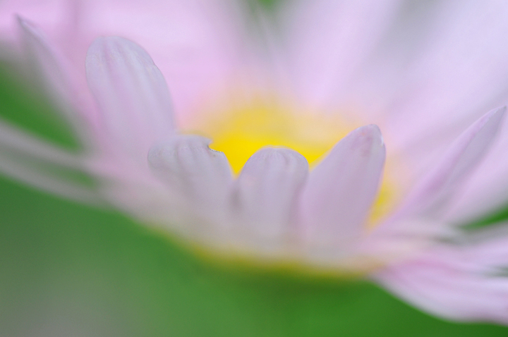
Nikon D300, Sigma 150. F/5.6, 1/400, ISO 200.
The first in a series of crams of my Helen Curtis Chrysanthemums. I would like to know if the softness works. Comments appreciated.
Comments
13 comments
Comment posted by Bob Duff on September 19, 2010 at 8:08 PM
Albert, I'm afraid it's not working for me. I like the division of colour and the softness of the green and white. I think that if the tips of all the fg petals were sharper then it could work. Also the Nick out of the fg petal is a bit of a distraction.
Registered on April 21, 2010, 160 Posts, 1675 Comments
Comment posted by Pat Sampson on September 19, 2010 at 9:14 PM
Albert,
As you know I'm somewhat cram challenged. I like this. It makes me think the flower is holding sunshine. The green and pink complement each other well. I'm not really concerned in any of these style of images that there's something in sharp focus but more that my eye can find a resting place. In this case it comes to rest naturally in the main V between the petals. I might clone in the nick, not sure.
Pat
Registered on May 19, 2007, 953 Posts, 15989 Comments
Comment posted by Carol Hyman on September 19, 2010 at 9:21 PM
I think the softness works quite well, Albert. The light is lovely.
I think you could have positioned this in the frame so the flower was a bit higher. I think that would have given you better balance between the green and the flower.
I'm looking forward to seeing more of this technique.
Cheers,
Carol
Registered on January 18, 2007, 597 Posts, 8062 Comments
Comment posted by Morris McClung on September 19, 2010 at 10:56 PM
Bravissimo! What a beauty. Soft and pastel.
Registered on May 7, 2007, 670 Posts, 19650 Comments
Comment posted by Miro Susta on September 20, 2010 at 12:52 AM
Very nice color palett bu a bit soft for my taste. Nicely done Albert.
Registered on August 18, 2006, 719 Posts, 3736 Comments
Comment posted by Gary Yeoh on September 20, 2010 at 6:44 AM
Albert:
The softness is lovely and I do like the sunshine in the middle. The nick on the petal is a slight distraction but other than that it is a lovely composition.
Registered on September 1, 2009, 588 Posts, 8184 Comments
Comment posted by Ramamohan Pai on September 20, 2010 at 1:07 PM
Albert, I take this photo with Colors as main subject. Love the complementary colors here and cannot wait to see other photos from this Series. I can clearly see you are onto to something interesting here
Registered on November 1, 2003, 550 Posts, 9037 Comments
Comment posted by Craig Strand on September 20, 2010 at 1:14 PM
Appropriate title and a wonderfully executed image. Well done Albert!
Registered on March 30, 2008, 416 Posts, 2885 Comments
Comment posted by Nathan Buck on September 20, 2010 at 1:24 PM
Interesting title, aptly named Albert. The colors are very nice.
I think I would prefer a bit more in sharp focus - as is, I don't know that I connect to the subject.
Nathan
Registered on November 1, 2003, 1101 Posts, 13589 Comments
Comment posted by John Williams on September 20, 2010 at 3:28 PM
Looks like a Fairy Tale. Nice and dreamy.
Registered on September 6, 2007, 221 Posts, 5985 Comments
Comment posted by John&Patty Benway on September 21, 2010 at 2:25 PM
Sweet shot Albert, really like the comp and soft colors. Very nice.
John & Patty
Registered on May 12, 2006, 626 Posts, 8700 Comments
Comment posted by Ian Wolfenden on September 22, 2010 at 9:31 AM
The softness seems fine to me, Albert - I love the colours and the yellow glow in the centre. I appreciate this is meant to be pretty abstract but somehow the lack of a stem bothers me slightly - the relatively sharp petals do stress the flower form and yet it floats inexplicably.
Registered on May 18, 2007, 1108 Posts, 7647 Comments
Comment posted by Bill Fach on September 22, 2010 at 1:40 PM
Albert: My impressions echo Nathan's and for my taste there is also perhaps a bit too much negative space in the lower left. Cropping it to 5:4 from the LLC works better for me. I do like the color palette. >=))>
Registered on November 1, 2003, 1805 Posts, 26981 Comments

Comments
13 commentsAs you know I'm somewhat cram challenged. I like this. It makes me think the flower is holding sunshine. The green and pink complement each other well. I'm not really concerned in any of these style of images that there's something in sharp focus but more that my eye can find a resting place. In this case it comes to rest naturally in the main V between the petals. I might clone in the nick, not sure.
Pat
I think you could have positioned this in the frame so the flower was a bit higher. I think that would have given you better balance between the green and the flower.
I'm looking forward to seeing more of this technique.
Cheers,
Carol
The softness is lovely and I do like the sunshine in the middle. The nick on the petal is a slight distraction but other than that it is a lovely composition.
I think I would prefer a bit more in sharp focus - as is, I don't know that I connect to the subject.
Nathan
John & Patty