Nature Photographers Network
This is the preserved archive of the original Nature Photographers Network. The community continues at naturephotographers.network.
The Stare - Repost
‹ PreviousAvian GalleryNext ›

The Stare - Repost

by Dottie Short

Gallery: AvianPosted September 22, 2010176 views14 comments
I haven't posted in a while...trying to get my arms around the PP part of digital photography, as well as solving some photographic short-comings on my part.

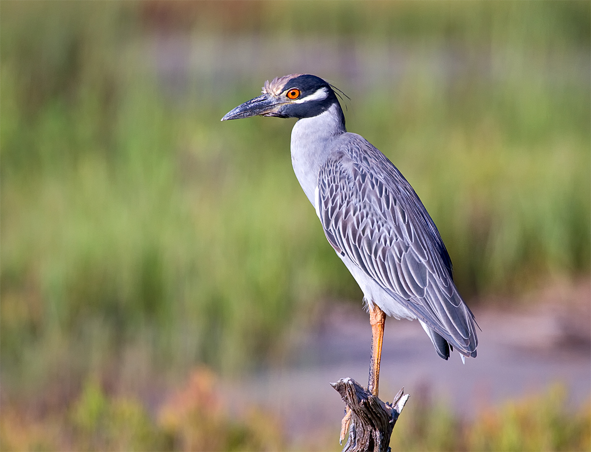
The Yellow Crown Night Heron was a well-behaved subject, and the BG was more pleasing than any I've had. I had another image of the YCNH scratching his chin, but there was a blurred dock in the BG. I may post that later. Comments and critiques are welcomed.

Small crop to move bird out of center
Canon 7D
100-400mm L @ 400mm
1/1250
F/5.6
ISO 400
+1.33
Gitzo Tripod

Comments

14 comments
Comment posted by Nate Chappell on September 22, 2010 at 1:45 PM
This looks really nice Dottie, I like the bg and the detail on the bird looks nice. If you have it in the original I might include a bit more room at the bottom. :toast:
Registered on February 1, 2006, 1158 Posts, 19528 Comments
Comment posted by John Kerr on September 22, 2010 at 2:05 PM
Great detai in the bird and I like the different colors of the bokeh in the BG. Looks like your getting pretty comfortable with your 7D, hope you continue capturing great photos like this one. :smile:
Registered on October 28, 2009, 111 Posts, 1070 Comments
Comment posted by Angela McCain on September 22, 2010 at 2:27 PM
Dottie. So glad to see you posting again. I like your heron shot. These birds can be difficult to catch because they are quite suspicious. I like the eye contact and light in the eye. Good job.
Registered on April 19, 2009, 367 Posts, 3589 Comments
Comment posted by Sally King on September 22, 2010 at 2:36 PM
I would love to see one of these some day. Great pose showing off that incredible eye. Nice and sharp against the blurred background.
Registered on December 2, 2008, 416 Posts, 4450 Comments
Comment posted by Keith A Anderson on September 22, 2010 at 2:49 PM
Beauty, Dottie. Wonderful detail and color. Wish I had something half so good in my files. :toast:
Registered on February 13, 2006, 166 Posts, 1818 Comments
Comment posted by Richard Ditch on September 22, 2010 at 3:49 PM
A solid image as posted, especially in the larger version. I agree about a bit more room at the bottom if you have it.

I'd adjust the color balance a bit in this as it has a slight blue or magenta cast to it.
Registered on November 1, 2003, 1031 Posts, 12705 Comments
Comment posted by Ian Mason on September 22, 2010 at 6:34 PM
Lovely image. I agree a little more room on the bottom would be good.
Registered on December 14, 2005, 399 Posts, 2305 Comments
Comment posted by May Haga on September 23, 2010 at 10:44 AM
Great image Dottie. I agree with Nate that a bit more room at the bottom would make it even better.
May
Registered on February 22, 2007, 714 Posts, 8470 Comments
Comment posted by Dottie Short on September 23, 2010 at 11:50 AM
Well I'm going to try this repost thing again. Guess I forgot how to do it :confused: :confused: I didn't have extra room on the original image to add more at the bottom, but I had another image that showed plenty of room. I also addressed the comment that the image looked too blue. After making the change, I agree it was too blue. I hope these changes improved the image. Thanks for all the suggestions. I've learned a lot :biggrin:
Registered on April 12, 2010, 61 Posts, 375 Comments
Comment posted by Mia McPherson on September 23, 2010 at 8:58 PM
Dottie

The color balance looks much better to my eye in the repost. I'd also consider a vertical comp for this. Well done.
Registered on June 25, 2007, 491 Posts, 12566 Comments
Comment posted by Simon Bennett on September 24, 2010 at 12:16 AM
Nice pose and head-turn.
Registered on February 4, 2007, 350 Posts, 4614 Comments
Comment posted by Jim Hackley on September 24, 2010 at 3:05 AM
That is quite a look, good pose and background really add to over all image. I like the adjusted repost better. The first image composition is wonderful, way to go.
Registered on September 17, 2009, 302 Posts, 5535 Comments
Comment posted by Geoffrey Baker on September 24, 2010 at 7:33 PM
An excellent image, the bird stands out well against the background too.
Well done.

Geoff.
Registered on August 20, 2010, 192 Posts, 980 Comments
Comment posted by Richard Ditch on September 24, 2010 at 11:45 PM
The adjusted color balance in the repost is much better.
Registered on November 1, 2003, 1031 Posts, 12705 Comments